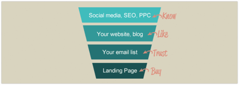
One of the critical jobs for marketers is to get leads for sales. They are constantly on their toes testing newer methods for increasing the conversion rates.
Email marketing is considered to have the highest ROI (1-to-38) among other online marketing activities. Hence, this method of marketing is extensively used by marketers.
Email marketing to be successful, dedicated landing pages are a must.
Landing pages are the proven way to increase conversion rates. According to WordStream, businesses with more than 40 Landing Pages generated 12-times more leads than those who had 1-5 landing pages.
But,
62% of the B2B businesses have 6 or fewer landing pages.
More than 20% of the businesses have reported that they do not have an adequate strategy for landing page testing.
Landing pages do not work as a standalone method. Influencers like Neil Patel suggest combining email marketing with landing pages to get the maximum result.
A typical sales cycle starts with the customer knowing you and ends with buying the product/service from you. If email marketing is the tool to build trust with your customers, then a landing page is the deal closing point.
EngageBay enables you to club the above two powerful methods. EngageBay allows you to customize already-built landing pages in less than two minutes. You can also create your desired landing page with the help of an extremely user-friendly landing page builder.
Since Engagebay is an Integrated Automation Software, all the information collected through the landing page is synced with email accounts in the database.
How we can sync email marketing and landing pages for maximum conversions?
- 1. Consistency in Design
- 2. Consistency in the Message
- 3. Compelling, Short Email Copy
- 4. Do Not Redirect to the Homepage
- 5. Separate Landing Pages for Different Email Campaigns
- 6. Segment the List
- 7. Mobile Optimisation for Email and Landing Pages
- 8. Headline Should Match the Offer in the Email
- 9. Red Button for Call-To-Action (CTA)
- 10. A/B test your Landing page
1. Consistency in Design
It is essential to make the customer feel that the landing page is a part of the message they read in the email. Design consistency helps the visitors understand at a glance, that they are on the right page.
Any confusion in the transition from email to the landing page can lead to a bounce.
To deliver a consistent experience to the customer, the design, color, and typography used in the email should be continued on the landing page. Consistency in design and visuals results in a better copy. This helps in creating a better user experience thus instilling confidence in the brand.
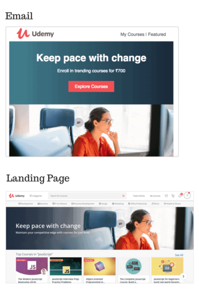
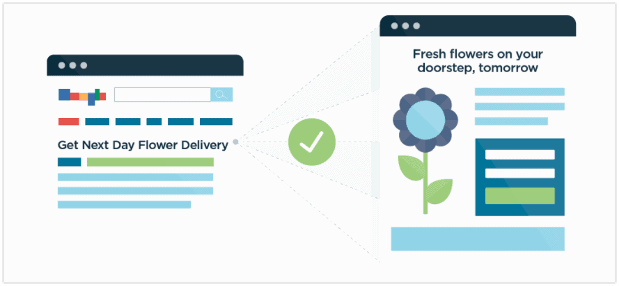
Looking at the image below we can see how beautifully the email message is transferred to the landing page.
2. Consistency in the Message
The concept is so important that it has a separate name for it. It is called the “Message Match”. Oli Gardner defines Message Match as “a measure of how well your landing page copy matches the phrasing of the ad or link that brought the visitor there.” “Strong message match increases conversions because it reassures people they’ve come to the right place.”
There was a reason your subscribers clicked on the email CTA. They were interested in the offer. Continue the message on the landing page. Try to reinforce the message mentioned in the email. While the textual content may be different, the message should be the same. Do not redirect them to the homepage. Do not show them multiple CTAs.
The landing page should be designed such that they should not even have to scroll to avail what was promised in the email copy. Put the CTA in bold font and attractive colors right above the folds.
3. Compelling, Short Email Copy
Treat the email message as a teaser to the actual content that is hosted on the landing page. The landing page should have in-depth information. In that short email copy, give your visitors enough reason to click on the CTA.
“Curiosity is the lust of mind”. – Thomas Hobbes
Create curious emails. You can also give them special offers and discounts so that they click on the CTA. But, do not disappoint them on the landing page.
An example of a curious email:
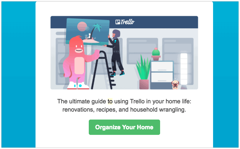
We are familiar with Trello as a web-based project management app. You could have used Trello in office to prioritize task, communicate with your team and track progress of your project.
Look at the email below that caught my attention in the promotions tab: Trello to manage your house.
The email copy should be compelling enough to make them click the CTA.
Yes, you want to make a sale. For that, you have content to:
- Make the prospect understand your product and its need in his life
- Explain the various features of your product that can help the customer
- Reveal all the plans, its cost
But, you cannot write everything in your email copy. Otherwise, it will look something like this:
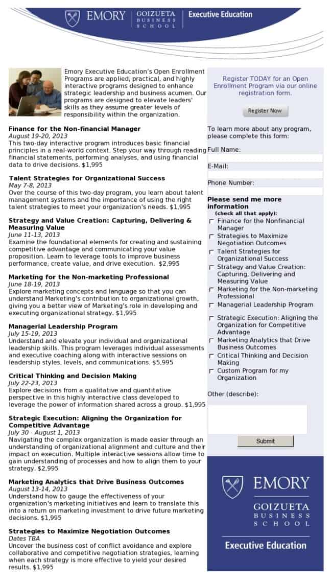
I am sure you don’t want to look like this.
Introduce the product in the email. Make the text attractive so that the readers visit your landing page. The landing page copy should have the similar theme, though not necessarily the same CTA. In the landing page, you can encourage them to try your product, download a copy or purchase.
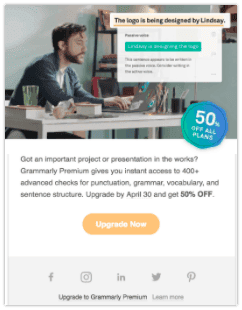
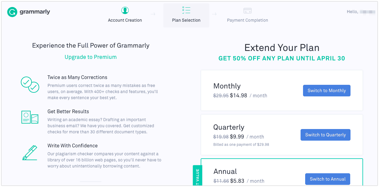
Now let us look at a better example. In the email copy below, Grammarly has cleverly explained what they do and why you should buy their service. They also gave you an added reason (50% discount) to click on the CTA button.
Next comes distributing the information between the email copy and the landing page. In the landing page, the company details its various plans and the cost. They further list the numerous other advantages of having this app.
4. Do Not Redirect to the Homepage
Have you ever been disappointed by a company by clicking on the product in the email and landing on the homepage of their website?
Sadly, I have been subjected to this disappointment several times.
What is even more frustrating is that often, the company does not yet have that product up. They had simply displayed that product to attract visitors, which is misleading. This practice is more familiar with products like apparel and bags. It is not a good practice and one can lose both customers, as well as their own reputation.
For better conversion, it is advised not to direct the visitors to your homepage. Instead, build a dedicated landing page for that product.
5. Separate Landing Pages for Different Email Campaigns
Even if you don’t redirect the visitors to the homepage, you may think of having a single landing page for a number of your email campaigns.
48% of the landing pages contain multiple offers. Multiple CTAs confuse the customers. As a result, they end up discarding the page altogether.
There should be a separate landing page for each email campaign. The landing page should have a limited or no navigation (only 16% are free of the navigation bar) and a limited number of exits. The ‘Call to Action’ should be clear and visible.
Do not try to kill two birds with one stone by displaying multiple offers. Try to minimize the distraction. Landing pages with numerous offers get 266% lower leads than single offer pages.
In the example below, we see two calls-to-action in one of Hubspot’s blogs. Come on! We all make mistakes.
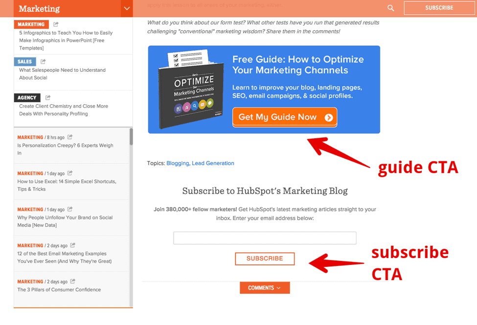
Credit
6. Segment the List
Having a unique landing page for a particular email campaign is great. The other way to get maximum out of your email marketing effort is to segment the list.
According to a study, 39% of marketers who segmented their email lists experienced higher open rates, 28% experienced lower unsubscribe rates, and 24% greater revenue.
If you have segmented your email list to collect information from the employees across hierarchies in an organization, you need to build separate landing pages for different segments. For example, the landing pages for CEOs will be different from those for the other employees.
Don’t try to build a ‘one size fits all’ kind of a landing page.
7. Mobile Optimisation for Email and Landing Pages
54% of emails are opened in mobile phones, and 17.4% of the global web traffic comes through mobile. This implies marketers can no longer afford to ignore mobile friendliness.
A responsive email design or landing page is the one that re-sizes itself when opened in mobile.
For this purpose, redesign your website to be mobile friendly (responsive) or create an altogether separate mobile version of your site. If you find it to be a mammoth task, then you can create mobile optimized landing pages. Creating responsive landing pages are much easier with Engagebay’s landing page builder.
Responsiveness is no longer a ‘good to have’ feature. With the increase in mobile phone usage worldwide, this is an absolute necessity.
8. Headline Should Match the Offer in the Email
Just like the message match, headline matching is equally essential. A headline is the first thing visitors see on the landing page. With the decreasing attention span of people nowadays, you have less than 30 seconds to convince them that they are on the right page. A good headline does the job quickly.
Try to keep the headlines of the email and the landing page the same. Major changes in the wording can lead to misinterpretation.
You made an offer of “50% discount on fresh apparel” in the email. The landing page must have the same headline.
9. Red Button for Call-To-Action (CTA)
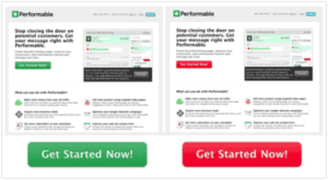
Although you can email A/B testing your landing pages for the color and size of the CTA button resonating with your audience, a couple of studies have found some standard results.
In a study with 600 subjects, it was found that conversions increased by 34% when they used a red button. In another study by Hubspot, it was found that the red button outperformed the green by 21%.
So, you can use the pre-generated and tested knowledge to quickly get the results out of your email marketing efforts.
10. A/B test your Landing page
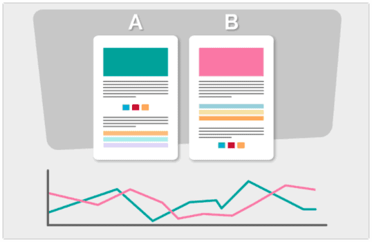
Not just the email campaign, test your landing pages also for maximum conversion as well. Show your creativity! Test different text, images, CTAs and even the color of the button. You never know which element resonates with your customers to achieve good conversion rates.
A disjointed marketing approach leads to fragmented results. Combining the two most powerful methods of marketing leads to new synergies. Therefore, better conversion rates can be achieved. How do you sync your email campaigns with the landing pages? Let us know in the comments below.
 Learn from the top sales page examples and elevate your sales strategy – find out more in our expert guide!
Learn more about landing pages with our Landing Page Guide:
- Chapter 1: What is a Landing Page?
- Chapter 2: Landing Page for Small Business
- Chapter 3: Landing Page Templates for Small Business
- Chapter 4: Drive Traffic to Your Landing Page
- Chapter 5: Perfect Landing Page Recipes
- Chapter 6: Landing Page Best Practices