
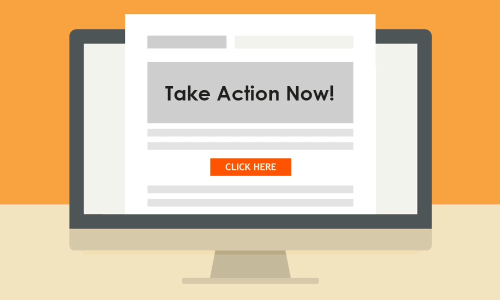
On the sales funnel path your lead travels through, them signing up for your email newsletter is about the midway point.
The lead is now curious and/or interested enough that they’ve subscribed to your emails. Hopefully, that interest will translate to them opening and reading the messages you send.
If you get to this phase with a lead, now’s the time to optimize your email call to action or CTA for more clicks and sales.
How do you do that?
It can be tricky. There are so many call to action tips out there that it’s easy to cross your wires and end up doing the wrong thing. You unnecessarily cost yourself leads and thus sales in the process.
We don’t want you to miss out on valuable leads because your CTA was too pushy or placed somewhere where readers just didn’t see it.
If you’re ready to improve your email calls to action, then read on.
First, we’ll dive into some useful information on CTAs. Then, we’ll share 12 tips for email CTA optimization.

Table of Contents
What Is a CTA in an Email?
An email CTA often appears in your messages as a link or a button. Whichever format you choose, you’re trying to encourage your reader to act.
If you’re having a sale or introducing a new product, your CTA button should encourage the reader to buy.
Perhaps you just want to provide information in your email. Then your CTA might inquire the reader to learn more.
Why Is CTA Important?
For any email marketing campaign to succeed, you need a CTA. Otherwise, you’re just pushing information at the reader but not giving them a way to do anything with it.
You can’t trust that they’ll get an email about a sale and then rush to your website if they have to go to your site on their own.
By providing them a direct link to your online store, you increase the likelihood of them completing the purchase.
What Makes a Good Call to Action?
Okay, so anyone can (and should) use an email call to action, but what makes a CTA good, even effective? We’re glad you asked!
Your CTA must have an urgency to it. You want the lead or customer to act now when the CTA button (or link, etc.) is right in front of them.
By conveying that urgency in your succinct CTA copy, you inspire the lead or customer to take the desired action.
You also want to present the benefits for the lead or customer. If they click your CTA button or input their phone number as part of an opt-in form, what’s in it for them?
You want to be upfront about the benefits derived from your email call to action. If you’re sending the lead materials, such as eBook chapters, newsletters, etc., say exactly what they’re getting. List the quantity as well, like 10 newsletters from 2020 or 16 eBook chapters.
Design beautiful email templates with rich text formatting and create appealing CTA buttons with EngageBay’s email software
Tell the lead or customer why this information is valuable as well. Otherwise, they won’t care if you offer them 10 newsletters or 10 billion.
Finally, make sure your CTA has some statement that mentions the lead or customer is under no obligation. In other words, if they opt in, they don’t have to make a purchase.
This lowers the risk the lead is facing, as they’re aware that opting in could deliver them 20 sales emails a day.
Your no-obligation statement could dissolve their concerns and encourage them to click or otherwise interact with your CTA.
How to Write Call to Action Text?
Could you use something like “click here!” or “call now!” as your CTA? Sure! But should you?
That’s a whole different story.
Boring CTA buttons that don’t really tell you much will not incentivize your users to click. Instead, you want to follow these handy writing tips for your email calls to action:
- Rethink your verbiage, using simple words like “try,” “find,” or “get” rather than “submit.” These words are more easily understood and come across as lower-pressure.
- Your CTA button needs to be big enough that it’s noticeable.
- Use directional cues such as arrows or images in your email that indicate where the CTA is.
- Add interactivity such as color changes to the CTA button, as it’s much harder to miss and makes it more fun to interact with.
How to Optimize Website Conversions by Improving Your CTA – A Neil Patel video:
12 More Great Tips to Optimize Your Email CTAs
Now, without further ado, here are our 12 tips for successfully using a CTA in email marketing.
1. Always Stay Above the Fold
According to Marketing Sherpa, a typical person will only read your email for 15 to 20 seconds. That’s it.
Unless it’s something pertaining to their jobs or their personal lives, they don’t give most emails too much attention.
This makes sense when you think of how pervasive email has become. Even personal email accounts can get hundreds of messages sent to them daily, often from companies like yours.
Who has time to sit and read each one top to bottom?
That’s why the placement of your CTA—often a button—is so darn important. This is something we’ve written about a lot on this blog, but it certainly bears repeating.
An effective CTA needs to be above the fold. It’s okay if it’s not the first thing a reader sees when they open your email, but it should be one of the first things.
2. But Off to the Side of the Content
Of course, your email newsletter isn’t just one giant CTA button. There’s content included as well.
You don’t want to interrupt the natural flow of reading, which goes from the left to the right and at the top of the page to the bottom.
If there’s a CTA button smackdab in the middle of a paragraph, this disrupts the reader. It can also annoy them.
You need to move with the flow of natural reading. By keeping your CTA button above the fold but away from your content, you don’t disrupt curious readers.
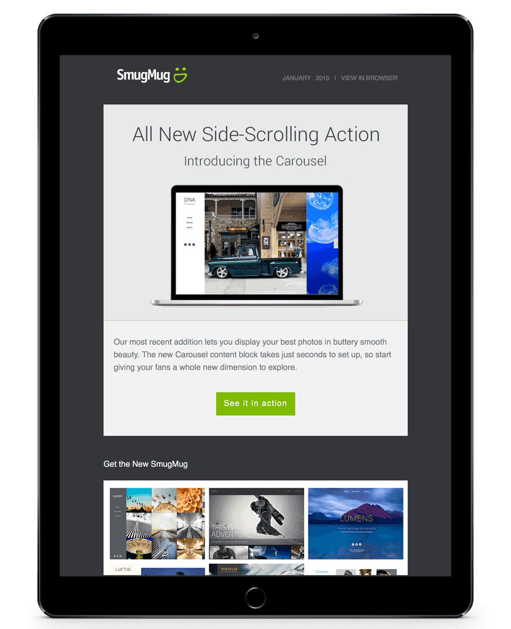
It’s recommended you put the button off to the right—not the left—as this follows natural reading flow.
Take a look at where photo company SmugMug placed their CTA for an example.
3. Powerful Copy Gets Results
What does your CTA button say? Is it something generic like “click here” or “see more?”
If so, then your conversion rates are probably not nearly as high as they could be.
We don’t recommend getting too wordy with your CTAs, because there’s just not enough room to do that with a button.
Rather than using more words to be descriptive, try these powerful, high-converting words instead:
- Upgrade
- Stop
- Start
- Save
- Off
- More
- Join
- Free
- Get
- Explore
- Create
4. Message/CTA Alignment Matters
What’s the goal of your email? Are you writing to let your audience know about a new product/service? Is something on sale?No matter your intentions, you have to make sure there’s alignment between your email message and the call to action button.
Here’s what we mean by that.
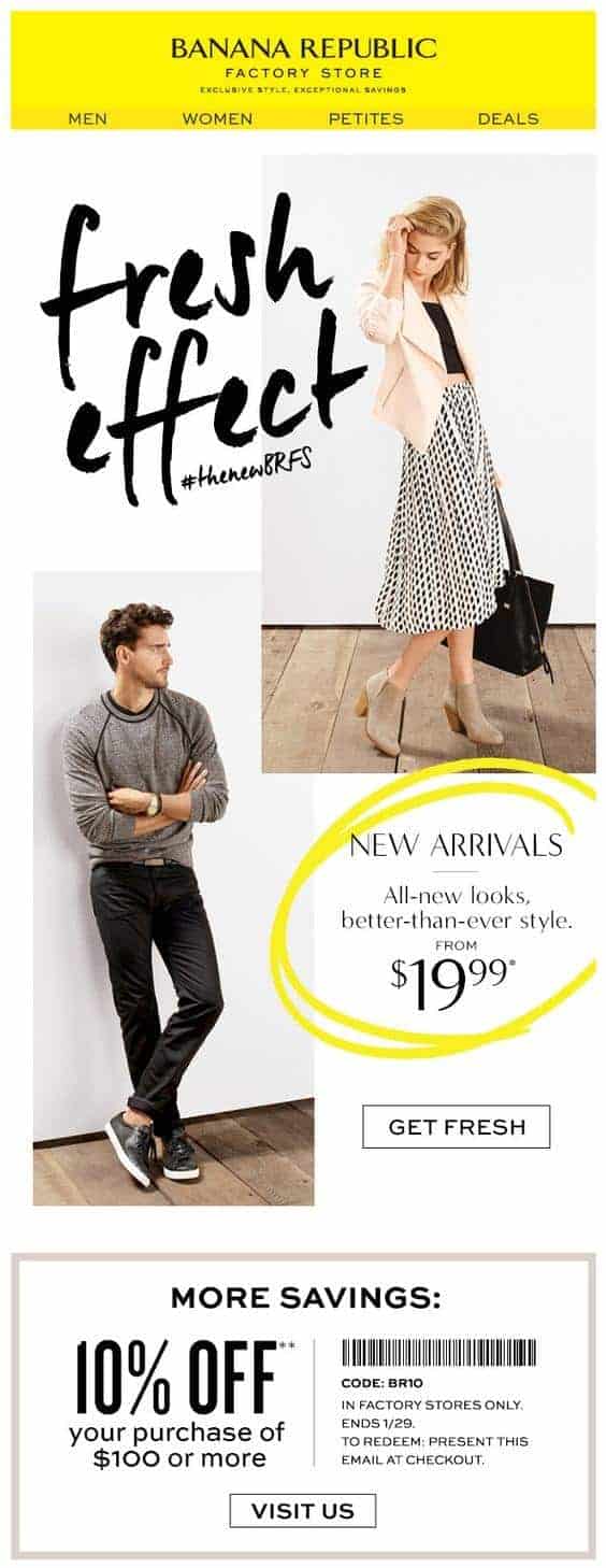
The above email from retailer Banana Republic is a perfect example of this.
The email describes a “fresh effect” while their CTA says “get fresh.” While we will note that the CTA button is maybe placed a little lower than it should be, there seems to be a reason for that.
The CTA is right by a second coupon for double the savings.
While you don’t have to use the exact same language from your headline to your CTA button, your button should always be aligned with your message.
👉Unleash the power of trigger email marketing for maximum engagement – explore our comprehensive guide now! 💌
5. Don’t Fear White Space
White space is nothing to be afraid of. In fact, it’s actually your friend. According to information systems company Segue Technologies, white space has several benefits:
- It separates elements that don’t necessarily go together.
- It makes a page or email look clean.
- It allows content to look more legible.
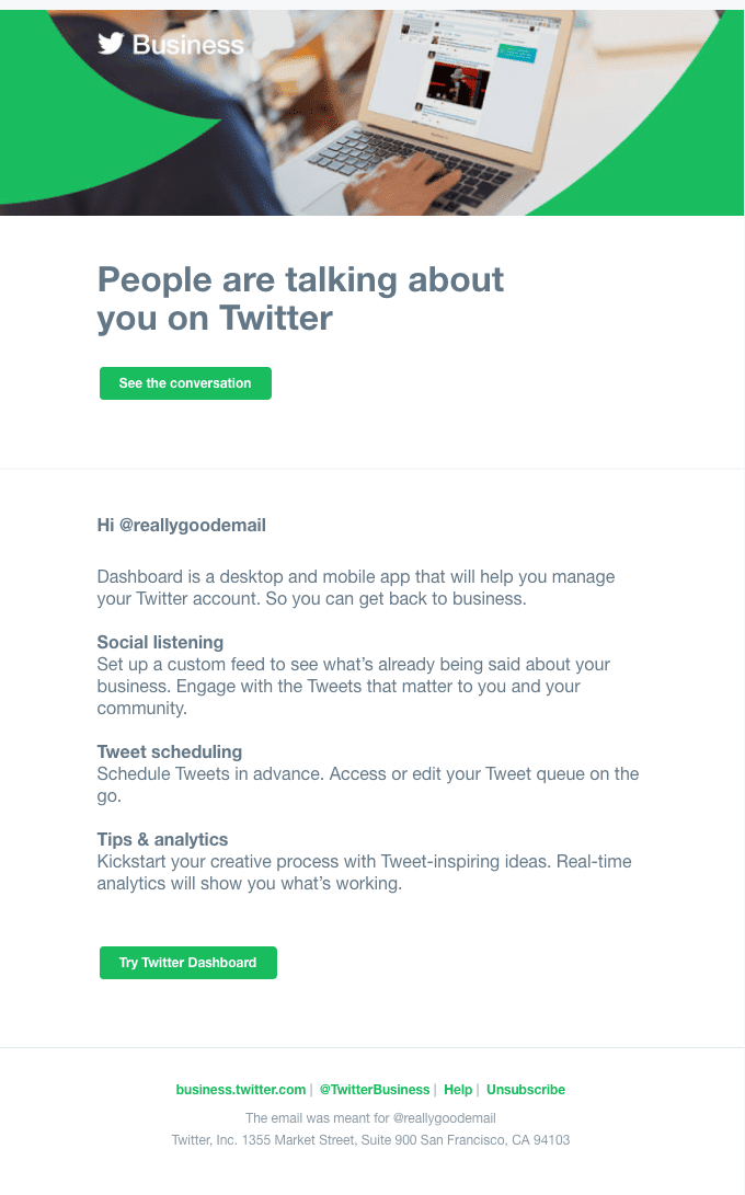
Still not convinced? Check out this Twitter email for an example of great use of white space.
 6. Colors Convert
Some marketers believe that designing a newsletter around the colors of the CTA button can boost conversions. That can work to a point, but you have to be careful.
Getting too matchy-matchy means your CTA button can easily be missed.
For example, take a look at this email from clothing retailer J. Crew:
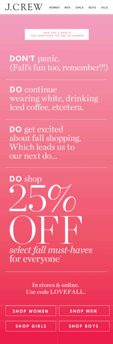
It has a pink gradient, but there are a few problems. First, the CTA buttons are all the way at the bottom of the email.
They also blend in so well with the hot pink that they’re easy to miss.
Compare that to this email from the restaurant Pizza Hut.
The email is mostly red, from the borders to the text headlines to a box with the food itself. The “order now” CTA button, which appears twice, is bright green. You couldn’t miss it if you tried.
Marketers and psychologists will always disagree about which colors make customers feel calm versus angry.
What we can all agree on is that complementary colors or other bold hues are a smart choice for CTA buttons.
7. Limit Button Count
We have another issue with that J. Crew email we shared above. There are four CTA buttons all in a row! Yes, they’re for men’s, women’s, girls’, and boys’ clothes, but the buttons could have been designed more efficiently.
For example, there could have been only two CTAs, one for women’s and girls’ clothes and the other for men’s and boys’ clothes. That would have been better.
Otherwise, they could have used a single CTA that said something like “shop now.”

The more CTA buttons you have, the more confusing it gets for your lead or customer. We don’t recommend any more than two.
The Pizza Hut email example above is a good one to follow for dual CTA buttons. The first button is right at the top, above the fold, where you can definitely see it.
Then, after Pizza Hut shares a unique coupon code, there’s a second button. This is to make it more convenient for a person to shop.
Why should they scroll back up and click the first button when there’s a second one right there? That’s much more convenient.
8. Both CTAs Don’t Have to Be the Same
In the last tip, we talked about the Pizza Hut email as an example of using two CTA buttons in one email. As you can see in that image, both those CTAs are the same.
They have the same wording, the same color, the same everything.
If you’re using two CTAs, do they always have to be identical? Not at all. This is known as having a secondary CTA.
Here’s a good example of a secondary CTA in action with two different messages. It comes from the pharmacy brand T.C. Pharma.
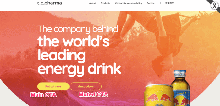
The two CTAs are placed side by side so neither are missed.
The main CTA is the yellow button that says “find out more” in transparent text. The secondary CTA is transparent with yellow text that reads “view products.”
Presenting two CTA buttons like this gives the lead more options. Maybe they’re not interested in the energy drink that T.C Pharma is selling for some reason.
If that’s the case, they can always click the secondary CTA. This way, they can browse other products from the company that may be better suited to their needs.
9. First Person Works Well
Writing CTAs and email copy in the first person (“me,” “my,” etc.) may seem foreign at first. It kind of feels like you’re assuming for the customer that yes, they want to try your product/service.
Wouldn’t it be safer to stick to second person (“you,” “your,” etc.)?
Sure, it’s safer, but it doesn’t convert nearly as well.
Unbounce A/B tested the first person versus second person CTAs back in 2013. What they found was conversions were significantly higher when copy was written in the first person than it was in the second person.
Leads and customers alike respond to personalization. It makes them feel like the company is paying attention to them as an individual.
Writing CTAs and email newsletters in the first person is another way to personalize your message.
10. Buttons Aren’t the Only Option
When most marketers think of CTAs, they think of buttons. Sometimes you can forget that there are indeed other options out there.
For instance, why not use a text-based CTA? That’s what beard retail company Beardbrand did in their email newsletter. Take a look here.
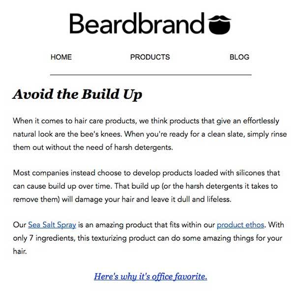
Yep, no CTA buttons to be found, just a few paragraphs of copy. The links tell you what you’re in for. If you were to click the link that says “Sea Salt Spray,” you’d undoubtedly be taken to a product page for the spray.
The “product ethos” link would take to you an about page.
Finally, “here’s why it’s an office favorite” might be a video link or a testimonials page.
If you’re going the text-based call to action route, we don’t recommend you include links like the last one.
You want to clearly spell out where you’re taking the reader if they click your link, just as you would with a button.
The last link is a little ambiguous and can redirect you a few different ways.
11. Create a Sense of FOMO
Fear of missing out or FOMO is a decision that drives consumers’ social lives and buying decisions. It’s a powerful motivator.

This email from retailer Chubbies cultivates FOMO well. It was probably sent the week before Labor Day and encouraged shoppers to enjoy the last little bit of summer in the brand’s apparel before the holiday.
You do have to use your FOMO-wielding powers responsibly. Psychology Today writes that FOMO can lead to negative feelings and a sense of distraction, two emotions you don’t want to associate with your company.
Always give leads and customers the chance to hop aboard your bandwagon before taking an offer away.
12. Get Creative with Your Button Design
The average CTA button is admittedly a little boring-looking, yet jazzing it up too much could hurt conversions. Is there a happy medium? It turns out, there is!
Take a look at this CTA button from the design and web development agency Huemor to see what we mean.
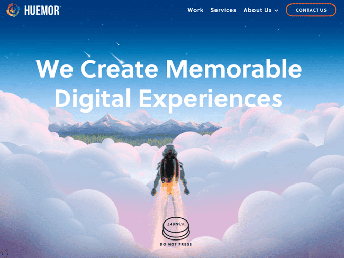
Instead of the standard “click here to learn more” CTA button, they play up what they do with an image of a man launching into space. Their CTA button is appropriately a launch button.
What makes this even more captivating is the warning not to press it. This is reverse psychology in action.
Telling someone not to do something makes them want to do it all the more. Who can resist a call to action button like that?
Conclusion
Your email subscriber count is going up, but there’s more work to do still.
Now, through well-crafted email content with a great call to action, you can nurture the lead relationship and nudge them towards making a purchase.
Any of these 12 tips should help you boost your sales and conversions. We hope you give them a try!
To learn more about email marketing campaign here are a few resources to check out: