Compared to other types of signup forms, landing pages have a 160% higher conversion rate. But how do you design a landing page that can drive the desired result?
A sign of a great landing page would be one that can entice a visitor to take some action on the page.
In this post, we will define different landing page sections, what elements to include, and also study the top landing page examples to get inspired from.
But before that, let’s understand the basic difference between a landing page and a web page.
Table of Contents
What Is a Landing Page?
A landing page is a standalone web page designed to persuade users to undertake certain actions, such as signing up for a form or downloading a resource material.
On the other hand, a web page such as the home page or pricing page is designed for explorations where visitors can browse and learn more about your business.
Generally, a landing page is linked to a marketing campaign, email campaign, social media, or search engine advertising. The purpose of a landing page is to direct visitors towards a single call to action and convert visitors into leads or customers.
This helps convert prospects faster, lowering the cost of acquiring a lead or a sale.
Key Elements of a Successful Landing Page
How do you differentiate a great landing page from a mediocre one? While not all landing pages look the same, a few elements make a landing page more effective than others.
Let me break it down for you.
#1. Headline
For any landing page, having a headline is important. The headline sets the tone for the rest of the content and gives users an idea of what the brand is about.
Thus, your landing page headline should be short, crisp, and instantly grab the reader’s attention. Ideally, the headline should be ten words or under.
Take a cue from PhonePe, an Indian Digital Wallet & Online Payment App that allows you instantly transfer money.
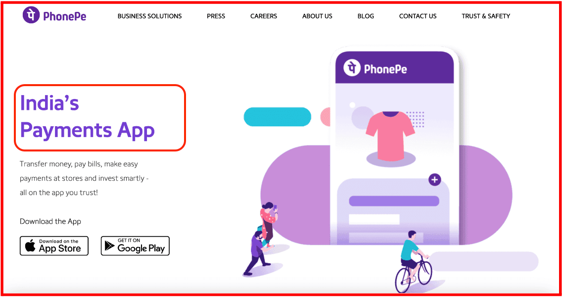
In just three words, the brand has conveyed what it does.
#2. Images or Videos
Another way to entice prospects into subscribing to your brand is by using images or videos on your landing pages. These elements act as a visual representation of what your product or service looks like.
They also save you from writing copious amounts of text and immediately capture the user’s attention.
If you decide to use graphic elements on your landing pages, ensure they are high-quality, large-sized, and relevant to your company.
Read also: The Definitive Landing Page A/B Testing Guide [With Ideas & Case Studies]
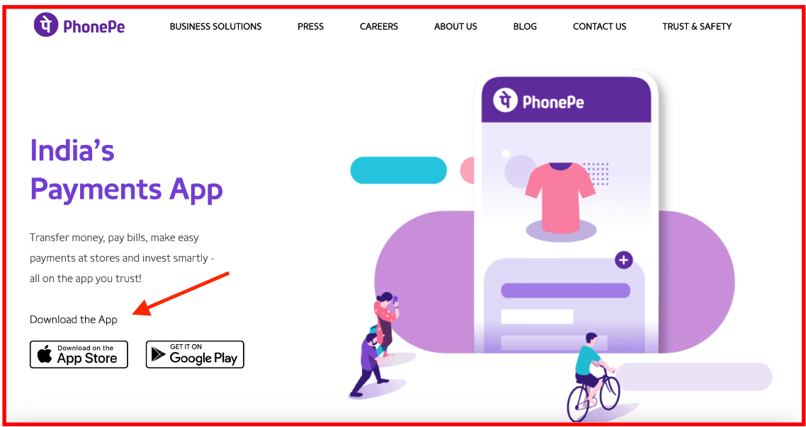
#3. Call to Action
The call to action (CTA) is the most critical element of your landing page.
It persuades visitors to your website to undertake actions such as signing up or subscribing to your brand.
Thus, ensure that the call to action button or tab is located so that the user can find it instantly. It is best to use contrasting colors to make your CTA stand out.
Second, make sure that you do not include multiple CTAs all directed toward different actions. It will only confuse your visitors.
In the same example, PhonePe has only one action, asking its visitors to download the app.
#4. Testimonials
By using social proof, you can further convince prospects about the authenticity of your brand. It also shows that other people have bought the product or service you are promoting and their experience using it.
You can either use videos, awards received from reputed organizations, quotes from customers, or display a count of the number of signups received from clients.
One example from Magic Flask offers a creative take on a customer feedback video. It captures taste testers’ actual reactions to the Magic Flask in real-time.
A video testimonial like that can certainly pique consumers’ interests.
#5. Unique Selling Proposition
To get the maximum conversions, you must convince prospects that your product is the best. This is known as your brand’s USP or unique selling proposition. Your USP defines your brand and what differentiates it from its competitors.
Your landing page can describe your brand’s USP by explaining why your product differs from others and how clients will benefit from it.
Make sure that the USP is not too long and conveys the message clearly.
Here’s how Hiut Denim Co. does it.

It can be tough to stand out if you are a denim manufacturer, given the number of competitors in the market. However, Hiut Denim Co. interestingly uses a winning USP on their landing page: “Do one thing well.”
They simply implied that they make jeans and nothing else so that the consumer can be guaranteed high-quality products.
Read also: 20 Of The Best Product Landing Page Examples Online
7 Awesome Landing Page Examples and Why They Work
So far, we have explored the basics of landing pages and why they are important for your business. In this section, we will take a look at some amazing landing pages, and what makes these landing pages stand out.
#1. Uber

Uber is a US-based transportation conglomerate that lets individuals book taxis or order food using its mobile app.
Uber earns the badge of the best landing page examples because it has managed to cover every aspect of a good landing page in its ‘above the fold’ section itself.
It’s clear from its crisp headline that if you want to become an Uber driver, all you have to do is just sign up.
This landing page by Uber is doing a great job at attracting people to sign up for its cab aggregator services by becoming independent business owners in partnership with the app.
Let’s break down its elements in detail.
What makes the page stand out?
Here is what makes this landing page the best out of the lot:
- Main Headline: The headline at the top is short, crisp, and to the point. Users can quickly understand that the company is looking for drivers for its cab aggregator services.
- Provides Value: With the brief description below the main headline, Uber can easily convince people to join the organization. It mentions how flexible Uber is for drivers, so they can earn on their own schedule.
- Large Visuals: Uber’s landing page has a high-quality image of a woman driving a car. Moreover, the image is large-sized and covers almost half the landing page, ensuring that visitors get that visual appeal as soon as they land on the page.
- CTA: The sign-up button makes it simple and quick for users to sign up and become part of Uber’s large team of cab drivers. People don’t have to scroll down to the end of the page or look anywhere else to sign up.
#2. Conversion Lab

Conversion Lab is an eCommerce brand that helps businesses optimize their landing pages using SEO-friendly practices and A/B testing.
Here, the website’s home page also acts as the landing page. It is minimalistic, without too much text or images, and clearly conveys the company’s goals.
Further, they have smartly focused on one CTA on the entire page – ‘Get my free consult.’
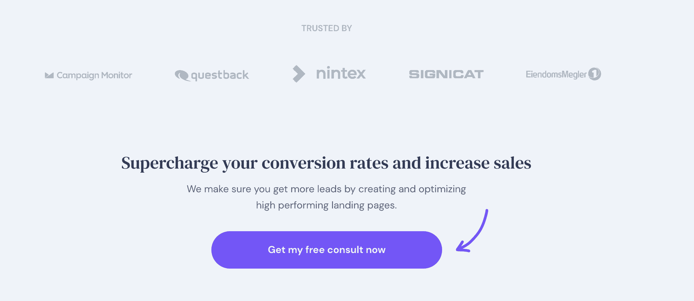
What makes the page stand out?
Here are a few elements that make Conversion Lab’s landing page successful:
- Main Headline: The headline of the landing page clearly conveys the benefit of using their service. Besides, the one-line description after that makes it clear what the company is all about, the services it provides, and how it provides value to its clients.
- CTA: The call to action button is located right at the center of the landing page and states what users can get by signing up. The mention of the term ‘free’ makes it even more compelling for users to check out Conversion Lab’s services.
- Data: If you scroll down the page, you will see a few statistics. The mention of statistics such as ‘+36% in the last 6 months’ and ‘-24% in the last 6 months’ reinforces the idea that the brand is authentic and has benefitted clients in the past.
- Sign-Up Window: Once you click on the CTA button, a sign-up form appears, asking you to provide your contact details and request a callback. Rather than opening a new tab or window, the sign-up form appears on the home screen, making it convenient to register.
- Client Testimonials: When the sign-up window opens, you can also see customer reviews in the left-hand corner. Using images of clients and their experience with the brand makes the landing page even more persuasive and boosts lead generation.