
How often have you visited a webpage and were greeted with a series of images, videos, and a creative headline? These are common elements of a product landing page – used to attract visitors and convert them into loyal customers.
Similar to a landing page, a product landing page typically consists of conversion-centric elements such as a headline in bold font, social proof, and high-quality graphics that include images, videos, GIFs, and call-to-action (CTA) buttons to improve conversion optimization.
Product landing pages help companies sell their goods and services and are mostly visited through other platforms, like YouTube, emails, Facebook ads, social media posts, or any other medium the potential customer frequents.
In this blog post, we’ve curated some of the best product landing page examples that can inspire you if you’re just getting started.
Table of Contents
25 Examples of Product Landing Pages That Convert
Our list of product landing page examples has no order or ranking.
Just go through them all and let us know which ones you liked best.
1. Blue Apron
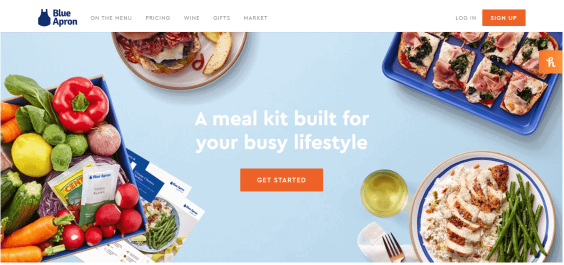
Blue Apron is a US-based ingredient-and-recipe meal kit company that is based out of New York City.
It beautifully captures a visitor’s attention with this cool graphic of food items on its product landing page.
The bold headline, ‘A meal kit built for your busy lifestyle’ is good enough to capture the user’s attention and convey what the brand is about.
The ‘Get Started’ tab below the headline is the CTA button that directs you to Blue Apron’s sign-up window, where you pick and choose meals for yourself.
Upon scrolling down, the website briefly explains what Blue Apron does and what you can expect to find in your meal box. The landing page has another CTA button that helps you select a meal plan.
2. Dollar Shave Club
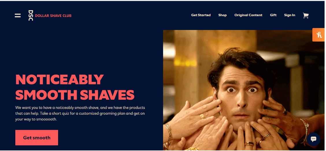
Dollar Shave Company is an American skincare company that sells razors and personal grooming products.
The brand’s product landing page is an excellent example of how to attract customers. The headline ‘Noticeably Smooth Shaves’ clearly highlights what you can expect from the brand.
What’s more, the brief description below the headline mentions how the Dollar Shave Club promises its patrons a smooth shave, along with a customized grooming plan.
Once you scroll down the homepage, you can find more about the various products offered by the Dollar Shave Club, its starter set for first-time customers, and the benefits that clients will receive upon signing up for the brand.
You can also find a customer testimonial at the bottom of the page, followed by a couple of sentences describing Dollar Shave Club and its products.
Your key takeaway from this product landing page example can be the multiple CTA buttons complemented by high-quality images.
In skincare, it is important for website visitors to know exactly what the brand sells. Dollar Shave Club’s landing page shows exactly what its customers can expect.
3. Minwax
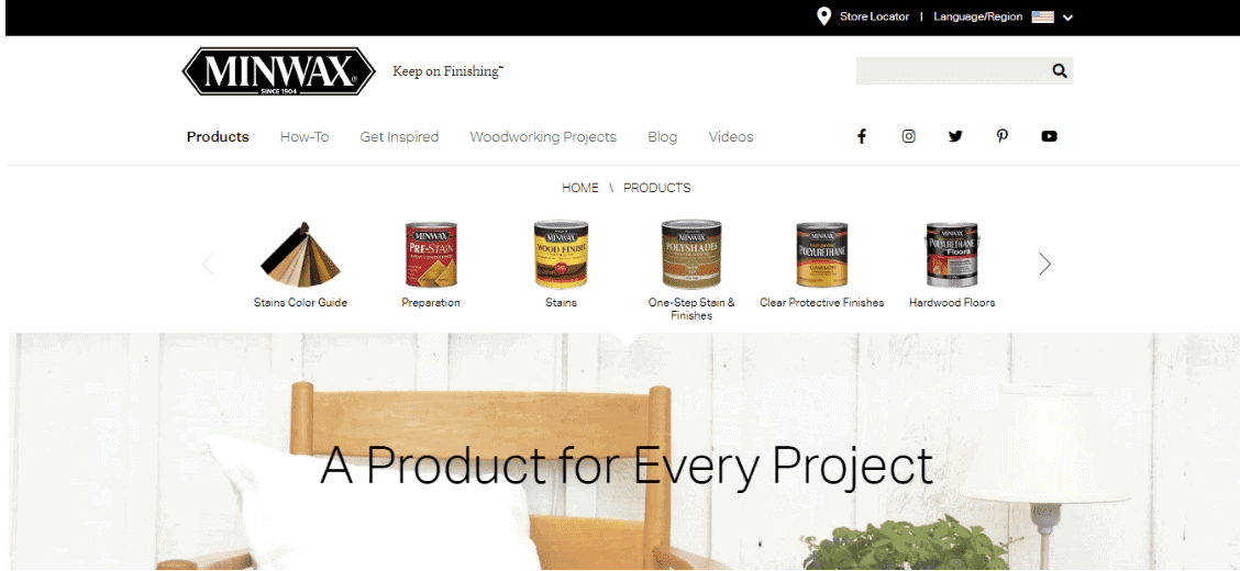
Minwax is a US-based company that specializes in the production of wooden products and architectural coatings.
The product landing page displays right on the top what Minwax sells, followed by a big bold headline that says ‘A Product for Every Project’.
When you scroll down, you can find the wide range of products that Minwax sells, accompanied by images. These images are clickable, helping you find more information about each product sold by Minwax.
You can also check out the various services offered by the brand. There’s also a product personalization section for your project.
Your takeaway from this example can be how detailed a product landing page can be, making it super easy for potential customers to understand your brand’s products and services.
Read more: What is a Splash Page?
4. Duolingo
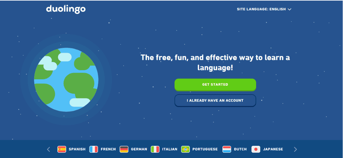
Duolingo is a popular American language-learning website and mobile app. It helps users learn various languages in a fun, conversational manner, backed by a range of exercises and tests.
Its product page captures the audience’s attention so well with the slogan – ‘The free, fun, and effective way to learn a language.’ Besides, the use of the Earth’s image on the left nicely conveys that users can learn languages from around the world.
It smartly displays the list of languages that one can learn, followed by a section on why you should choose to learn with Duolingo.
And if you are interested, you can easily download its iOS and Android app or buy any product on offer, such as Duolingo Plus and Duolingo for Schools.
5. Shutterstock
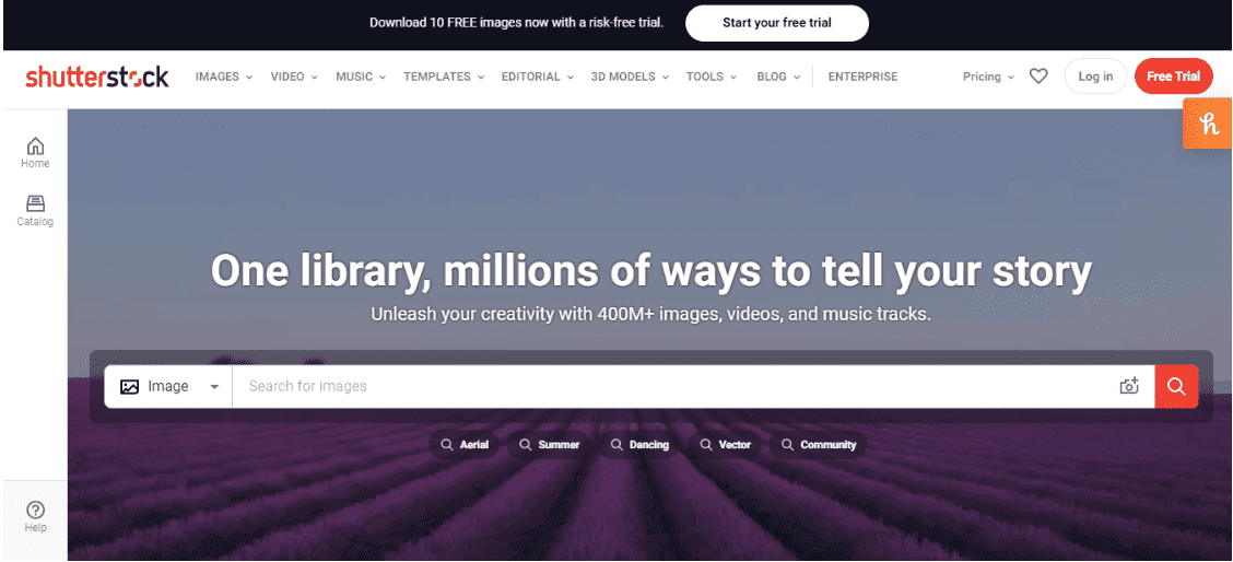
Shutterstock is a website that provides a range of images, videos, stock footage, stock music, and editing tools. Its product landing page greets users with a headline that conveys what Shutterstock is about, along with the number of images, videos, and music tracks on offer.
Another reason why Shutterstock’s product landing page design is appealing is that it uses a collection of high-quality background images. The background images keep changing and show users what they can expect from Shutterstock.
Below the search bar, there are a couple of popular search phrases to help users get started.
You can also search for graphics by clicking on the respective categories while scrolling down the page.
What’s more, users can also find popular and handpicked visuals across different categories, as well as related articles on how you can create high-quality graphics.
Read more: Real Estate Landing Pages: 8 Beautiful Examples
6. Thinx
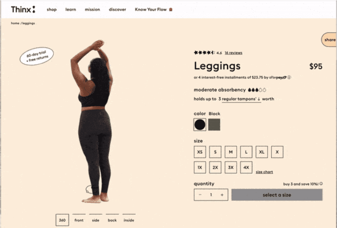
Thinx is a New York-based company that specializes in feminine hygiene products. The brand sells undergarments and leggings catered to women, specially designed to be worn during menstruation.
The company’s product landing page provides a 360-degree view of what a garment looks like from all angles.
Visitors can choose from a range of sizes, and clicking on a size reveals its price.
You can also take a look at the customer reviews before placing an order. The best part, however, is that Thinx explains how absorbent a particular product is based on the menstrual products used by its customers.
7. SNOOZ
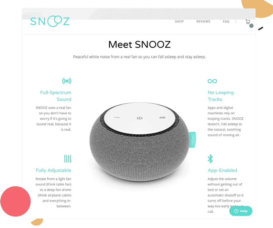
SNOOZ is a brand that sells white-noise machines. Since the company specializes in electrical appliances, there is a detailed description of the features of the white noise machine on its product landing page.
The landing page also has a large product image of the white noise machine right at the center, helping visitors understand what the appliance looks like.
The image is surrounded by text on both sides, which clearly explains what you can expect from the product, including its benefits.
What’s more, below the headline that says ‘Meet SNOOZ’ there is a line stating ‘Peaceful white noise from a real fan so you can fall asleep and stay asleep.’
The line quickly conveys to the visitor what SNOOZ sells and how its product will help them.
Read more: Demystifying Squeeze Pages: 8 Best Practices to Generate Maximum Leads
8. Gather
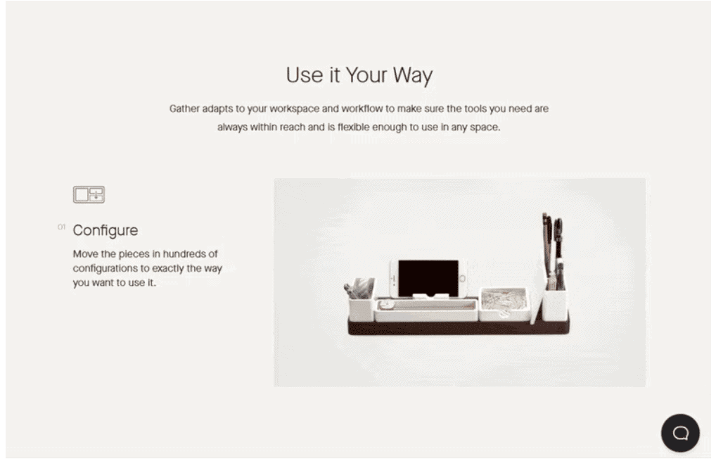
Gather is an e-commerce website that helps you organize your space. It helps you store your belongings in such a way that they are always within your reach and can be adjusted into any space.
Gather’s website is an excellent example of what a product landing page should look like.
The page consists of a range of videos and GIFs demonstrating how the company helps you re-organize your tools irrespective of how much space you have.
As you scroll down the page, you can find various demos of how you can organize your space, followed by a couple of customer testimonials and a related article on how to create a minimalist workspace.
Read more: Create A Buzz With Your Coming Soon Page: Inspiring Examples And Tips
9. Bellroy
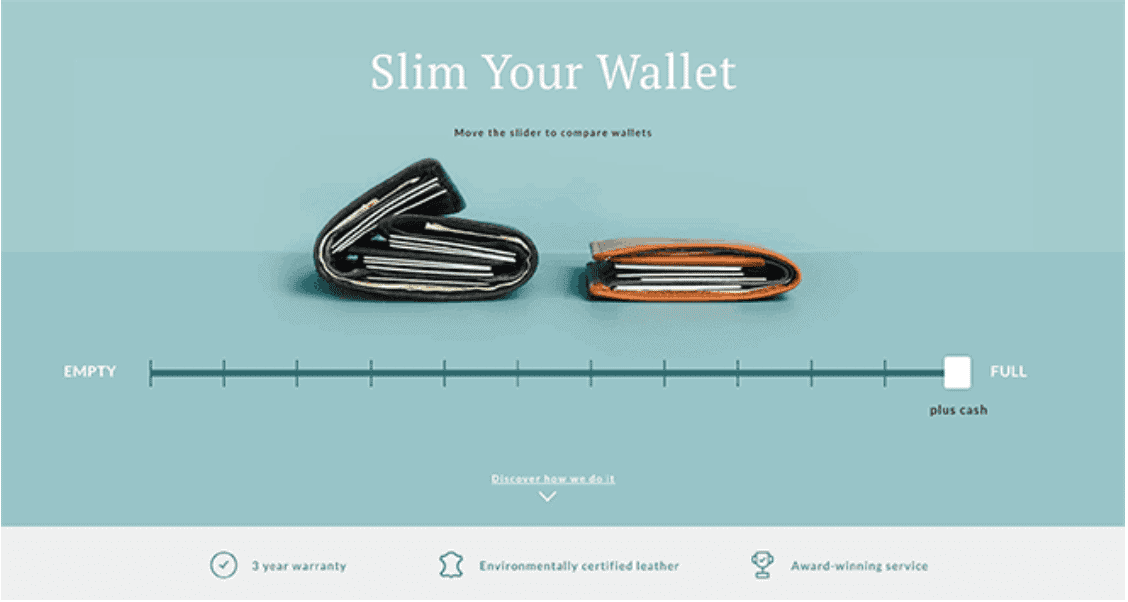
Bellroy is a company that sells wallets, cardholders, keyholders, bags, phone cases, wristwatch bands, and earphone cases. Its product landing page shows how its patrons have benefitted from buying its products.
The product landing page displays the headline ‘Slim Your Wallet’, implying that no matter how much cash, cards, and other items you wish to keep, Bellroy’s products will ensure that your pockets are never heavy.
You can use the slider to compare the size of a Bellroy wallet versus that of another brand, as you keep adding things to it.
In addition, you can find videos on how Bellroy’s products will be beneficial for you, along with multiple CTA buttons that direct you to the products sold by the brand.
Read more: 10 Ways to Sync Email Marketing and Landing Pages
10. Orangina
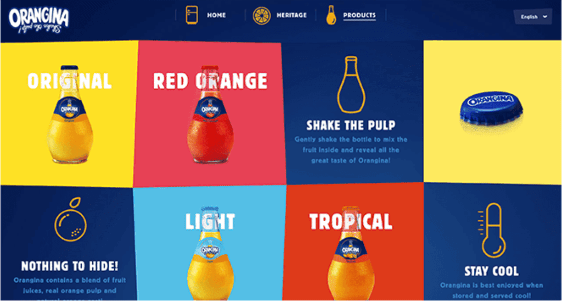
Orangina is a beverage brand that specializes in carbonated drinks.
Orangina’s product landing page shows the various flavors sold by the brand, displayed as a series of interactive and engaging visuals in a grid-like form.
What’s interesting about Orangina’s website is that as you move your cursor on each image, a clear CTA button appears along with a short animation.
The grid also includes a brief description of why you should try Orangina’s beverages, how to drink them, and the ingredients used in the making of these drinks.
11. Aurate
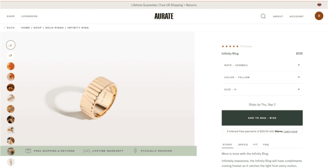
Aurate is a New York-based fine jewelry brand that sells necklaces, rings, and a variety of other ornaments. The brand is known to make jewelry using recycled gold and diamonds that are sourced ethically.
Once you select a product to buy from Aurate, you are directed to its landing page to place an order. The product landing page provides a detailed description of all the features of the jewelry you are interested in, such as the size, fit, color, and rate.
In addition, each piece of jewelry has its own story and an FAQ section that explains common queries customers have, including delivery and returns.
Further, the product landing page includes a range of images that show what their products look like when worn, followed by customer testimonials and a video showing how they were made.
12. Metvrse Engine
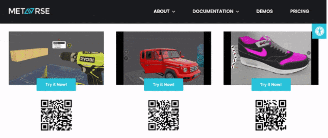
Metavrse Engine is a virtual reality (VR) consultancy and product developer that specializes in VR insights as well as VR and 3D tools to help businesses better serve customers with their goods and services.
Metavrse Engine’s website is the perfect product landing page template for those who want to demonstrate how their products work without using text.
Visitors can choose to either scan the QR codes below each image or simply place their cursor on each image to see the animation video.
Each product also has its own CTA tab that takes you to an interactive 3D product view of the product to show you how the product looks and works.
Read more: 14 Stunning eCommerce Landing Page Examples
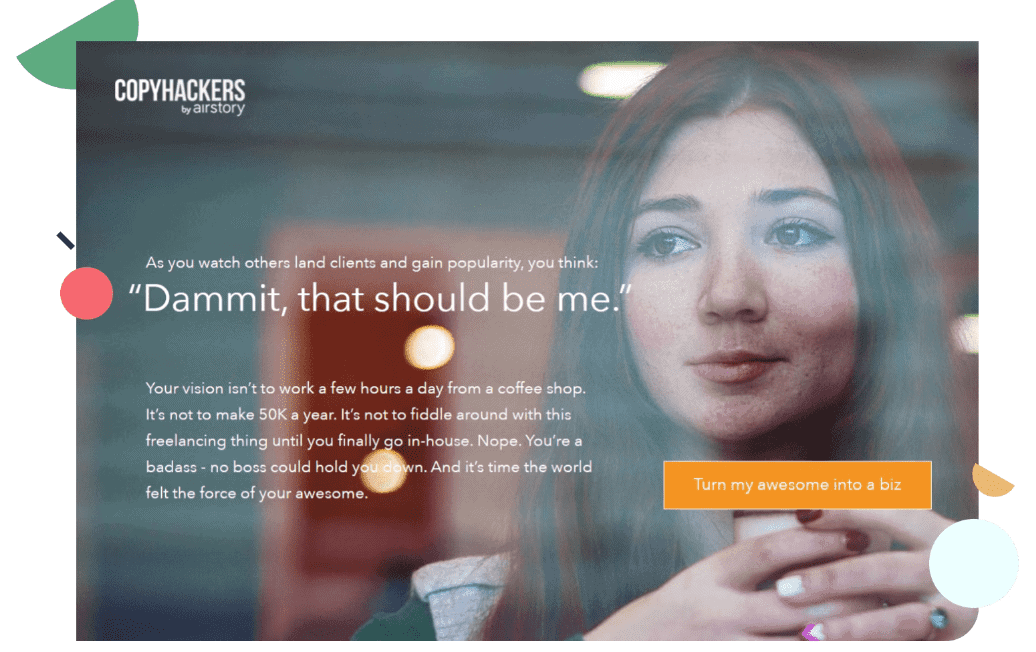
13. CopyHackers
 CopyHackers is a website that provides digital marketing and copywriting services. One of its main products has been its copywriting course.
The example shown here is that of CopyHacker’s copywriting course.
The product landing page does not display any large or catchy headings. Instead, it touches upon struggles that are common among freelance writers and thoughts they may often have about their career.
The webpage sends a message to freelancers about what they should be doing to change things and how CopyHackers can solve their problems. They even have several event landing pages that show several upcoming webinars and workshops.
The CTA tab on the right that says ‘Turn my awesome into a biz’ directs visitors to the CopyHacker’s course website, from where they can sign up or register for the copywriting course.
14. Absurd Design
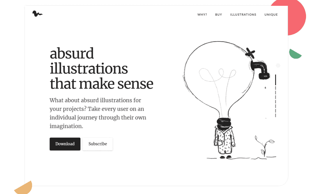
Absurd Designs is an eCommerce website that specializes in the creation and sale of unique illustrations for your website and product landing page.
The website does a great job at demonstrating what Absurd Design sells, with a simple black and white color scheme and minimal text.
Upon scrolling down the product page, you can see why Absurd Designs wants you to use its services. It explains clearly why black color is the new way to express emotions and shows previews of previous projects undertaken by the brand.
The product landing page also explains how the illustrations are created, and touches upon different membership plans. It has a CTA button asking users to subscribe to its newsletter.
15. Cowboy 4
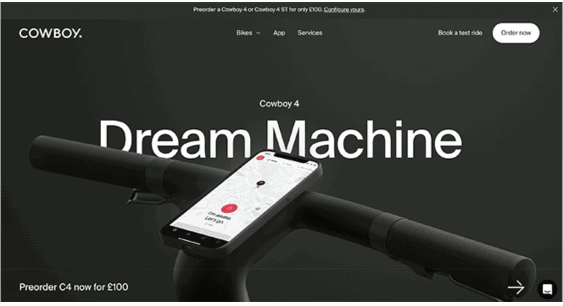
Cowboy 4 is a company that produces and sells electric bikes across the world.
The product landing page for one of its bikes shows an animation of how the bike works, followed by a step-by-step guide to its different parts and how you can benefit from it.
This product landing page also includes brief descriptions as you scroll down the page, detailing what you can expect from your bike and the importance of each part of the bike.
What’s more, you can find multiple CTA buttons around the page. These CTAs help you place an order and see the estimated date of delivery.
Read more: Ultimate Insights For High-Converting Lead Capture Landing Pages
16. Reel
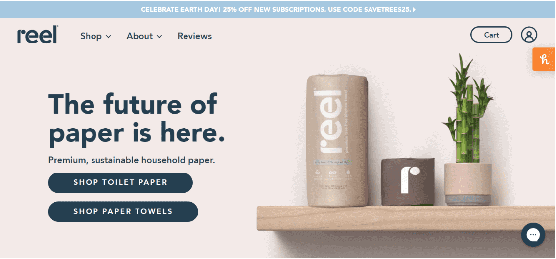
Reel is an e-commerce retailer that specializes in the manufacturing of sustainable household paper. The brand produces toilet paper and paper towels that are made from 100% bamboo.
Once you reach Reel’s product landing page, it welcomes you with a bold headline followed by a line that clearly explains the product’s USP.
You can see that the main text on the landing page conveys what Reel is about, what problem it is trying to solve, and what products it sells.
The image of a Reel household paper roll alongside a bamboo plant is attractive; it is also clever brand positioning.
The landing page explains in detail the problem with paper, and why bamboo is better used to make household paper. This is followed by an explanation of Reel’s products, and how consumers can benefit from them.
There are also multiple CTA buttons all over the page that direct you to place an order right away.
17. Oura Ring
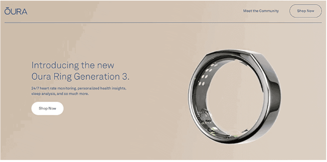
Oura Ring is a brand that sells rings that help keep track of your heartbeat, body temperature, and sleeping patterns. Its product landing page shows how you can capture visitors’ attention with minimal text.
With just a glance, you can see that Oura Ring’s landing page has a lot of room. There is only one large image of its product, along with the name of the brand and a brief description of the product.
However, the two sentences that describe the features of the product are enough to make users understand what Oura Ring is selling.
The description also explains the benefits that come with the product. It is followed by a CTA button that leads you to a billing page.
18. Apple AirPods Max
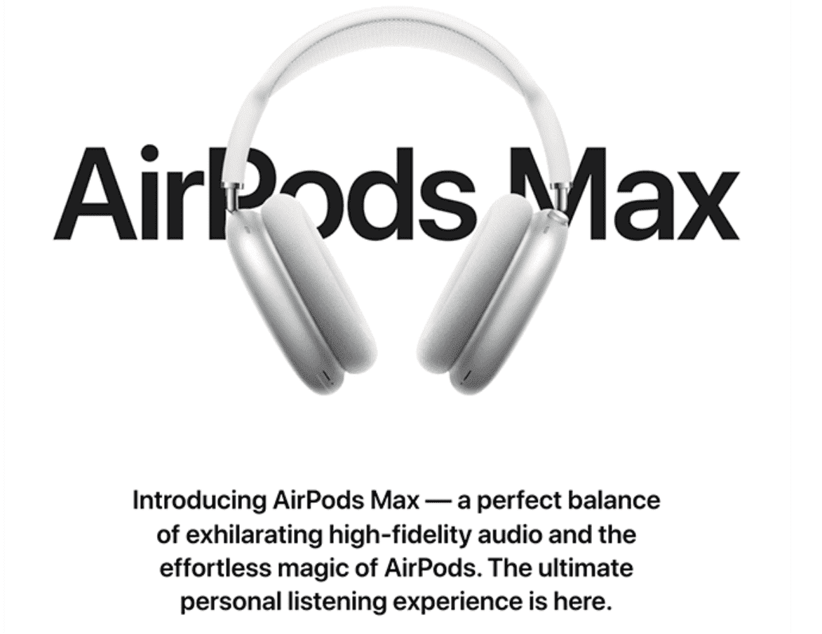
Another excellent example of how you can convince your visitors to buy your product is Apple’s AirPods Max landing page.
This product landing page makes use of minimal text and chooses to display a life-size image of the AirPods Max.
It helps capture the attention of potential customers because it gives them a good idea of what the headphones look like.
The text briefly explains why you should purchase the AirPods Max and how it will give you a worthwhile audio experience.
On scrolling down further, you will find animations that display the product from multiple angles. You can also zoom in and out to see every element of the headphones.
These animations are accompanied by text that explains the materials involved in the making of the AirPods Max, their benefits, the different parts of the headphones, how you can use them with your iPhone, and what sets them apart from the other Apple products.
Read more: The Definitive Landing Page A/B Testing Guide
19. Mailbrew
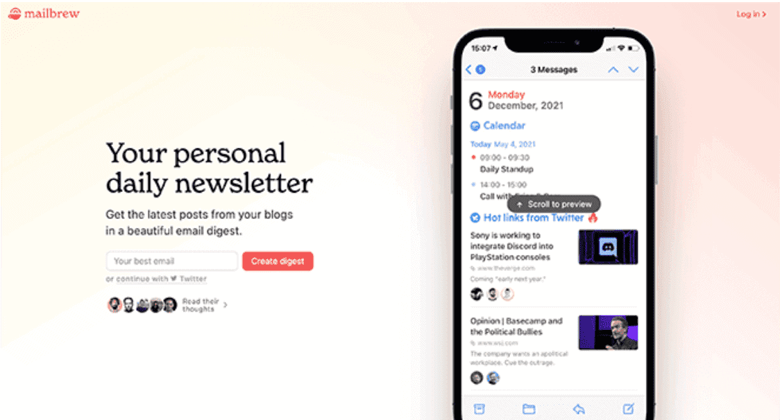
Mailbrew is a website that delivers personalized daily newsletters to your inbox.
Its product landing pages show how you can receive the latest posts from blogs and other sources in the form of an email digest daily.
The picture of a smartphone screen showing an email from Mailbrew clearly demonstrates what a customer’s inbox would look like if they subscribed to it.
The headline ‘Your personal daily newsletter’ quickly conveys what the website is about and the service it offers.
Moreover, there is more than one CTA button to help you sign up for Mailbrew’s newsletter.
Customers can choose to either provide their email address or register using their Twitter handle.
When you further scroll down Mailbrew’s landing page, you can also see how and where to save your favorite blogs and news articles, followed by social proof in the form of tweets from various subscribers.
20. Astraflow
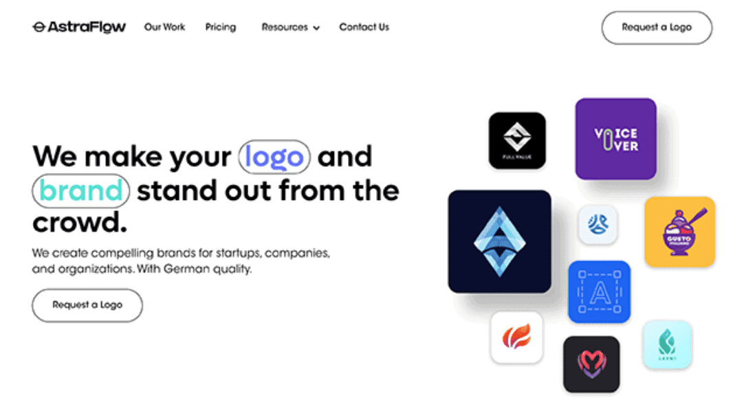
Astraflow is a company that provides branding and logo designing services.
Their B2B landing page website makes use of minimal text and relies on high-quality images of logos to show the work that they have done.
One of the most unique aspects of its product landing page is that it highlights the words ‘logo’ and ‘brand’ to convey the services it offers and specializes in.
You can also see two CTA buttons saying ‘Request a Logo’ without the need to scroll down the page.
Once you move down Astraflow’s webpage, the company tries to convince you to avail of its services by listing down its benefits such as fast delivery and smooth collaboration, followed by a few lines on the creative process involved in building logos.
However, the best part is that the product landing page consists of an FAQ section at the end, helping address any queries or doubts that visitors may have about Astraflow and its services.
Read also: Top Website Header Examples to Inspire Your Design
21. Ali Abdaal’s Feel Good Productivity
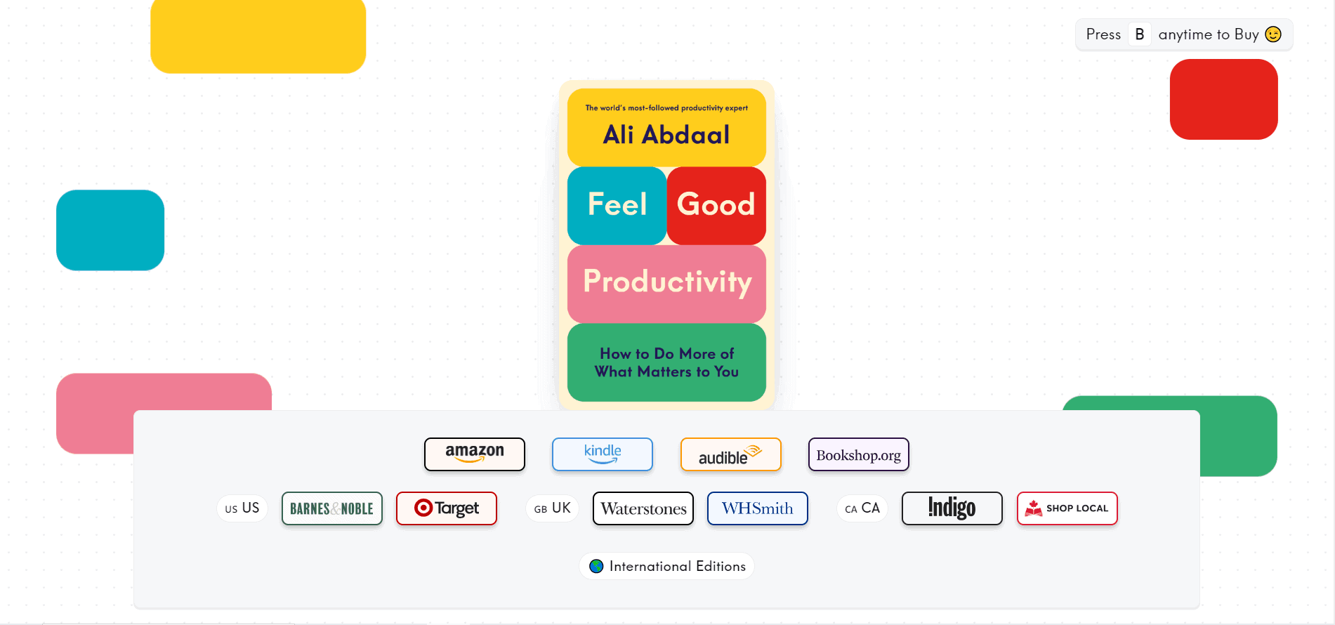
Ali Abdaal is a well-known YouTuber and productivity guru. His latest book, “Feel Good Productivity,” where he teaches you how to make productivity enjoyable, offers a fresh take in the world of hustle culture.
The product landing page features colorful blocks from the book cover that playfully come together as you scroll to recreate the cover design.
Below the book image, you’ll find the various retailers that sell the book along with an option to check out the international editions. But what steals the show is the “Press B to anytime to Buy 😉” CTA. It’s a unique and refreshing take on CTA that takes you to the Amazon page.
Abdaal’s product landing page does everything else right, too. As you scroll further down, you’ll find a blurb of the book, a YouTube video where he talks about what the book will teach you, social proof, and an about the author section. It doesn’t get better than this …
22. Dr. Squatch
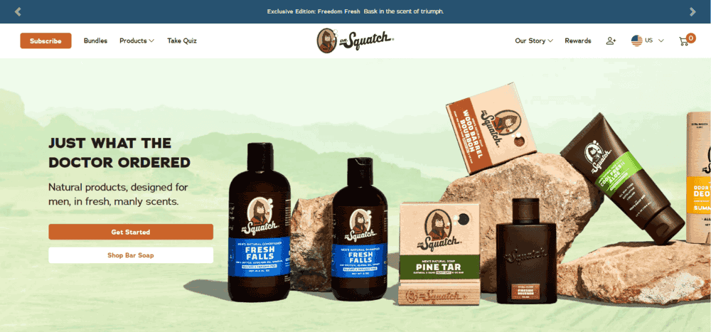
Dr. Squatch is a brand that sells natural grooming products for men. The product presentation is masterfully done. The green backdrop with Dr. Squatch’s products lined with rocks gives a rugged feel. Plus, the headline, “Just What the Doctor Ordered,” reinforces the brand’s promise of selling natural products.
There are clear CTAs to get started or directly shop their bar soap. They neatly list out all their offerings, share their brand story, offer rewards, and even product quizzes!
As you scroll further down, you’ll find short video reviews from satisfied customers, along with ingredients and trust indicators from various reputable magazines such as Men’s Journal and GQ.
23. Goby
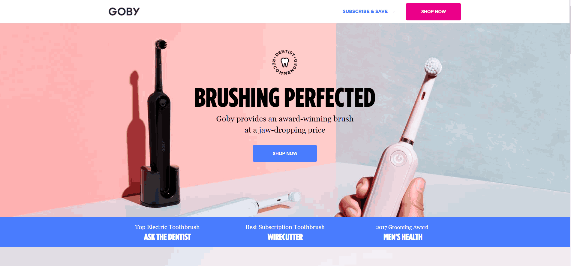
Goby is an award-winning electric toothbrush brand. The top fold of the product landing page provides you with just the essentials: the product images, a crisp headline, social proof, and a shop now button.
As you scroll down, you’ll find a breakdown of the product features, customer reviews, and user-generated content from Instagram with the hashtag #Gobygram.
Another standout feature of Goby’s landing page is that they have included a section on their social responsibility where they talk about their partnership with NYU College of Dentistry’s Global Student Outreach Program, through which they donate a percentage of their sales to provide dental services around the world.
Read also: Awesome New Year Landing Pages and What To Learn From Them
24. Onewheel’s GT S-Series
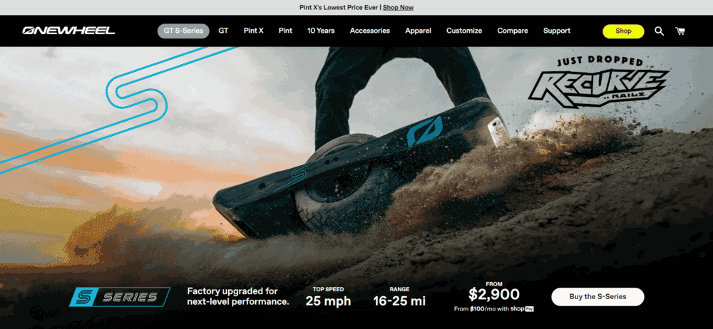
The landing page Onewheel’s electric self-balancing boards knows how to catch eyes. The top fold gives you all the necessary information at a glance, along with a cool product image of someone using the Onewheel on a sandy terrain.
They also include a thrilling video of someone riding the board off-road. But what’s most interesting is how they share their product’s technical features with interactive visuals that show the inner workings of this fantastic product.
Onewheel also shares several close-ups of the product also with customer testimonials from individuals that create more trust in the product.
25. TALA mango snacks

Tala wastes no time. The delicious, guilt-free dried mango snack has zero added sugar and they proudly boast, “ingredients: Mango.”
The bright yellow color of the packaging deliciously stands out against the black backdrop, and the product features are declared in large and bold, giving you confidence in the product.
With clear options to choose between different quantities (3, 5, 10 bags) and a straightforward “ADD TO CART” button, the purchasing process is smooth and easy. Tala is a premium product for health-conscious people, and it advertises itself just as that.
Read also: How to Build a Dropshipping Brand That Clicks
Design Wise: The Key Elements of Product Landing Pages
Now that you have seen the best product landing page examples let’s discuss various elements you need to include in a product landing page for a high conversion rate.
1. Have a bold, problem-focused headline
Whenever someone visits your webpage, the first thing they would notice is the headline.
Hence, you must keep your headline short and crisp yet catchy. Moreover, it should be in bold, with a large font, and directly address your users.
If your headline is too long or vague, there is a high probability that visitors will exit your page at once.
2. Describe the benefits of your product
Once you have got the attention of your visitors, mention why they need to buy your product.
While it is important to include a product description and how to use it, it is also essential to mention why your product is the best.
You should mention the advantages that your product has, why it is better than your competitors, and how consumers would benefit.
3. Use only high-quality graphics
On average, humans tend to respond to visual data 60,000 times faster than text.
Thus, it is crucial to include some high-quality images on your product landing page. Also, ensure that you are using the right color scheme, which appeals to your potential customers but does not distract them from your product.
Prospective customers want to see what your product looks like and how to use it. Graphics are particularly beneficial if you have an online store since people cannot get their hands on the physical product till they purchase it.
Moreover, long forms of text can actually dissuade visitors from buying your product, causing them to exit the website.
4. Add customer reviews and testimonials
Another important campaign strategy is to include social proof on your product landing page. Social proof consists of customer reviews and testimonials of your brand. You can either choose to mention quotes from your clients, videos, or both.
Even if your product has not been launched yet, you can provide early access to social media influencers, friends, and colleagues and ask them to review it.
This will build credibility around your brand, convincing visitors that your website and company are genuine.
5. Work hard on your call to action (CTA)
After you have convinced your visitors to make a purchase, it is time to take action. This is where the CTA buttons come in.
A CTA is a link to all the information that a potential buyer needs to place an order. It does not just include the price but also information like product variations, estimated delivery time, date of arrival, payment methods, and so on.
Ideally, you should include multiple CTA buttons on your product landing page.
If you have more than one product, each should have its own CTA button.
These CTA tabs should direct visitors to the product itself.
Text on the CTAs and any popups that come with them should have information like product details, delivery estimate, price, answers to frequently asked questions, and so on.
6. Lead generation form
A key aspect of a good product landing page is the lead generation form. A lead generation form helps your brand capture a large number of prospective clients. You can then send them discounts and promotional offers and keep them updated about any newly launched products or services.
Moreover, you can also use the lead generation form to inform your prospects about any sale days, such as Black Friday sales.
Thus, even if a prospect does not make a purchase right now, they may be convinced to do so at a later date.
The lead generation form should be short and simple. It should only ask for basic information such as the customer’s name, email address, and phone number.
7. Mobile friendly
Today, an increasing number of people prefer to browse on a mobile device than on a desktop or laptop. Hence, you should ensure that your product landing page is mobile-friendly.
The webpage should be designed and optimized in such a way that it is responsive to smartphones.
The product landing page should consist of the optimum font size and graphics so that customers don’t have to spend a lot of time adjusting the screen size.
Moreover, they should be able to access all parts of your website, including any sign-up links.
Read also: 12 Great Landing Page Optimization Practices
Best Practices: How to Create Your Own Product Landing Page
Here are some of the best practices to keep in mind while building a product landing page.
1. Create anticipation and trust
Once someone has arrived on your product landing page, how do you create a sense of excitement about your product?
Since the first element of any product landing page is its headline, it is important to make sure that it gives your visitors the right idea about your brand.
The headline must mention the problem users are facing, and how your product will solve it. It can also include the benefits of your product.
This builds trust and anticipation around your brand, prompting customers to make a purchase.
2. Mention the features of your product
A key feature of a good product landing page is making a mention of all the features of your product.
While showcasing your product’s features does not imply explaining everything in detail, you should have some text about what the product is and how it can benefit your customers.
In the absence of product features, visitors may not understand why they should buy your product, making them exit your webpage.
3. Shows visitors what they want
Since visitors cannot see a physical version of your product, it is crucial that you show them what they want to see.
Your product landing page should include all the necessary product features, a clear value proposition, and an option for a demo of how to use it.
These things can be explained through text, images, gifs, graphics, animations, and videos.
4. Include positive customer reviews
To further convince visitors about the quality and credibility of your product, mention a few positive customer testimonials on the product landing page.
The social proof can be in the form of quotes from your clients or a few videos, mentioning why your product is good and how the customers have solved their problems from it.
5. Create personalized product landing pages for each segment
If you are selling more than one product, it is best to create personalized landing pages for each product.
By having personalized product landing pages, you can explain the features of every product in detail without crowding a single landing page or missing out on important information.
Without landing page personalization, you will deliver an incomplete user experience. This can keep your website visitors from converting.
Conclusion
Product landing pages save you from leaving revenue on the table by helping visitors convert.
The sole purpose of a product landing page is to convince people to make a purchase by explaining everything about your brand and why they should buy from you.
With a good product landing page, you can get high conversions, increase your customer base, and improve your brand reputation.
And if you want to use the world’s most affordable landing page builder, just sign up for a free account with EngageBay.
👉Get inspired by the best sales page examples to create high-converting pages – explore our comprehensive guide now! 🌟
Content updated for freshness and SEO by Swastik Sahu.