
Would you be more likely to click on a call-to-action that said ‘Click here,’ or does ‘Unlock your free guide’ sound better? Most people would probably go for Option 2.
The reason is that it offers something specific and tangible. In marketing speak, these call-to-action phrases can trigger the buying impulse where a bland, uninspiring ‘Click here’ might fall flat.
Unfortunately, CTA wording doesn’t always receive as much attention as the headline, hero image, and body copy. Then there’s the design and placement aspect you need to get right.
After all, it plays a crucial role in ‘stopping the scroll’ and getting your desired clicks and sales.
Need proof?
Research shows that:
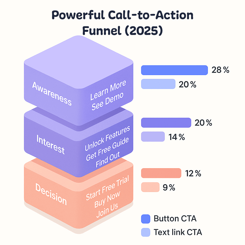
- A descriptive CTA can increase conversion rates by up to 60%
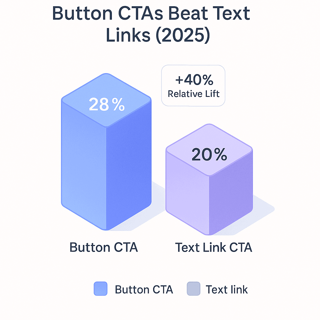
- Button-based CTAs increase engagement by 28%
EngageBay’s July 2025 roundup of 50 power-words-packed CTAs spans every funnel stage, from “learn more” top-of-funnel nudges to urgency-laden purchase buttons.
After filtering for phrases that balance clarity, value, and low friction across most B2B and B2C contexts, these five consistently surface as conversion winners:
TL;DR — Quick picks: 5 evergreen CTA phrases
-
Get Started for Free
-
Start Your Free Trial
-
Claim Your Discount
-
Download Your Guide
-
Unlock Exclusive Offer
If you’re a small business owner who wants to learn how to refresh underperforming CTAs and make them stand out to your target audience, this article is for you.
In this blog, we’re going to look at:
- 50 powerful call-to-action phrases
- What does a strong CTA need?
- Types of call-to-action phrases for different channels
- Call-to-action phrases by industry
- How to make your call-to-action stand out
Let’s get started.
Table of Contents
What Are Call-to-Action Phrases?
Think of CTA phrases as more persuasive CTAs that tell you what to do and what you’d get from doing it. They ‘sell the benefits’ to motivate the reader, increasing the odds of click-through.
More often than not, CTA phrases are longer–five to seven words in length–compared to direct CTAs. They make use of adjectives to help visualize the outcome.
For example, ‘Explore our products’ instead of ‘Click here.’
If the offer is unclear from the subject line or body copy, readers may not want to ‘read more.’ CTA phrases help remove this friction by explaining what will happen when the reader clicks it.
Adding a USP to your CTA can help differentiate your brand from others and build social proof. For example, award-winning design firm.
50 Powerful Call to Action Phrases (By Funnel Stage)
What have we here?
To help you pick the best CTA without breaking a sweat, we’ve handpicked and categorized the CTAs for various scenarios, needs, and stages.
Dive in!
1. Stage-specific CTAs to guide your buyers through the funnel
Every business, regardless of industry, has a buyer funnel that includes the awareness, lead generation, and purchase stages. Here are some powerful CTAs tailored to each stage of the buyer’s journey.
|
Learn More & Product Exploration CTAs |
Lead Generation & Sign-Up CTAs |
Purchase & Conversion-Focused CTAs |
| Perfect for users who need more information before making a decision. | Ideal for capturing leads and encouraging sign-ups. | These CTAs aim to drive purchases or other conversions directly. |
|
|
|
Infographic mapping powerful call to action phrases to each funnel stage.
2. Psychology-driven CTAs to drive buyer action
Psychology plays a key role in influencing a buyer’s purchase decision. CTAs that spark curiosity or evoke emotional appeal can make a significant difference.
Marketers often create urgency or FOMO, while adding a personal touch, to maximize their impact. Here are some powerful CTAs to help you achieve just that:
|
Curiosity-Driven CTAs |
Emotional Appeal CTAs |
Personalization & Customization CTAs |
| Encourages users’ curiosity to discover more by offering something interesting or mysterious. | Connect with your audience on a deeper level by evoking excitement, exclusivity, or a sense of belonging. | Make your audience feel seen and valued by addressing them directly or customizing their experience. |
|
|
|
Comparison chart showing higher click-through rates for button CTAs
3. Trust-building CTAs to establish credibility and confidence
In today’s highly competitive market, standing out requires more than just great products or services — it’s about building credibility.
Businesses reinforce their reputation by showcasing trust badges, certifications, awards, and customer ratings, much like Romexterra Restoration does to demonstrate its commitment to quality and professionalism.
The key to doing this is by establishing trust and showcasing your expertise or authority, allowing your customers to feel confident in choosing you. Here are some powerful CTAs that can help you with that:
|
Trust & Credibility-Building CTAs |
Authority & Expertise CTAs |
Social Proof and Testimonials CTAs |
| Instill trust by offering assurance of quality, satisfaction, or positive results. | Emphasize your brand authority, expertise, or quality to encourage user confidence in their decision. | Leveraging the experiences of others, these CTAs help build trust by showcasing positive feedback from users or clients. |
|
|
|
4. Engagement and value-building high-converting buttons
This category encompasses CTAs that encourage interaction, provide value, and offer support — all of which are essential for building strong connections with users and fostering trust.
These CTAs invite users to explore, connect, and find assistance, enhancing their experience with the brand.
|
Engagement & Interaction CTAs |
Download & Resource Access CTAs |
Support & Assistance CTAs |
| Prompts users to interact or share their feedback, creating an active relationship with the brand. | Encourages users to download valuable resources or tools. | Ideal for customer service or product support, promoting a more user-friendly experience. |
|
|
|
5. Industry-specific CTAs for maximum impact
These powerful CTA phrases are tailored to resonate with particular industries, using language and actions that align with specific customer needs and expectations within those sectors. Here are some CTA examples by industry:
|
Skincare & Beauty |
Health & Wellness |
Hospitality & Travel |
|
|
|
|
Education & E-learning |
Financial Services |
SaaS & Tech |
|
|
|
What Does a Strong Call-to-Action Need?
Okay, you’ve seen some excellent call-to-action examples, but what exactly is a strong call-to-action?
Don’t worry, we’ll tell you here.
Power words
Any call-to-action worth its salt needs at least one ‘power word,’ preferably more.
A power word invokes emotions in the reader and motivates them to follow through with the action you want them to take.
Those emotions don’t exclusively have to be positive, by the way. If you look at one of the effective CTA examples from our list above, “No thanks, I don’t want free insights,” — it has a negative connotation.
You’ll see calls to action like this all the time. They use reverse psychology to drive the same outcome, inspiring the lead to sign up or check out.
Depending on what kind of mood you’re going for in your CTA, you can choose from literally hundreds of power words.
Here’s a short list of power words to get you started:
- Inspiring
- Guilt-free
- Seriously
- Genius
- Discover
- Challenge
- Easy
- Cheat sheet
- Effortless
- Irresistible
- On-demand
- Essential
- Detailed
- Affordable
- Ultimate
- Master
- Instantly
- All-inclusive
How To Create Landing Page in EngageBay CRM
Conciseness
Whether crafting a CTA button from scratch or inserting a CTA link into a paragraph of text, you must keep it concise.
There’s a reason that all the effective call-to-action examples we showed you include short sentences. Some of the best call-to-action phrases we spotlighted have just a few words.
You have to keep your message concise. You don’t get paragraphs to work with here or even sentences, but merely a couple of words that form a sentence.
The rule of thumb is to stick to five to seven words when writing a compelling CTA. You can go a bit longer, as the list above exemplifies, but not longer.
Otherwise, you won’t be able to fit the information you want on a button!
Clarity
A good call-to-action has clarity.
What do we mean by that? Today’s consumers want to know where you’re taking them if they click a link or a button.
It’s rarely enough to say “click here” in your CTA unless you have much supporting context.
We get bombarded by so many CTAs and Internet links that it’s natural to be dubious. Ideally, a good CTA should explain what will happen or where you’ll redirect the user when they click.
For example, “register for free” clarifies that clicking that link will take the reader to a registration page.
A simple CTA like “Come see our prices” indicates that you’ll go to the company’s pricing page by clicking it, thus prompting immediate action. Your potential customers will appreciate the transparency!
A value proposition
All good calls to action have a value proposition. This is how you make your product, service, or offering an appealing option to your audience.
The value proposition extends beyond the CTA itself and encompasses your presentation content. In that case, the CTA is like the icing on the cake. It further motivates the reader to do something.
Swapping a bland “Submit” for a descriptive CTA can boost conversions by up to 60 % (PencerTech)
Read also: 7 Powerful Tips for Small Business Owners in 2024
Psychological Techniques to Write Better CTAs
While using powerful words and providing clarity in your CTAs can work wonders, tapping into cognitive biases and emotional triggers takes them to the next level.
CTAs can become powerful tools to guide users to take action. Here’s how you can use psychological techniques to create CTAs that resonate and convert:
Risk aversion
Customers today are cautious about potential risks, such as compromising their personal data or encountering unreliable services.
Using CTAs that address these concerns can alleviate hesitation and build trust.
For instance, phrases like “Your Privacy Is Our Priority,” “Protected by Trusted Technology,” or “Shop Securely” can reassure customers about safety.
Similarly, if you want users to sign up for your platform, phrases like “Try It Risk-Free” or “Money-Back Guarantee” can reduce barriers to trying your product without fear of loss.
Social proof
Social proof appeals to our tendency to follow the behavior of others, especially when making decisions.
By showing that others have already taken action, CTAs can build trust and encourage engagement.
Phrases like “Join 1000+ Happy Customers” or “Trusted by Industry Leaders” reassure users of the brand’s credibility.
You can even use ratings to draw in customers by highlighting positive feedback with CTAs like “See Our 5-Star Reviews” or “Rated #1 in Customer Satisfaction.”
Reverse psychology
Sometimes, using reverse psychology in your CTAs can encourage users to act by presenting the opposite of what they might want.
By framing the inaction as a deliberate choice, you can subtly nudge users to take the desired action.
Let’s say you offer website optimization services, a CTA like “Boost My Website Traffic” alongside “No, I’m Fine with Losing Visitors” creates a contrast that highlights the benefits of taking action.
This technique works because it forces users to consciously reject an appealing offer, which can make them second-guess their hesitation.
Action-oriented CTAs
Action verbs are the backbone of effective CTAs. They prompt users to take specific, immediate steps, leaving no room for ambiguity. By starting with a strong, action-driven word, your CTA becomes more compelling and directive.
Some examples like ‘Download,’ ‘Book,’ etc., tell users what to do next and make the desired action feel achievable.
Read also: Event Email Templates: Tips, Examples, and Best Practices
The Significance of Color and Font in a CTA
You’ve developed a few CTAs you like but are unsure how to proceed with the design. It’s worth putting time into this part of the button design to align with your inbound marketing efforts.
Your words get lost if you have a clear message but a hard-to-read font. A CTA button color that blends right into the background will also fail to make an impact.
This section will help you nail both design elements so your CTA copy can stand out.
What you need to know about CTA button colors
Colors are psychological. You can amp someone up with fiery hues like red, calm them with earthy colors like green or blue, or create purity with white.
But follow a consistent color pattern in your inbound marketing campaigns.
While most CTA buttons are orange, yellow, green, or red, that doesn’t necessarily mean those hues are the best for your call-to-action.
We recommend focusing on psychology and sound design when determining what color or colors you’ll use.
First, let’s talk about the moods you can invoke with your chosen colors.
- White: Calmness, balance, purity, neutrality
- Green: Health, growth, peacefulness, calm
- Blue: Strength, calm, trust, dependability
- Purple: Wisdom, imagination, creativity
- Red: Boldness, excitement, youth
- Orange: Confidence, cheerfulness, friendliness
- Yellow: Warmth, optimism, clarity
Based on the message you’re putting forth with your CTA, you should select a color or a few colors for button candidates.
You must also keep in mind the colors already splashed across your website.
For example, if your site has a lot of green, a green call-to-action button could get lost in the shuffle.
Okay, but what if you want to exemplify the qualities of green? You can still use green, but you’ll have to play with the hue. Maybe you select a lighter shade of green, a darker tone, or a brighter, more neon green.
One of the best examples of effective color usage is how law firms use color psychology to build trust and encourage action. For example, Tehrani Law Group uses strong blue branding to reinforce professionalism and dependability, while orange call-to-action buttons showcase a sense of approachability.
How to choose a font style for your high-converting button
As for what type of font to use for your CTA, there’s generally less disparity among marketers. You must choose a concise, clean, and legible font to clearly guide users to the specific action.
You can’t go wrong with a sans-serif or traditional serif.
If you want something more flowery, such as a script font, you must have a bigger font size so readers can clearly distinguish the letters.
We wouldn’t suggest using a script font for a CTA button, though.
Rather than guess what kind of call-to-action design will work best, use A/B testing to develop a few viable versions of the CTA and then narrow it down from there.
Where to Place Your Call-to-Action Buttons
How To Create Really Cool Landing Pages in Under 4 Minutes
Equally as important as the look of your call-to-action button is its placement to make sure it drives the specific action you intend.
If you place the button midway down the page or at the bottom, all the hard work you put into its design will have been for naught.
No one will see it, the button will fail to make a splash, and your digital marketing campaign will flop.
Here are some parts of a page to consider for a CTA button.
Above the fold
By far, the primo location for a call-to-action will always be over the fold.
If you’re unfamiliar with it, “Above the fold” is an old newspaper term that refers to the content you can see without having to unfold the newspaper. Yes, the content was literally above the fold.
Today, it refers to the content you can see on a website without having to scroll.
Okay, so where on the top of the page specifically should your CTA placement be? Well, evidence suggests that in the Western world, readers will follow a Z-shaped pattern when reading content.
That suggests that placing the button on the right side of the page may perform well.
However, what matters is that the button needs to be more clear. If you have several other page elements on the top right, moving the CTA button to the top center or top left is perfectly fine.
Middle of the page
The second-best location for a CTA button is in the center of the page. The button will likely reappear here rather than appear in this spot initially.
Rather than repeat the same CTA as users saw above the fold, you can create a secondary button that redirects to the same content but uses different verbiage and colors.
If the middle of your webpage is more than accounted for, you can always insert a secondary CTA at the bottom of the page or even the footer.
Here’s an example from EngageBay’s email marketing product page.
It has all the important CTAs placed above the fold. Scrolling down, you’ll notice another CTA thoughtfully placed in the footer.

This ensures the page isn’t overloaded with CTAs and provides users with the option to take action after they’ve reviewed all the information and are ready to get started.
Call-to-Action Phrases for Different Channels
Different media platforms each have rules regarding layout, formatting, font size and resolution, etc. These impact how you frame, among other things, the CTA. Here’s how to optimize your CTA for each channel.
Facebook ads
Since space is limited, short and direct CTAs generally work best for Facebook ads. Here are some examples:
If your goal is to drive traffic, replace bland CTAs like “Click here’ with “Learn More” or “Shop Now.”
A simple “Download Now” works well for driving app downloads on Facebook. You can also build some FOMO with a ‘Don’t Miss Out – Download now.’
Product landing pages
Unlike social media ads, landing pages offer space for custom CTA text and design.
For example, you can use a combination of button CTA (in the top of the fold) and form CTAs (in the middle) to increase the odds of conversion based on your campaign goals.
The CTA in this example from Dollar Shave Club works because it focuses on value. Notice how the hero image complements the short and clear title and subject line.
The brand nails the color scheme with a warm pink CTA button that effortlessly stands out against the navy background.
Contact forms
When creating CTAs for contact forms, it’s best to use simple, direct copy because space is premium. For example, Subscribe, Follow, etc. You want readers to take one specific action, and the text should state just that.
Again, your website should have a mix of both – use persuasive CTA phrases on the website’s home page and tone down to direct CTAs by the time the reader gets to the ‘Contact Us’ page.
This approach is commonly seen on service-based websites, such as those of healthcare and wellness brands. For instance, Southern Live Oak Wellness uses clear, low-friction CTAs like “Contact Admissions” and “Verify Insurance” on its contact forms to guide users toward a single, focused action.
How to Send Trackable Videos in EngageBay (with Dubb)
Marketing email
Whether it’s a welcome email or cart recovery reminder, persuasive CTA phrases can play a key role in guiding people and closing sales.
Add elements of intrigue with the text ‘We’re holding something that belongs to you- 5 items in cart’.
Social media (LinkedIn and Instagram)
LinkedIn ads need to be benefit-driven to appeal to B2B decision-makers. The key is to be as specific as possible on pain points or interests and link them to a benefit.
For example, amp up a basic CTA ‘sign up for financial coaching’ to ‘Fix your relationship with money – we’ll show you how.’
Instagram is a visual platform, and you can’t add clickable links as CTAs. You can only redirect to the bio. Inviting readers to ‘tap the link in my bio’ or adding arrow icons to direct attention to the link can help.
Focus on being relatable and friendly to connect better with younger audiences. For example, ‘Grab the best deals – shop our latest collection.’
Read more: Best CTA Examples for Small Businesses To Learn From
Examples of Awesome CTA Phrases from Various Brands
Let’s examine how big brands have successfully added CTAs to their web pages and emails.
Non-profit: Click A Tree
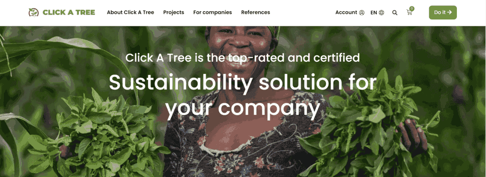
CTA: Do it
Why it’s effective:
The “Do it” button on the Click A Tree website is a standout CTA because it’s short, punchy, and action-oriented. It speaks directly to you and encourages you to take environmental responsibility.
Drinks brands: Gray Goose
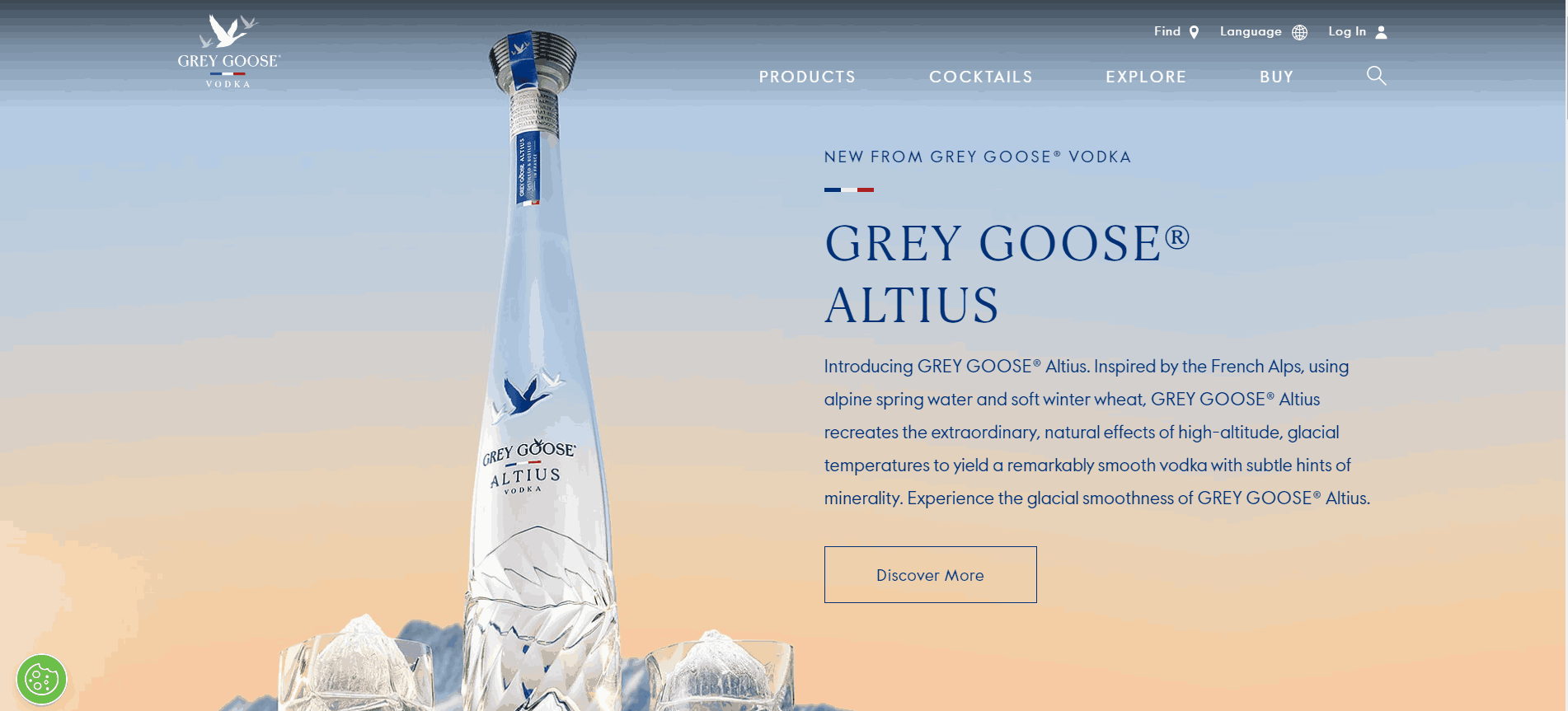
CTA: Discover More
Why it’s effective:
Grey Goose’s “Discover More” button invites users to learn about their new product, Grey Goose Altius. It’s effective because it teases more information, sparking curiosity.
Moreover, the design of the CTA and the surrounding text match that of the bottle, which is pleasing to look at.
Ride-hailing company: Lyft
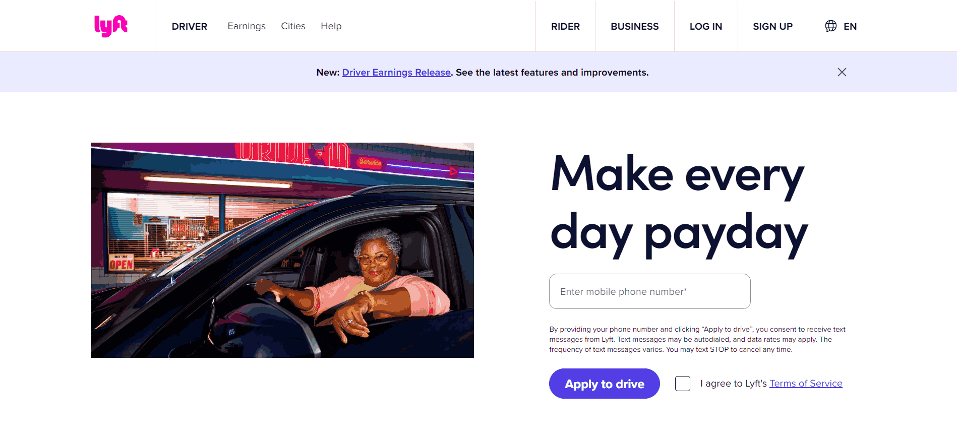
CTA: Apply to drive
Why it’s effective:
Lyft’s “Apply to drive” button is clear and direct. There’s no fluff, and the CTA takes you straight to the registration page.
Streaming platform: Netflix
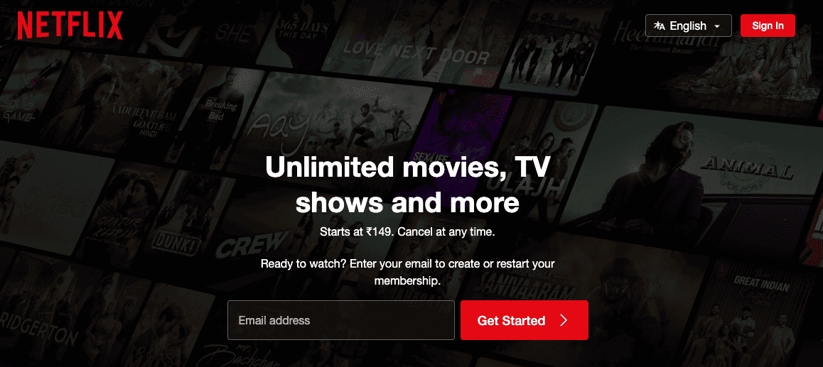
CTA: Get Started
Why it’s effective:
Netflix’s “Get Started” CTA is a bright red button set against a dark background, making it impossible to miss.
The promise of “Unlimited movies, TV shows, and more” right above the button adds a strong incentive to click. This combination of visibility and clear value makes the CTA very effective at converting visitors into subscribers.
Clothing brand: Patagonia
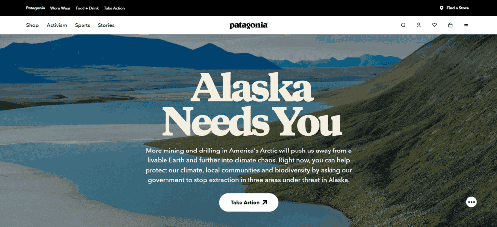
CTA: Take Action
Why it’s effective:
Like Click a Tree, Patagonia’s “Take Action” CTA encourages users to do something about Alaska’s environmental issues. The font choice is spot on because it reminds visitors of the snow they must protect.
Real-estate company: Zillow

CTA: Get our tips
Why it’s effective:
For anyone looking for high-quality house-hunting advice, the hero image and headline at the top of the fold are likely to attract instant attention.
The primary CTA, ‘Get our tips,’ holds out the promise of high-quality advice curated by experts at one of the nation’s largest housing platforms. It gets the reader thinking about how much it will cost and if they have the budget.
This segues nicely into the secondary CTAs – each link offering online calculators for the reader to:
- ‘Find a home’s estimate’
- ‘Calculate your budget’
Restaurant chain: Chick-fil-A
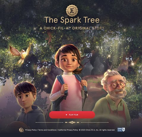
CTA: Play Film
Why it’s effective:
When creating a call-to-action for restaurants, the key is to create a visual experience. Chick-fil-A, Inc. has been coming out with an animated short film each year since 2020 around the holiday season.
Though the movies don’t directly promote the brand, there are contextual references that are hard to miss.
For example, the main protagonist visits a Chick-fil-A outlet to grab a bite. The brand dovetails promotions for new menu items that are themed after the movie.
Notice that the CTA ‘Play film’ is distinctive and simple, set against a full-size banner, and designed to connect with the audience. The warm pink button stands out while complimenting the overall look of the banner ad.
E-learning platform: Skillshare
CTA: 50% Off Is Waiting For You
Why it works:
In this example, you’ll notice the same CTA appearing thrice – first at the top (horizontal section in green) of the email so that readers can see it right away, then followed up with a link CTA (50% off), again at the top of the fold.
This may be too excessive. However, it increases the chances the recipient will click through without scrolling down.
The CTA phrase ‘waiting for you’ suggests that it belongs to them, and they can get it right away.
Online education: Section
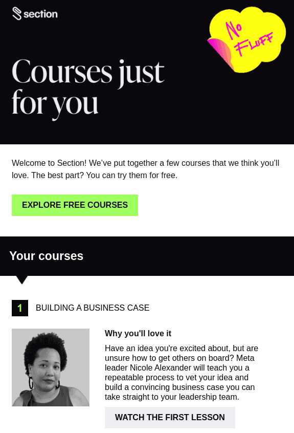
CTA: Explore Free Courses
Why it works:
Whether you want to drive course enrollment, event sign-ups, or student engagement, CTAs must tell the reader what’s in it for them and create a sense of urgency.
In this example, the CTA ‘explore free courses’ tells the reader what’s in it for them, encouraging action.
You’ll notice that both CTA buttons in the example are precisely the same. You want to try different variations like ‘Test your knowledge’ or ‘Start your learning journey today.’
Check out our CTA glossary here
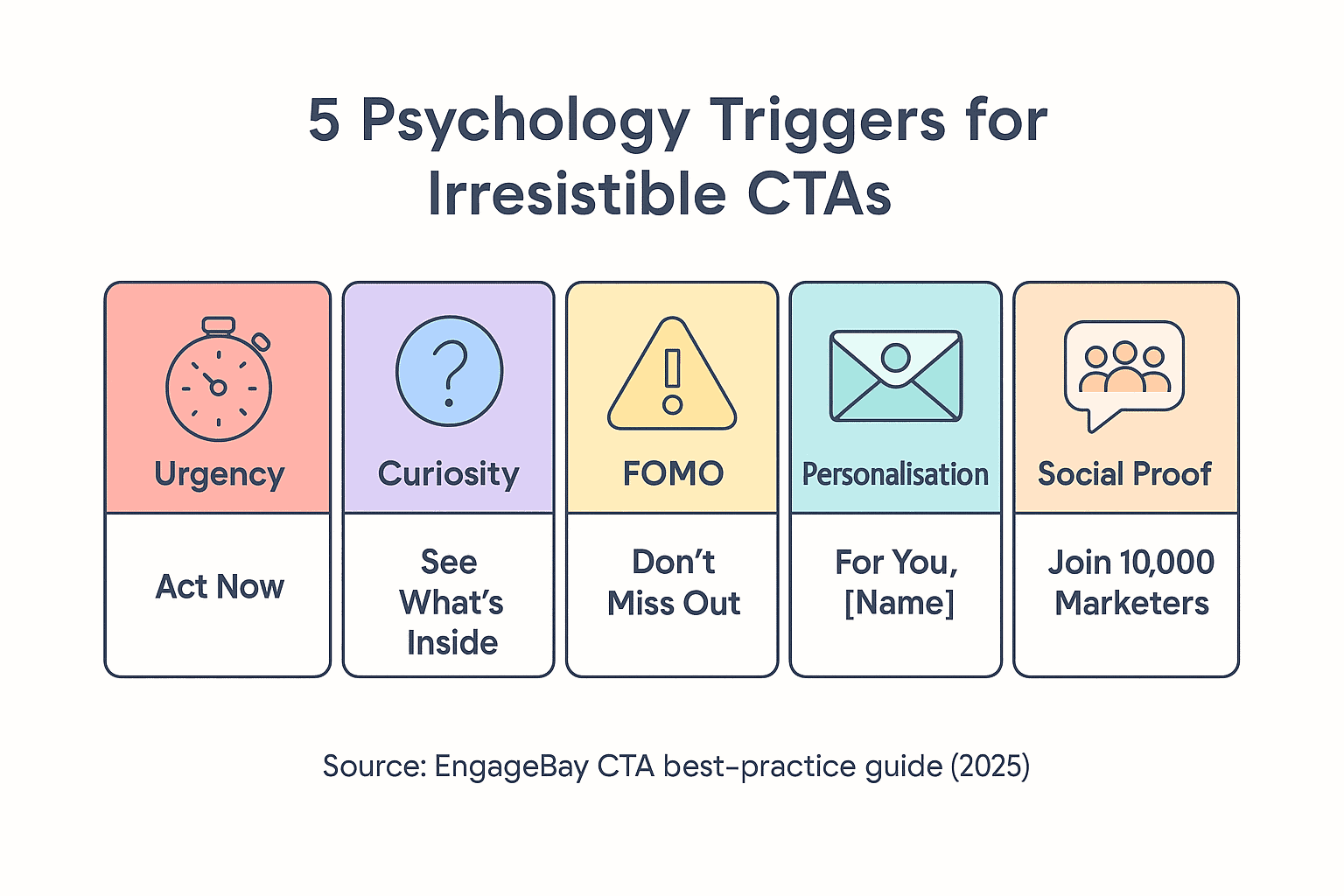
Five psychology triggers that make call to action phrases irresistible.
Best Practices to Make Your Call-to-Action Stand Out
We’ve given you a lot of phenomenal tips for creating winning calls to action, but we’re not entirely done yet. Here’s a collection of best practices to help you take your CTA buttons further up a notch!
Use different button shapes
A button needn’t always be square-shaped or rectangular. Experiment with different shapes, such as rounded edges.
Use split testing to determine which shape looks the most appealing. If you choose a shape for a button, keep the same button shape throughout that page for consistency.
Don’t venture beyond rectangles, squares, or ovals, either. If you try to make triangular CTAs, your audience might not find it clear that they’re looking at a button, so they’ll ignore it.
Add bonus text
Don’t be afraid to add bonus button text if you feel you must be too sparse on your CTA copy. This short burst of text under the CTA can act as a secondary link and explain what the CTA button is all about.
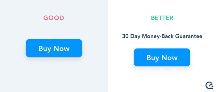
Check out this CTA example below to see what we mean.
No doubt the website visitor knows what they’re in for when they click, as you explained it in two different ways.
Follow the ‘less is usually more’ mantra
A CTA button and your website design have a lot in common. The simple, stripped-back approach can work wonders in capturing the interest of your target audience.
Remember, your CTA button won’t stand out when you overcomplicate or overload the webpage. Even if the button has an excellent copy, a good font, and an appealing color choice, it might not matter if it’s overwhelmed by everything else.
Reduce elements on your webpage where you can and give your buttons a chance to shine. A little bit of white space isn’t the end of the world!
A/B test your CTA buttons
Throughout a campaign, refreshing your CTA design or color can help keep your target audience engaged.
For example, experiment with different button shapes, sizes, and colors for contrast.
This can improve visibility and ROI. A/B testing helps you understand the incremental impact of every tweak you make and build those learnings into future campaigns.
Know more about A/B Testing here.
Build urgency into your CTA phrases
When writing CTA wording, focus on verbs to build urgency. For example, ‘get’ or ‘learn’. Follow it up with words like ‘now,’ ‘today,’ or ’this week’ for the reader to take action within a specific timeframe.
Tell them what they will get on submitting a form or subscribing- a quote, ebook, template, case study, and so on.
This should build on elements like the subject line and offer. Address common objections within the CTA text.
For example, ‘Free Trial – no credit card required’ or ‘Open your account in 4 minutes.’
Optimize for mobile
According to Statista, 96.2% of users used mobile phones to surf the web in 2023. Marketers must, therefore, optimize the placement and resolution of CTAs in their ads, emails, and landing pages.
For example, place the CTA above the fold so the reader doesn’t need to scroll, test for rendering issues, and ensure the rest of the content, including the introduction and body copy, aligns with the offer.
96.2 % of internet users go online via a phone (Source: Demandsage)
Choose the right button size
The average call-to-action button is 47.9 pixels tall, while the smallest is 20 pixels tall. If you go any smaller than this, mobile users may be unable to tap on your CTA. A larger-sized button could affect the copy.
The key is to preview how your CTA button appears across desktop and mobile before using it. Email marketing tools like EngageBay have a handy preview function that allows you to check for breaks and alignment or use a pre-built email template from its extensive library.
The average email CTA button is ~47 px high (most cluster at 47–50 px, safely above Apple’s 44 px touch-target rule) (Source: Really Good Emails)
Use a combination of text or visual effects
Placement is essential for increasing CTR for your CTA button. However, adding visual effects or interactive elements can make them irresistible.
For example, adding hover effects like size increases or text animation effects can stop the scroll and increase the odds of click-through.
You can also direct your attention to the CTA button via the arrow icons on either side. Just make sure to get the spacing right. Interactive elements like countdown timers can be excellent for time-sensitive offers.
Leverage testimonials
Testimonials and positive reviews make your CTA credible. They can be adapted for Facebook ads.
For example, CTAs like ‘See what our clients are saying’ and ‘Join thousands for satisfied customers’. For platforms like Instagram or LinkedIn, you can use image CTAs with the customer’s headshot and testimonial.
Make the image clickable in itself or add a separate CTA button. This tactic lets you build on social proof to drive clicks, submissions, or downloads, as the case may be.
Use first-person pronouns
First-person pronouns (I, me, etc.) make CTA’s more personal. The reader may feel you are talking directly to them, resulting in better engagement and sales. To be sure, A/B test both first and second person CTA before running them.
Small hacks like these can sometimes deliver substantial results.
Personalize your calls-to-action
Personalized CTAs can resonate with your audience, making them more engaging.
Personalized CTAs leverage data such as user names, browsing history, location, or past interactions to craft a message that feels uniquely tailored.
- Appeals to individual needs: When users see CTAs reflecting their interests or behaviors, they feel more connected to the offer. For example, “Welcome Back” or Discover Your Next Adventure” feels more inviting than a generic “Check Out Our Offers.”
- Boosts relevance: CTAs like “Continue Your Journey” for returning users or “Explore Nearby Deals” based on location make the experience feel customized.
- Encourages action: By speaking directly to the user, such as “Unlock Exclusive Rewards Today!”, you create a sense of importance and exclusivity.
Optimize for voice search and conversational CTAs
With the rise of voice assistants like Alexa, Siri, and Google Assistant, optimizing your CTAs for voice search has become crucial.
These CTAs should align with how people speak, making interactions seamless and intuitive.
When people do voice search, they talk like they are having a natural conversation. So instead of “Subscribe for Updates,” you can try “Can We Send You Updates?” Or, you can replace “Learn More” with “Tell Me More About This.”
Voice searches are often more conversational and less formal. Using phrases that mimic how people naturally talk makes your CTA feel approachable and relatable.
You can even add a touch of personalization and natural flow, such as “What’s Next for Me?” or “Help Me Find the Right Plan.”
Conclusion
Whether you’re building a social media ad, email campaign, or product landing page, call-to-action phrases are just one of many vital elements.
Small business marketing teams often don’t have the resources to scale campaigns or track their performance. EngageBay is an affordable all-in-one CRM that integrates your marketing into a smooth, efficient process, letting your team quickly identify and adapt to changing customer preferences.
Remember: Powerful call-to-action phrases win clicks by marrying an action-led verb with an unmistakable benefit, then spotlighting that promise in thumb-friendly, high-contrast buttons across every channel.
Ready to see it in action?—Book your free EngageBay demo now and watch our drag-and-drop builder, built-in A/B testing, and real-time analytics turn those words into revenue.
Check out our free email marketing templates and workflow builder.
Sign up for a free trial today and experience the EngageBay advantage.
They spell out the value (“Unlock my demo”) and the action in the same breath. Research cited in the post shows that swapping a bland “Submit” for a descriptive CTA can lift conversions by up to 60 percent, proving that clarity + benefit beats vagueness every time.
Aim for five to seven words—just enough space to front-load a strong verb (“Get,” “Start,” “Claim”) and a tangible reward (“your free trial”) without crowding the button. This sweet spot balances scannability with persuasive detail.
Keep the primary CTA above the fold. With 96.2 % of web users browsing on phones, thumb-centric positioning prevents extra scrolling and captures intent the moment a page or email loads.
Stick to a button height of ≈ 47 px (well over Apple’s 44 px minimum) and choose a high-contrast color that pops against your brand palette. This combination hits ergonomic touch targets while leveraging color psychology to draw the eye.