You’ve got a product or service to sell and built a sales page — but getting people to click “Buy” is no easy feat. While it’s relatively simple to encourage downloads of free resources like eBooks, convincing visitors to purchase requires a different level of persuasion.
The success of your sales page hinges on understanding your audience and tailoring your approach to them.
Just copying a successful sales page won’t automatically guarantee conversions.
However, you can build a page that drives results by learning your customers’ language, addressing their pain points, and analyzing what’s working for your competitors.
On this Sales Page guide you’ll learn:
• What a sales page is
• How to structure your copy for conversion
• Real examples you can replicate
Let’s get started.
Want to check out the sales page examples first? Jump right in!
Table of Contents
What Is a Sales Page? (and Why It Works)
A high-converting sales page creates a seamless experience that guides users naturally toward making a purchase. At its core, it relies on three essential characteristics to drive conversions.
html
How to Create Landing Pages in EngageBay
In the digital marketing world, a well-optimized sales page can be a powerful tool. These pages are designed with one purpose — to convert visitors into paying customers.
- Offers clarity: A sales page must deliver crystal-clear information that lets buyers make quick purchasing decisions. The focus should be on delivering only the essential details — nothing more, nothing less.
- Employs persuasion: This is where understanding buyer psychology comes into play. Whether selling basic T-shirts or promoting a cause, you must find unique selling points that resonate with your audience.
- Narrates a story: Your sales page should be anything but boring. Craft a compelling narrative around your product or service, turning it into a story that keeps users hooked. A well-told story engages visitors from start to finish, persuading them to take action through a well-placed call-to-action (CTA).
- Engages with design and copy: The characteristics of a high-converting sales page can only be effectively communicated through the synergy of design and copy. If your sales page were a car, design, and copy would be the twin engines that keep it running smoothly.
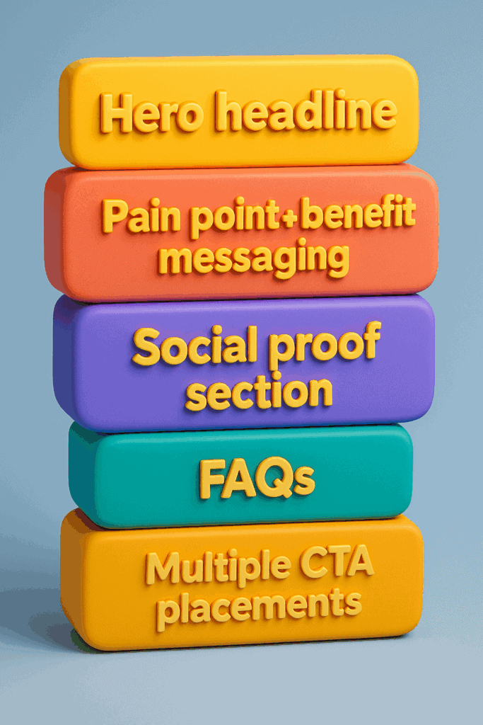
The Key Elements of an Effective Sales Page
After analyzing several well-crafted sales pages, it’s clear that certain elements contribute significantly to their success. Let’s break down the essential components of a high-converting sales page:
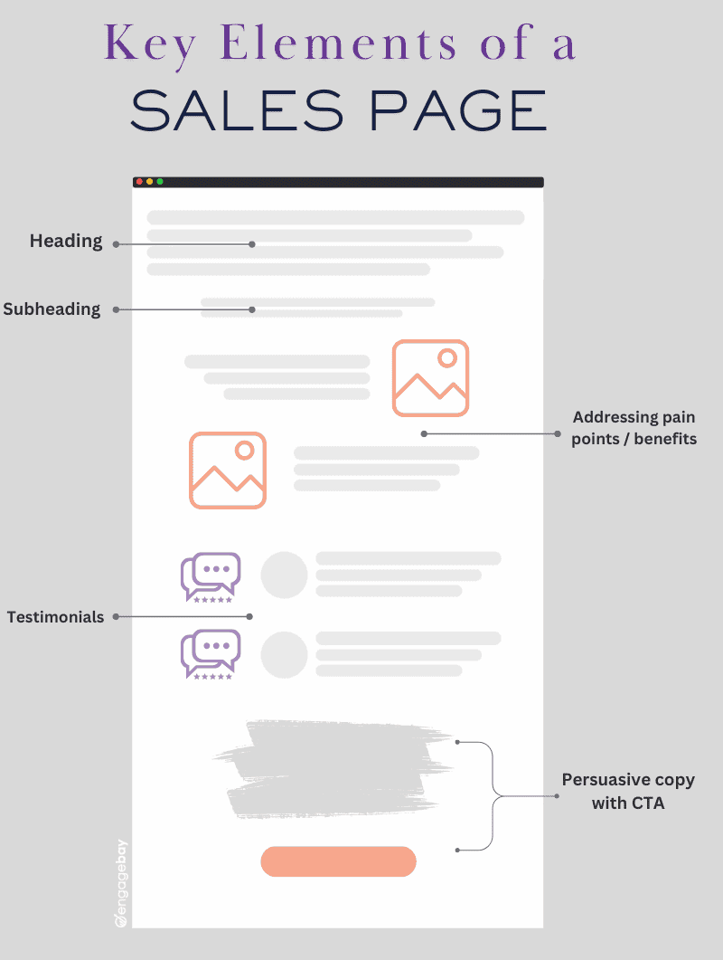
Catchy headline
A great headline grabs your reader’s attention and compels them to explore further. To craft an effective headline, focus on addressing a key benefit or appeal that resonates across different demographics. It should be concise, relevant, and engaging.
Addressing pain points
You don’t need to delve deeply into all the pain points your product solves. Instead, focus on the main issue and emphasize one key benefit that addresses it directly. This approach keeps the messaging focused and impactful, helping readers quickly understand how your solution helps them.
Testimonials and reviews
Customer feedback is one of the most important aspects of a high-converting sales page. To build trust, include customer reviews or video testimonials that demonstrate the popularity and effectiveness of your product or service. Social proof is a powerful tool for convincing potential clients to take the next step.
As Nicole Malczan says: A great sales page is a simple yet straightforward overview of what your company sells and why it’s worth buying
Frequently Asked Questions (FAQs)
At the end of your long-form sales page, including an FAQ section is crucial. This section should address common questions and concerns that potential customers might have, helping to clear up doubts and reduce hesitation before purchasing.
Who this is not for
Clarifying who your product is not suited for may sound counterintuitive, but it helps filter out non-ideal customers. This reduces unnecessary customer support issues and product returns.
CTA buttons
Including multiple strategically placed CTAs throughout your page is crucial. Whether it’s a “Buy Now” or “Enroll Now” button, make sure to have a CTA at the end of the page to give users one last nudge toward conversion.
html
The Ultimate Formula for Sales Pages that Convert
Sales Pages vs Landing Pages vs Product Pages
Businesses often use landing pages, sales pages, and product pages when it comes to marketing and selling their products and services.
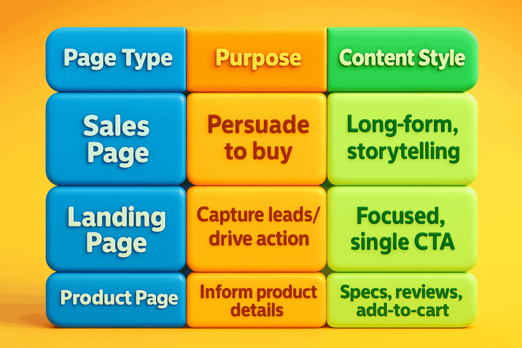
While you may think they are the same, each of these pages serves a different purpose. Understanding the differences is crucial for optimizing conversions and engagement.
Let’s have a more detailed look at the differences in this table below:
|
Feature |
Landing page | Sales page |
Product page |
| Main purpose | Capture leads or drive specific actions (e.g., sign-ups, downloads). | Convince visitors to make a purchase through persuasive storytelling. | Provide product details for an informed purchase decision. |
| Length & content | Short and focused on a single action. | Long-form, using persuasive copy, storytelling, and social proof. | Standard product descriptions, specifications, and customer reviews. |
| CTA approach | Direct and singular (e.g., “Sign Up,” “Get Free Guide”). | Strong sales-driven CTA with urgency (e.g., “Buy Now,” “Get Instant Access”). | Standard eCommerce CTAs like “Add to Cart” or “Buy Now.” |
| Design focus | Minimal distractions, simple layout. | Persuasive elements like testimonials, urgency triggers, and long-form content. | Product-focused layout with images, descriptions, and pricing. |
See how we improved conversions using our landing page best practices in this case study
Best Practices for High-Converting Sales Pages
Customizing Landing-Page URLs in EngageBay
Whether you’re building a short-form or long-form sales page, keep these best practices in mind:
- Mobile-responsive design: Ensure your landing page is fully mobile-responsive, offering a seamless user experience across all devices.
- Visually appealing layout: The color scheme, typography, and imagery should flow cohesively, creating a visually engaging experience that aligns with your brand and grabs attention.
- Keep it simplified: Focus on delivering essential information in a clean, concise format. Avoid clutter, and guide your visitors toward the desired action effortlessly.
- A/B testing: One key advantage of a sales landing page is the ability to run A/B tests. You can experiment with different headlines, CTAs, and layouts without affecting other pages of your website.
- Build links: Once your sales page is live, start promoting it. Link building is an effective strategy to drive traffic. The easiest way to get your first backlink is by hiring professional service providers.
Infographic showing key elements of an effective sales page
Sales Page Examples That Captivate, Engage, and Convert
Now that we’ve laid the groundwork, it’s time to explore some outstanding sales page examples across various sectors. We’ll dissect each one, highlighting what makes them effective so you can draw inspiration for creating your own high-converting page.
Whether you’re in tech, fashion, services, or digital content, these examples will provide valuable insights into best practices and innovative strategies that drive results.
Featured special discount sales pages
We’ll look at sales pages with deep discounts and limited-time promotions from top brands. This will help you understand how to craft your own sales pages.
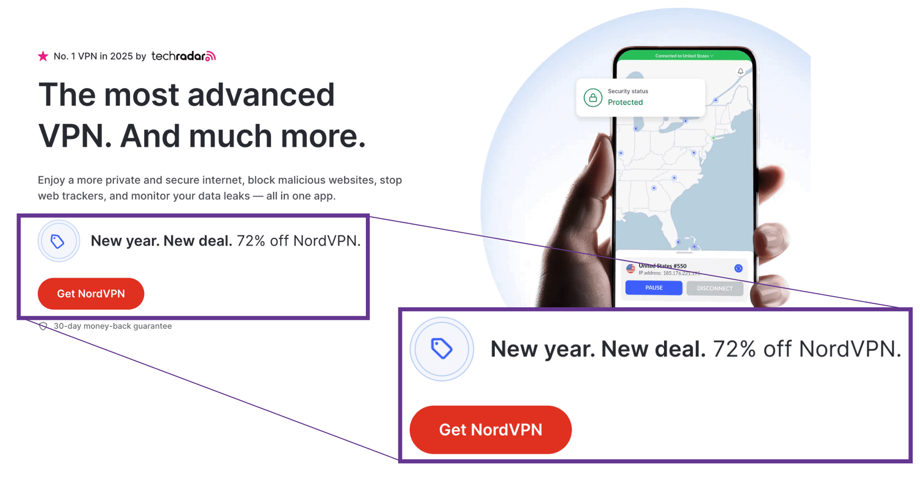
1. NordVPN New Year sale page
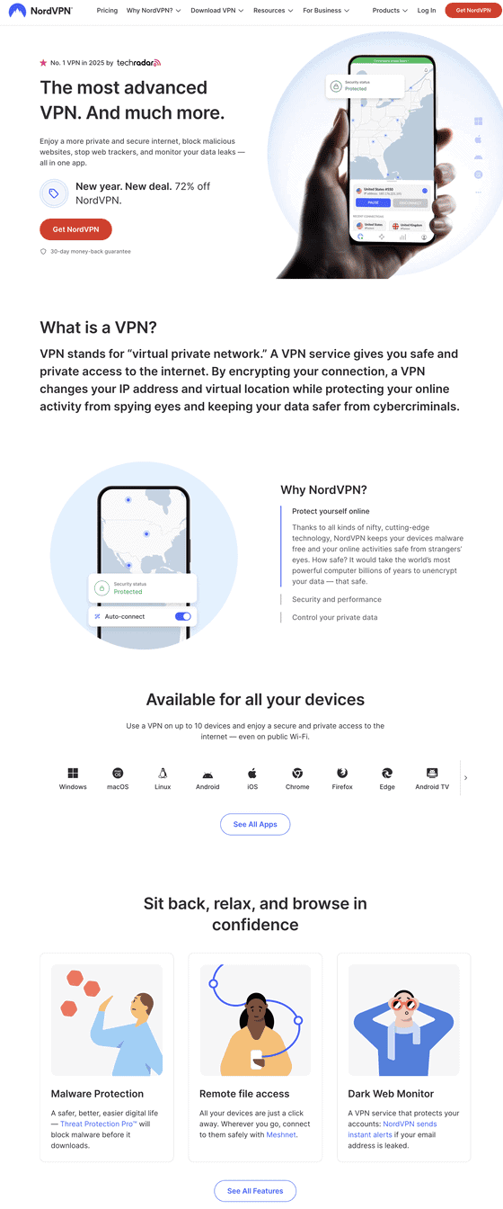
NordVPN’s website masterfully presents its advanced VPN services, emphasizing speed, security, and user-friendly features to ensure a secure and private internet experience.
What we liked:
- Compelling value proposition: The homepage immediately highlights NordVPN as “the most advanced VPN in the world,” offering a substantial 72% discount, which effectively captures visitor interest.
- Content flow: The site is thoughtfully organized, guiding users from understanding what a VPN is, to exploring NordVPN’s unique features, and seamlessly leading them toward subscription options.
- Engaging visuals and effective CTAs: High-quality graphics and clear calls-to-action, such as “Get the Deal,” are prominently displayed, encouraging user engagement and facilitating easy navigation toward securing the service.
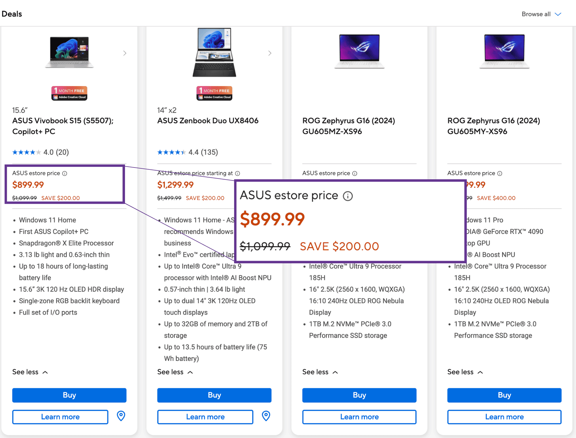
2. ASUS New Year sale

ASUS’s deals page is a treasure trove for tech enthusiasts, offering a wide array of discounted products that cater to various needs and preferences.
What we liked:
- Clear and attractive promotions: Each deal is presented with high-quality images, detailed specifications, and clear pricing, making it easy for customers to understand the value and make informed purchasing decisions.
- User-friendly navigation: The website’s intuitive layout allows users to effortlessly browse through various deals, with filters and categories that streamline the shopping experience and help users quickly find products that meet their specific needs.
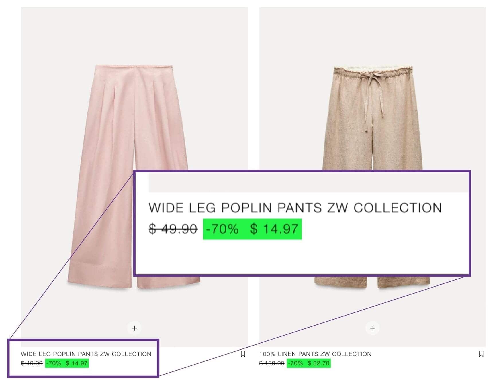
3. Zara’s deep discount sales page
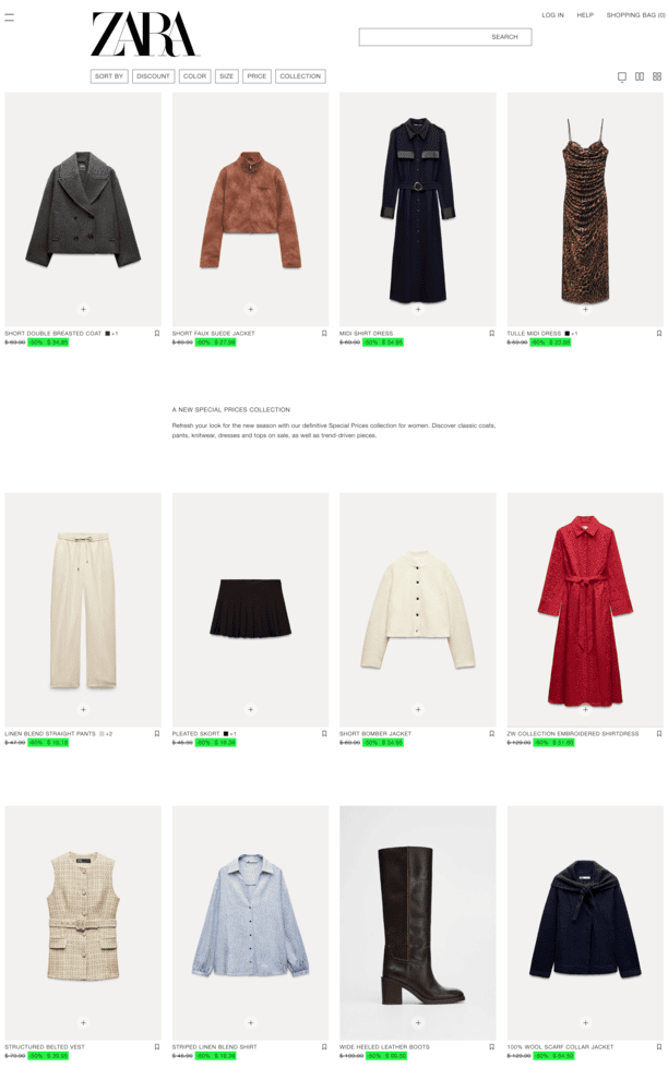
Zara’s “Special Prices” page offers a curated selection of women’s fashion items at attractive discounts, blending style and affordability.
What we liked:
- Irresistible price displays: The use of slashed prices alongside the original and discounted amounts taps into the psychological appeal of savings, making every deal feel like a steal.
- High-quality visuals: Clear, high-resolution images showcase product details like fabrics, cuts, and textures, helping users visualize their purchase and feel confident about their choice.
- Seamless browsing experience: User-friendly filters and categories simplify navigation, allowing shoppers to quickly find items that match their style and preferences without frustration.
4. Coursera Plus sale page
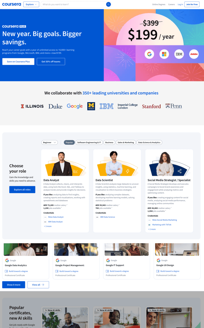
Coursera’s website serves as a gateway to a vast array of online learning opportunities, connecting users with courses, certificates, and degree programs from top universities and industry leaders.
What we liked:
- Inspiring New Year Message: The homepage embraces a motivational “New Year, Big Goals, Bigger Savings” mantra, perfectly timed to appeal to users setting ambitious goals for personal and professional growth at the start of the year.
- Featured discounts section: Coursera capitalizes on the New Year spirit by prominently featuring discounted courses and programs that align with career advancement and self-improvement aspirations, seamlessly guiding users to take action.
- Engaging visuals and CTAs: Bold banners highlighting savings and clear calls-to-action like “Start Learning Today” create a sense of urgency and excitement, motivating users to invest in themselves for the year ahead.
Technology products sales pages
When it comes to selling technology online, crafting effective sales pages is crucial for turning potential customers into buyers. We’ll explore two standout examples of tech product sales pages.
5. Apple Watch Series 10
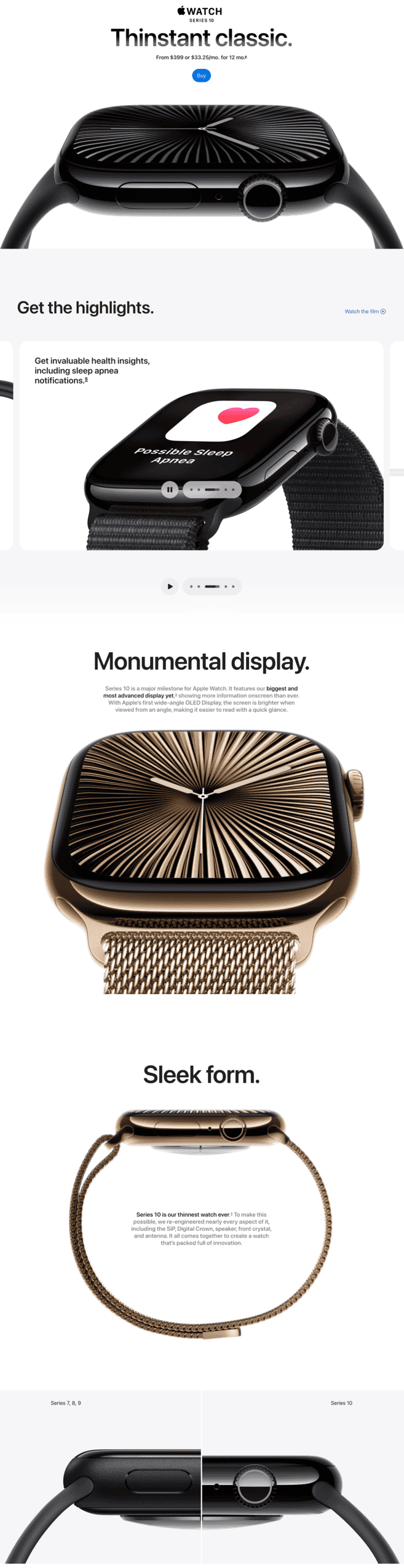
From the outset, the page communicates the product’s standout feature with the phrase “Thinstant Classic.” These words alone convey the uniqueness of the Apple Watch Series 10.
The page is packed with crisp, high-resolution images and videos of the Apple Watch in action. These visuals allow potential customers to see the product from various angles, giving them a real sense of its design, functionality, and how it fits into daily life.
Apple skillfully taps into emotional appeal by showing how the watch integrates into different aspects of daily life — fitness, wellness, and communication.
What we liked:
- Persuasive copy: The standout tagline ‘Thinstant Classic’ immediately communicates the product’s uniqueness and appeal to the audience.
- Stunning visuals: Apple is known for its high-quality 3D banners that show the product in action, seamlessly blending design and functionality into everyday life.
- Effective CTA: A well-placed CTA button moves interested buyers quite easily.
Visit the Apple Watch Sales Page
6. Roku Video Doorbells
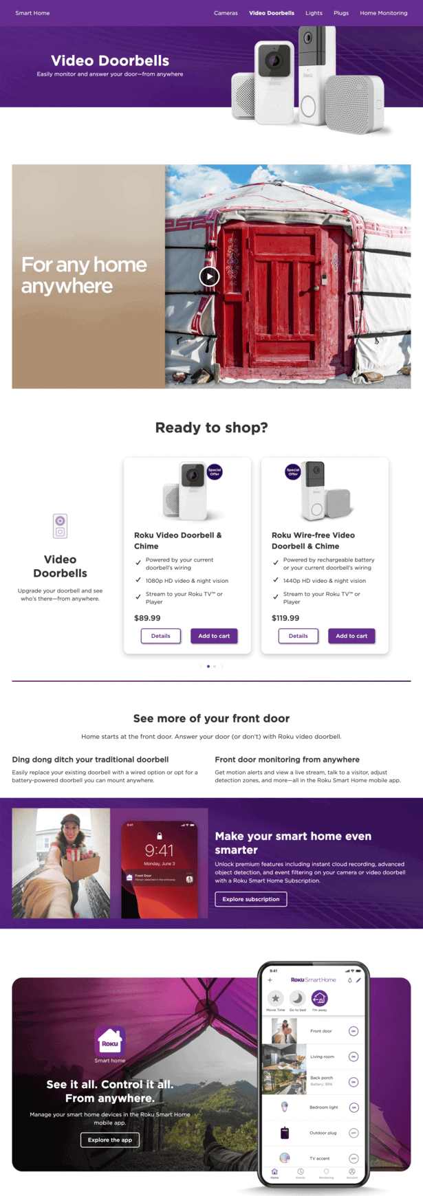
The Roku Smart Home Doorbell page excels as a short-form sales page by keeping the design clean and uncluttered and delivering its core message upfront.
The headline is direct: “Easily monitor and answer your door—from anywhere.” This immediately communicates the product’s key benefit — smart security — without unnecessary fluff.
A short and engaging video is embedded below the headline, providing a quick, visual demonstration of how the doorbell works and its benefits. The video is an effective tool to pull users in, and once they’re hooked, the page prompts them with “Ready to shop?”— a subtle but powerful nudge toward conversion.
What we liked:
- Clear value proposition: The headline “Easily monitor and answer your door—from anywhere” delivers the product’s key benefit upfront.
- Engaging visuals: A concise video demo immediately grabs attention and highlights the doorbell’s functionality.
- Strategic CTAs: Multiple CTAs guide users to explore additional products or proceed directly to purchase, enhancing the sales potential.
Visit Roku’s Doorbells Sales Page
Fashion and retail sales pages
In the competitive world of fashion retail, brands must focus on creating visually striking sales pages to capture the audience’s attention. We’ll look at H&M to demonstrate how these pages use effective design elements that reflect their brand’s ethos and engage customers.
7. H&M Fashion
H&M, a global fashion brand, has expertly collaborated with renowned Indian designer Anamika Khanna to merge Indian and Western styles in their latest collection — and their sales page does a fabulous job showcasing this partnership.
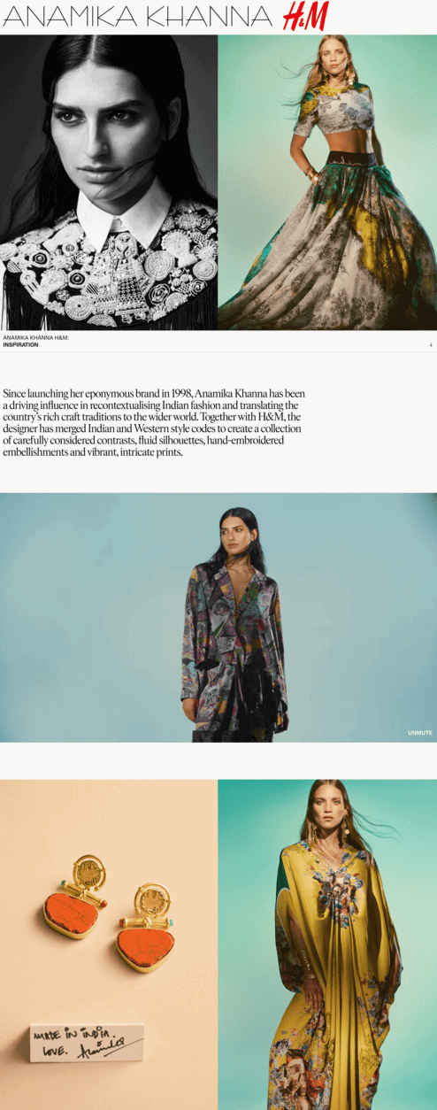
From the moment you land on the page, the visual impact is undeniable.
A bold, high-resolution banner featuring Khanna’s designs grabs attention. And the use of vibrant, contrasting colors beautifully represents the cultural blend at the heart of the collection.
The lookbook format, with individual pieces styled as part of complete outfits, inspires users and offers ideas on how to wear the collection. The seamless scroll and user-friendly navigation create an intuitive shopping experience.
What we liked:
- Striking visual design: The page features high-resolution banners and vibrant colors that capture attention and reflect the cultural fusion of the collection.
- User-friendly navigation: A seamless scrolling experience and intuitive interface allow users to explore the collection effortlessly.
- Exclusive member access: Offering early access to members rewards loyalty and enhances customer engagement.
SaaS/Services sales pages
The same goes for SaaS and service-based industries. We’ll look at more sales pages and explore how these companies managed to showcase their unique value propositions and stand out against their competitors.
8. Deliveroo
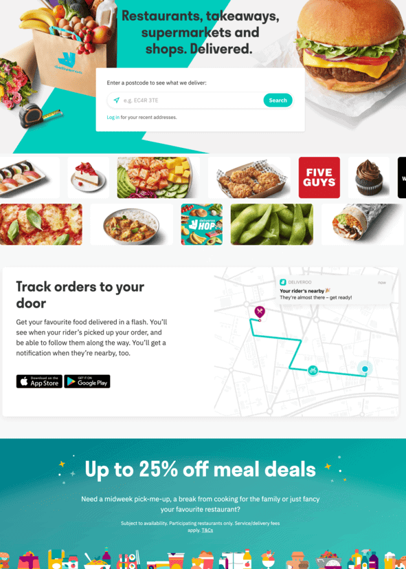
Deliveroo’s website teaches us how to showcase benefits without talking about features and other jargon. From the moment you land on Deliveroo’s page, the design and visuals make it clear: your cravings are just minutes away from being satisfied.
What we liked:
- Engaging heading: The hero section’s direct invitation and brief benefit statement immediately convey the advantages of partnering with Deliveroo.
- Emphasis on real-time tracking: The sales page highlights Deliveroo’s real-time order tracking feature, showcasing how it enhances customer satisfaction by providing transparency and timely notifications when the rider is nearby.
Visit the Deliveroo Sales Page
8. Hotjar
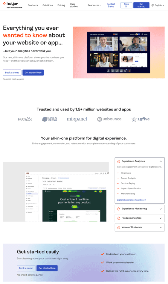
Hotjar is a platform that helps you understand users’ online behavior and voice. It makes for an excellent sales page example, as its landing page directly talks about the brand.
What we liked:
- Compelling value proposition: The headline, “Everything you ever wanted to know about your website… but your analytics never told you,” immediately captures attention by addressing a common gap in traditional analytics.
- Comprehensive tool overview: The page clearly presents Hotjar’s key features—Heatmaps, Recordings, Feedback, Surveys, and Interviews—each accompanied by concise descriptions and visuals, enabling potential customers to quickly grasp the platform’s capabilities.
- Simple CTAs: Prominent “Get started” and “Book a demo” buttons are strategically placed throughout the page, encouraging user engagement and facilitating easy access to the platform.
9. Ruby
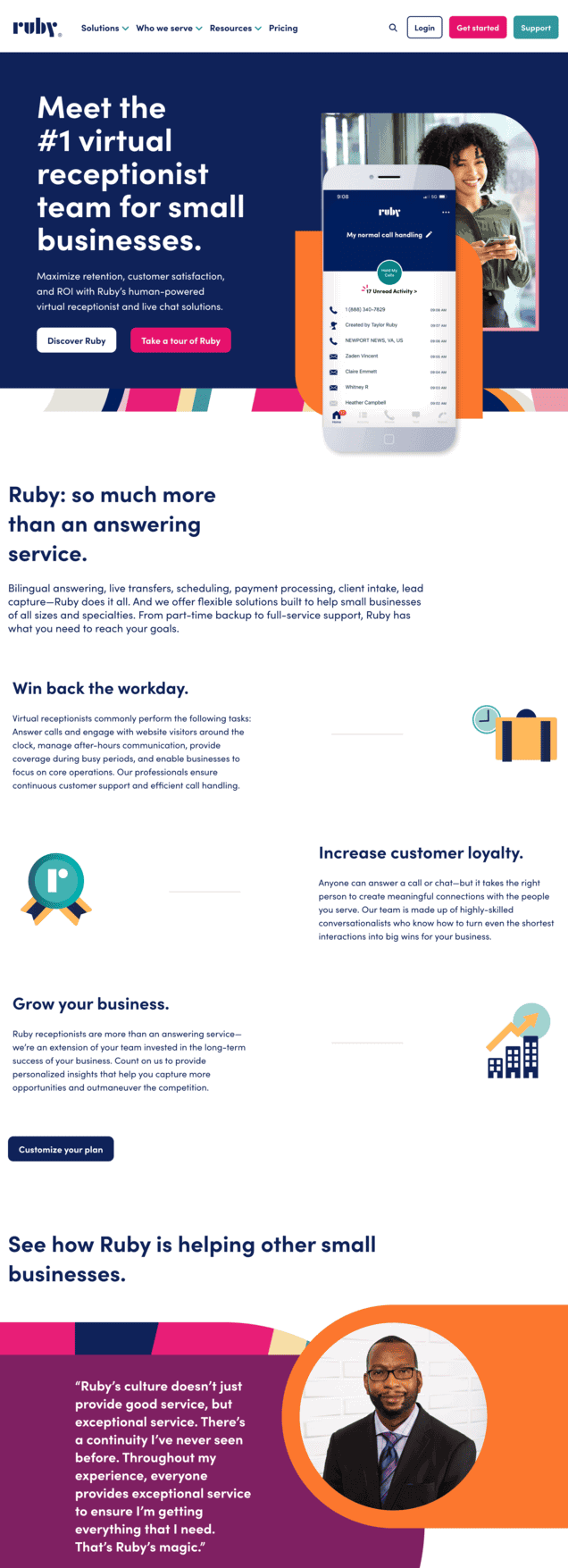
Ruby is a virtual customer service provider for businesses and business owners. “That’s Ruby’s magic,” one customer notes, and it certainly is true for their sales page.
What we liked:
- Tailored messaging for small businesses: The headline “Meet the #1 virtual receptionist team for small businesses” immediately establishes Ruby’s expertise and resonates with its target audience.
- Diverse feature highlights: Ruby showcases its wide range of services, including bilingual answering, lead capture, and client intake, ensuring businesses see the value of a complete solution.
- Engaging and actionable CTAs: With CTAs like “Discover Ruby” and “Take a tour of Ruby,” the page encourages interaction while making it easy to explore the platform further.
10. Wix
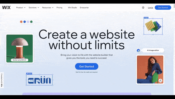
Wix is a software company that provides website creation, website templates, and cloud-based web development services.
The sales page features stunning animations, smooth-scroll sections, and vivid imagery that seamlessly come together to tell a story.
What we liked:
- Catchy title: The headline, “Create a website without limits,” immediately captures attention by emphasizing the platform’s versatility and user empowerment.
- Diverse template selection: The page highlights access to over 900 free, customizable website templates, catering to various industries and user needs, facilitating a quick start for website creation.
- Strategic CTA placement: Prominent “Get Started” buttons are strategically placed throughout the page, encouraging user engagement and facilitating easy access to the platform’s features.
Digital content and courses sales pages
Let’s see how these brands persuaded curious visitors into eager learners with effective storytelling, visuals, and CTAs.
11. Codecademy
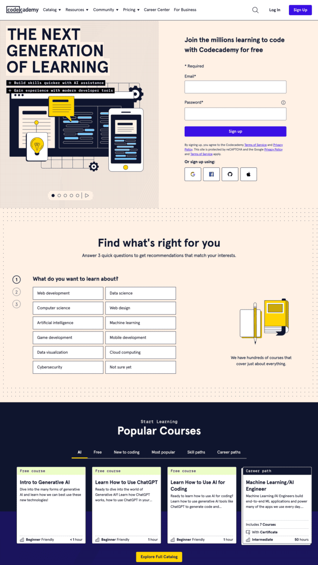
Codecademy’s sales page showcases its coding education platform with simple yet relatable copy and CTA.
As you scroll down, a short demo emphasizes the platform’s interactive elements — showcasing how Codecademy makes learning active and engaging. This approach allows team members to practice and apply their knowledge in real-world situations, reinforcing the learning experience.
What we liked:
- Relatable headlines: “The Next Generation of Learning” and “Join the millions learning to code with Codecademy for free” immediately capture attention by emphasizing accessibility and a large, supportive community.
- Interactive course offerings: The page highlights a diverse range of courses, including popular options like “Intro to Generative AI” and “Learn How to Use ChatGPT,” catering to various interests and skill levels.
- Personalized learning paths: By prompting users with questions about their learning interests, Codecademy offers tailored course recommendations, enhancing user engagement and satisfaction.
Visit the Codecademy Sales Page
12. Jacob McMillen
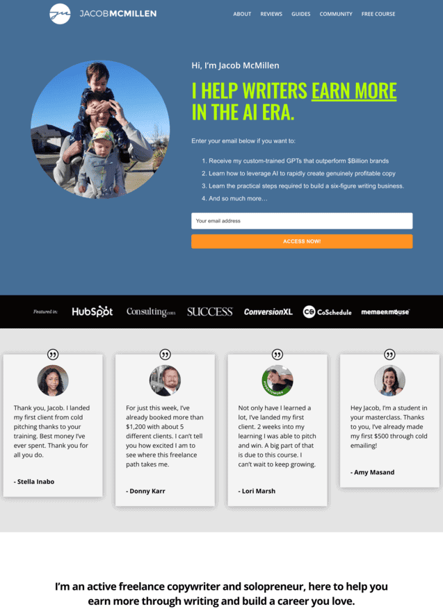
Jacob McMillen has skillfully built a thriving community around freelance writers and uses his sales page to invite others.
Right from the start, Jacob sets a strong tone by quantifying the milestones writers can achieve.
His transparency about the low subscription price sets his sales page apart. He acknowledges that some might find the price surprisingly low, which could raise skepticism. However, he addresses this head-on by explaining his belief that access to this resource should be affordable for everyone.
What we liked:
- Clear messaging and value-driven resources: The homepage headline and free offerings, like the 21-email crash course and AI training, immediately resonate with writers looking to enhance their skills and income.
- Strategic design and visuals: Minimalist design, high-quality images, and well-placed sections create an intuitive flow, keeping users engaged and focused on the content.
- Personal connection and credibility: Jacob’s own imagery and testimonials build trust and relatability, while visuals for courses and community offerings enhance professionalism.
Visit the Jacob McMillen Sales Page
13. Rebelle Nutrition
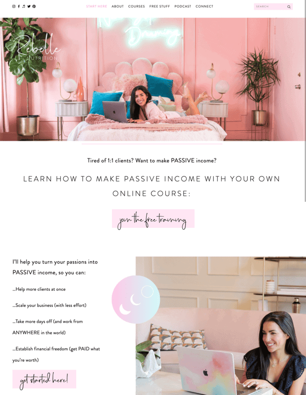
The sales page for Rebel Nutrition’s “Instapreneur” course is a vibrant and engaging example of how design, storytelling, and strategically placed CTAs can create an irresistible online course sign-up experience.
The first thing that stands out is the design, which mirrors the Instagram aesthetic — colorful, dynamic, and visually stimulating. What truly sets this page apart is its use of storytelling. From the introduction, creator Amie draws visitors in by sharing her personal journey — how she transformed her 1:1 coaching business into a thriving six-figure Instagram venture.
This storytelling continues throughout the page. It’s more than just a sales pitch; it’s an inspiring narrative that connects on a personal level.
Amie also smartly lays out the curriculum in detail, helping to eliminate any hesitation by showing exactly what students will get once they sign up.
What we liked:
- Targeted value proposition: The homepage clearly addresses aspiring wellness entrepreneurs, offering tailored guidance for building profitable online businesses.
- Strategic layout and CTAs: The website’s intuitive design flows seamlessly from value proposition to free resources and courses, with prominent CTAs like “Join the free training” encouraging engagement.
- Personal branding and visual appeal: High-quality visuals and founder Amie’s personal photos build authenticity and connection, complemented by a cohesive, professional color scheme.
Visit Rebelle Nutrition’s Sales Page
Other sales landing pages
Let’s also look at stunning sales pages from various other industries.
14. Levora
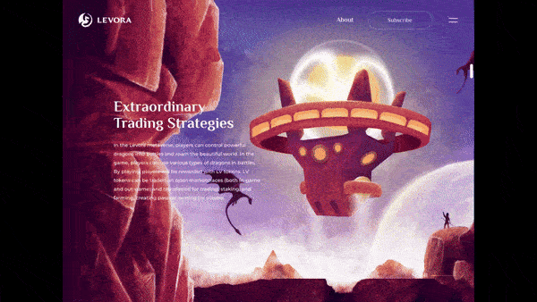
Levora’s website, developed by Cuberto, effectively showcases its metaverse medieval game, emphasizing evolutionary NFTs and play-to-earn mechanics. Scrolling through the page transports you into another dimension with its stunning animations and vivid colors.
What we liked:
- Immersive and stunning visual design: The website employs high-quality graphics and animations that vividly depict the game’s medieval fantasy theme, capturing visitor interest.
- Seamless scrolling through sections: Information is organized logically, guiding users through game features, unique selling points, and tokenomics, enhancing comprehension and engagement.
- Interactive elements: Subtle animations and interactive components create an engaging user experience, encouraging exploration and deeper involvement with the content.
15. Zoe Pepper
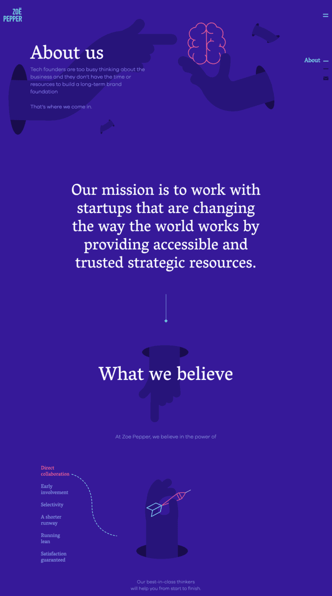
Zoe Pepper’s beautiful sales page might have a soothing effect on your mind. It also communicates its mission to support tech founders in building long-term foundations through accessible resources.
What we liked:
- Addresses pain points: The page immediately identifies the challenges tech founders face in brand development and positions Zoë Pepper as the solution, emphasizing collaboration and early involvement.
- Immersive layout: The layout logically presents the company’s mission, beliefs, and values, guiding visitors through their approach and commitment to client satisfaction.
- Engaging visuals and design: The use of a clean, minimalist design with strategic typography and spacing enhances readability and reflects the company’s professional ethos.
16. Cult.fit
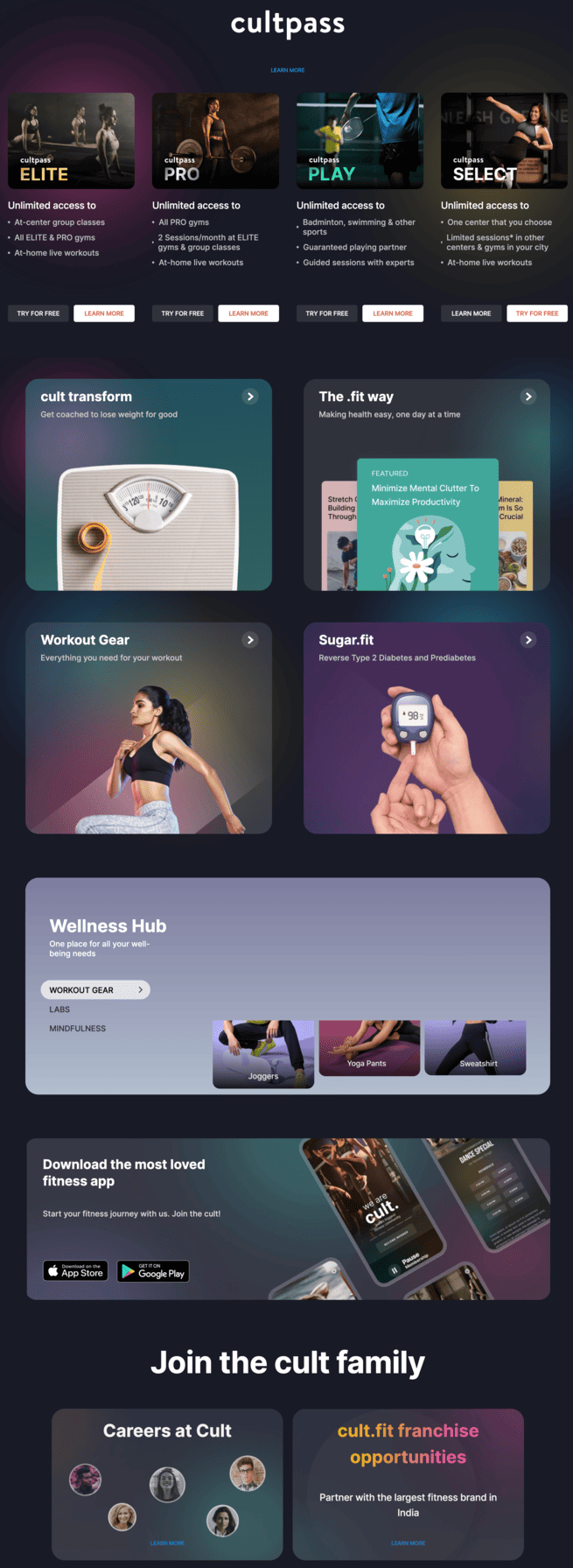
Cult.fit is a fitness and workout platform that provides personalized workouts to its clients. The sales page presents details on health and fitness, attracting visitors with vivid colors, imagery, and copy.
What we liked:
- Comprehensive value proposition: The sales page communicates Cult.fit’s mission to make group workouts fun, daily food healthy and tasty, mental fitness easy with yoga and meditation, and medical and lifestyle care hassle-free, encouraging users to #BeBetterEveryDay.
- Engaging visuals and effective CTAs: High-quality images and videos showcase workout sessions and healthy meals, while prominent CTAs like “Join the cult!” and “Get the app” are strategically placed to encourage user engagement and facilitate easy access to services.
17. Somnifix
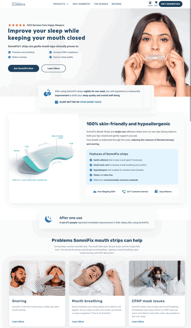
Somnifix’s sales page promotes its mouth strips to reduce snoring and encourage nasal breathing.
What we liked:
- Explains pain points and solutions: The homepage immediately conveys the benefits of SomniFix Mouth Strips, highlighting their ability to promote nasal breathing, reduce snoring, and improve overall sleep quality. The site also effectively guides users through understanding the problem, the science behind the product, and real customer success stories, leading seamlessly to purchase options.
- Strong, bold CTA: The bold statement “Sleep Better or your money back” reinforces confidence in the product, paired with prominently placed “Buy SomniFix” buttons that drive conversions.
Wrap Up
A sales page is created to increase sales. It entices people to purchase your product or service.
A good sales page is precise, straightforward, and has all the relevant information regarding your brand in one place. Take inspiration from these sales page examples, and create a sales page design that works like a charm for your audience.
EngageBay can help you design incredible landing pages. EngageBay offers a sales page template builder, custom landing page templates, automation based on specific actions from web visitors, email list management, email marketing software, and more!
Sign up for free with EngageBay or book a demo with our experts.
By the way, GetApp declared EngageBay a top-rated sales and retail tool. See why 🙂
An effective sales page combines a magnetic headline, persuasive and benefit-driven copy, social proof like customer testimonials, and a bold call to action. Design elements like scannable formatting, bullet points, and high-quality visuals help maintain user attention. The goal is to guide the visitor seamlessly toward conversion by building trust, urgency, and clear product value.
A high-converting sales page should feature a compelling headline, a concise sub-headline, persuasive product descriptions, bulleted benefits, credibility indicators like reviews or case studies, a strong call to action, and urgency triggers like limited-time offers. All content should be structured to reduce friction and guide the reader step-by-step toward purchase.
A sales page is specifically designed to sell a single product or offer, unlike a homepage which introduces a brand or a landing page focused solely on lead capture. Sales pages use focused messaging, fewer navigation distractions, and strong CTAs to drive conversions. It’s a more direct and action-oriented asset in the marketing funnel.
Social proof is a powerful trust signal on any sales page. Customer testimonials, star ratings, influencer endorsements, and user-generated content help reduce skepticism and increase conversion rates. When prospects see real people validating your product, it reinforces credibility and assures them that the purchase is a smart decision.
To boost conversions on your sales page, use A/B testing on headlines, CTA buttons, and layouts. Write benefit-first copy, place CTAs strategically throughout the page, and reduce loading time. Use tools like heatmaps to analyze user behavior and tweak sections that create friction. Always highlight the unique value proposition early and clearly.