
A website’s design sets the stage for user interaction. A thoughtfully designed header can enhance user engagement and simplify the navigation process. This directly influences the effectiveness of a website.
The first point of interaction for visitors, the header, plays an important role in shaping perceptions, driving engagement, and guiding navigation. For small businesses, the stakes are even higher. A well-designed header can help capture attention, convey brand values, and encourage website exploration.
In this blog post, we’ll share some of the best website header examples we could find. We’ll also talk about what makes them click, and what you can do to design awesome headers for your website.
Table of Contents
Key Takeaways
- The website header serves as the cornerstone of a site’s navigation and branding, setting the initial tone for user experience. Its design and functionality directly influence visitor engagement, guiding them smoothly through the site and toward key actions or information.
- Effective headers are characterized by clarity, ease of navigation, and strategic placement of elements like the logo, navigation menu, contact information, search functionality, and call-to-action buttons.
- A well-optimized header for mobile devices ensures that the growing number of users accessing the web via smartphones and tablets enjoy a seamless experience, reflecting positively on the site’s usability scores and search engine rankings.
- Avoiding common design errors such as overcrowding, hidden menus, and excessive use of large images or animations can significantly enhance site performance, reducing load times and improving overall user satisfaction.
The Role of Website Headers in User Experience
A website’s header is located at the topmost part of every webpage, making it ubiquitous throughout the entire site. It describes what the website stands for through elements like logos, menus, or sometimes contact information or search fields.
In line with current web design trends, headers are no longer just static containers but dynamic experience drivers that balance aesthetics with functionality.
The UX of this section defines how first-time visitors approach websites right from their arrival, and the overall explore-ability of a website largely depends on thoughtful header design and functionality.
Effective headers ensure that visitors can find what they’re looking for without confusion, hence improving the overall usability of the site.
It’s impossible to overestimate how quickly people form initial responses; thus, an intelligently designed header immediately communicates what purpose any such sites hope to serve so as to encourage participation at various levels, leading to positive user experiences.
Read also: What is an Email Header? 6 Email Header Examples to Learn From
Key Elements of an Effective Website Header
Now, let us take a look at what makes good website headers work.
1. Search bar feature and utility
For sites with extensive content or product listings, a search bar in the header allows visitors to find specific items or information quickly, significantly improving the user experience.
The placement, size, and design of the logo are critical, as they contribute to the overall first impression of the website and need to be visible without overpowering other header elements.
2. Logo placement and significance
Here, we speak about logos as an embodiment of brand identity presented graphically, which easily identifies a company’s image, among others.
Normally placed within the top left corner of a web page’s heading area, such icons reflect businesses throughout all phases of customer interactions on websites.
It is more than just an identification symbol; in most cases it acts as a hyperlink which sends the user back to the home page from any other pages of the site.
3. Navigation menu: Clarity and ease of use
The header includes links that direct users into different sections of the website. Navigational links are carefully selected so that only key pages are included such as “About Us,” “Services,” “Blog” etc.
This should provide a straightforward path for visitors to follow when navigating through the site without overwhelming them with choices.
Good navigation systems use dropdown menus for sites with a lot of content, enabling people to reach what they want with a few clicks.
Collaborating with a UI UX design company can ensure that both logo placement and navigation menus are optimized for user experience, enhancing overall site functionality and aesthetics.
4. Contact information accessibility
In its header, a content-rich website or an online shop should have a search bar to make it more usable. It helps customers who do not have to go through menus but are looking for some specific information or objects.
In cases where users are more action-oriented, headers that surface key contact options can be equally effective, as seen on service websites such as halperinlegal.com, a Richmond-based personal injury law firm, where essential contact details and consultation CTAs are immediately accessible.
There are also some advanced features of search in eCommerce sites, such as auto-complete and filtering, that can easily make shopping easier for consumers and increase their satisfaction level and the likelihood of conversion.
5. Shopping cart icon
A vital element in the header of e-commerce websites, the shopping cart icon, signifies the end goal of the shopping journey. Users can remember what items they have chosen and move directly to check out with a quick option built into it.
Usually, a numerical indicates how many things are in the basket next to this symbol, so it becomes both functional and appealing at once.
6. Social media buttons
Social media buttons, on the other hand, enable a seamless integration between a website and a brand’s social profiles, whereby these buttons allow users to connect with brands through different platforms right from their websites.
7. Login field
Membership or subscription-based websites mostly benefit from access points being personalized with login fields because they offer an individual touch point for every visitor.
Its placement in the header makes it reachable from any page, calling on users to sign in order to access personalized features or content.
For example, checkout process simplification for e-commerce sites, saving user preferences, and tracking order histories all improve the overall purchase experience; hence, the login field plays a vital role here.
Read also: Email Footer Examples To Inspire Your Design
Call-to-Action (CTA) Buttons: Types and Placement
Visually distinct CTA buttons like “Shop Now,” “Contact Us,” or “Sign Up” must be placed in the header area to get the attention of users and prompt certain actions.
Brand identity anchor
A good website header integrates several important elements that serve different purposes, all aimed at enhancing user satisfaction and making site navigation easier. Prominently positioned at the top left, the logo is an identity anchor that immediately conveys recognition and trustworthiness to visitors. This strategic placement targets natural reading patterns, with the logo being the first thing a viewer sees.
The navigation menu, which has been designed for clarity and ease of use, enables visitors to easily navigate through different sections of the website. The focus was on creating an intuitive layout and readability so as to ensure that users access information quickly without any unnecessary complexity.
Contact information, when included in the header, showcases how reachable companies are. This element should be easy to access and may represent multiple contact methods such as telephone, email, or a separate contact page.
By allowing users inputting specific questions, the search bar feature significantly enhances the site’s usability. It remains within easy reach so as to let individuals bypass traditional navigation choices in favor of desired results only hence simplifying user journeys.
Driving actions: CTA buttons
Call-to-action (CTA) buttons are strategically placed within the header to draw attention and encourage engagement. These buttons are designed for maximum visibility, using contrasting colors or distinctive shapes to stand out.
Their messaging is clear and action-oriented, directing users towards desired outcomes such as making a purchase, signing up for a newsletter, or starting a free trial. The effectiveness of CTA buttons lies in their ability to guide users toward key actions without detracting from the overall user experience.
Use visual components with caution
It would help if you had a solid justification for any visual components you use in the navigation, such as icons, pictures, and videos.
Icons can be helpful for website header features such as the shopping cart, language switcher, location finder, search bar, and so forth, as seen in the examples given above. Just use caution when utilizing icons that are unusual or have unclear meanings.
Regarding pictures and videos, you could do without these heavy components. Except for the logo, of course, adding picture files to your header is usually not the best option if you’re already having trouble keeping your website loaded as quickly as possible.
However, in certain situations, graphics speed up a visitor’s ability to obtain the information they require from the header and, more especially, the navigation.
Read also: 50 Powerful Call-to-Action Phrases (and Tips) to Boost Conversions
Top Website Header Examples to Learn From
The website header serves as the storefront window for small businesses, offering a snapshot of what they have to offer.
Of the numerous design types, some headers that can capture the visitor’s attention, express a brand’s identity and lead the potential consumer through the website effectively are as follows. These headers are aesthetic, as well as practical, and they set a great example for web designers.
1. Slack
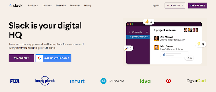
Slack’s website header is quite simple and easy to understand – it has no distracting elements. The message “Slack is your digital HQ” is written in big letters and there are the big Call-To-Action buttons and the logos of the clients who use Slack. It effectively conveys what Slack is and why it is important in an instant, and subtly ushers the user towards the goals of registering or learning more about the tools available.
In short, one has to admit that its design is laconic and rather attractive, and the range of issues it addresses, is quite clear.
2. Creative Corner

Creative Corner’s header is edgy and eye-catching with white, oversized words on a black background that reads, “Turn Your Website Into A Powerful Marketing Tool. ” Again, the value proposition is echoed by the supporting text that describes their services. However, what differentiates the design more is the use of a logo placed right at the header background that features programming icons, thus giving the website a cool tech theme and vibe that is in line with the firm’s focus.
Other broadly appealing aspects of the site layout include the clear Call-To-Action button and the easily navigable structure.
3. Convert
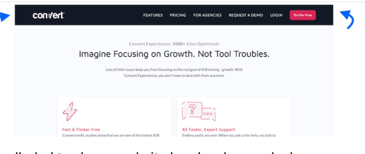
With its minimalist design, Convert’s header exudes a sense of simplicity and focus. The headline “Imagine Focusing on Growth. Not Tool Troubles.” effectively communicates their core value prop. The use of icons and concise text highlights key features without overwhelming the user.
The contrasting red call-to-action button amidst the predominantly blue color scheme creates a visual hierarchy, guiding users toward the desired action.
4. Brightcove
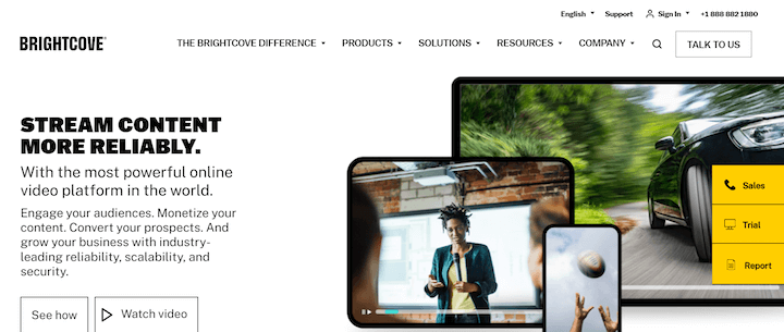
Brightcove’s header is immersive and visually compelling. It showcases its online video platform through a large auto-playing video. The headline “Stream Content More Reliably” reinforces their value proposition, supported by descriptive subtext. The contrasting yellow call-to-action buttons foster engagement, while the clean navigation menu enables easy exploration.
This multimedia-rich header effectively demonstrates the power of their platform.
4. Developer.com

The developer.com’s header has a clean and efficient design. It is well-suited to developers and technology professionals. The major dropdown menus provide an organized way to drill down through content by programming language, platform and other topics so users can easily find their section of interest.
There is also a search bar for more specific queries. Featured in “Top articles” section is the most viewed and helpful one. Summing up the header gives a clean and easy-to-use experience in which the user will get to know about everything he is looking for, faster than before.
Read also: 6 Stunning eCommerce Website Design Examples
5. WordStream
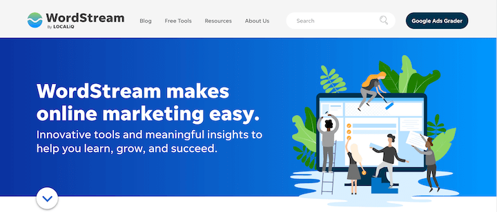
The WordStream header is an excellent example of an effective website header design. It has a simple and easily understandable tagline ‘WordStream makes online marketing easy’ that communicates the function of the firm. Furthermore, the illustration strengthens the message with illustrative appeal signifying learning, growth, and success, aligning with the commitment to deliver “innovative tools and meaningful insights. ”
The elements of the graphic design are arranged neatly, the use of bright contrasting colors of magenta and white for the typography is perfect and has successfully captured the eye of the visitor.
6. Nike

Nike’s header is attention-grabbing with the tagline ‘Firsts Together,” which does an excellent job of representing Nike’s brand and encourages consumers to buy back-to-school supplies to kick things off. The leg image decided for the ad and likely displayed on a sports ground or a court enhances Nike’s athletic theme. The clean and easily understandable buttons are commanding the users to take the next step of exploring the products.
On balance, this header is a very good example of how Nike’s brand vision and icon can be incorporated into a seasonal promo, and how a brand leader can make sure its website header captures customers’ interest and contributes well to the overall goal of the site.
Read also: Email Design Best Practices: Do Your Designs Convert?
Common Mistakes to Avoid When Designing Your Website Header
Here are some pitfalls that can significantly have a negative impact on the user experience and site performance.
- One such common mistake is overcrowding the header with too many elements. This can overwhelm users, making it difficult for them to locate the information or navigation options they need, potentially leading to increased bounce rates as visitors may leave the site out of frustration.
- Another frequent error is the use of hidden navigation menus, often represented by the ‘hamburger’ icon. While this design choice can create a cleaner look, it may also hinder site usability, especially for less tech-savvy visitors who might not immediately recognize this symbol as a menu. This can slow down the navigation process, as users take longer to find essential links, impacting the site’s overall user engagement metrics.
- Failing to optimize the header for mobile devices is a critical oversight. With a significant portion of web traffic coming from mobile users, a header that does not adjust to smaller screens can lead to poor layout display, unreadable text, and inaccessible navigation links. This not only affects the user’s ability to interact with the site but can also harm the site’s search engine rankings, as mobile-friendliness is a key factor in search algorithms.
- Incorporating too many high-resolution images or complex animations in the header can also affect site performance by increasing page load times. In today’s digital environment, where speed is of the essence, longer loading times can lead to user impatience and site abandonment, thereby reducing the site’s ability to retain visitors.
Read also: 15 Excellent Newsletter Examples for Creative Inspiration
Conclusion
A small business owner who seeks to get a great first impression about their business online cannot afford to underestimate the importance of a great website header.
The insights and examples shared throughout this article serve as a foundation for understanding how strategic header design can enhance user experience, improve site navigation, and contribute to business success. These principles should be considered when designing website headers, though small business owners must make sure that their headers are not too pretty to function properly.
For those seeking to refine their website’s first impression further, consulting with professional web designers offers a pathway to personalized advice and expert implementation. Many small businesses also turn to top WordPress developers to ensure their headers are not only beautiful but fully optimized for performance and responsiveness.
Advertisers know what approach and what design might be most effective to achieve specific objectives, thus protecting the specific purpose of the website header but also making it able to attract attention and turn it into action and clients effectively.
FAQ
1. What is the ideal size for a website header?
The ideal size for a website header varies depending on the overall design and layout of your site. However, a common practice is to keep the height within the range of 100 to 150 pixels and the width corresponding to the full width of the webpage.
This size ensures that the header is noticeable without overwhelming the content below it. It’s important to maintain a balance where the header provides essential navigation and branding without detracting from the user’s ability to engage with the site’s content.
2. How often should I update my website’s header?
Updating your website’s header should be based on several factors, including branding changes, user feedback, and website performance data. A good rule of thumb is to consider updating your header when you undergo a rebranding, when navigation needs become clearer, or when you want to refresh the look of your site to keep it modern.
Generally, evaluating your header’s effectiveness annually is a good practice, but don’t hesitate to make changes as needed to ensure your site remains engaging and user-friendly.
3. Can a website have multiple headers?
Yes, a website can have multiple headers, but this approach requires careful planning to avoid confusing your visitors. Different headers can be used for various purposes, such as a distinct header for the homepage and another for internal pages or separate headers for logged-in users versus guests.
The key is to maintain a cohesive design language and ensure that each header serves a clear purpose, enhancing the user experience rather than detracting from it.
4. What’s the difference between a header and a banner?
A header is a consistent element that appears at the top of every page on a website, containing the logo, navigation, and possibly contact information or a search bar. A banner, on the other hand, is a large image or video that typically appears below the header on the homepage or landing pages, often used to highlight a key message or promotion.
While both are important visual elements, the header focuses on functionality and brand identity, whereas the banner is more about marketing and communication.
5. How do I make my website’s header stand out?
To make your website’s header stand out, focus on unique design elements, such as a memorable logo, an engaging color scheme, or interactive features like a search bar or dropdown menus. Utilizing high-quality images or animations can also capture attention.
Ensure the header is visually distinct from the rest of the page but still cohesive with the overall design. Testing different layouts and designs can help identify what best captures your audience’s attention while maintaining usability.
6. Is it necessary to include social media icons in the header?
Including social media icons in your website’s header is not strictly necessary but can be beneficial for increasing your brand’s reach and engagement. If your social media channels are an active part of your marketing strategy, placing icons in the header makes it easy for visitors to find and follow you.
However, ensure these icons are not overly prominent, distracting from more critical navigation elements or calls to action.
7. How can I ensure my website’s header is mobile-friendly?
Ensuring your website’s header is mobile-friendly involves adopting a responsive design that adjusts to various screen sizes and orientations. This often means simplifying the header for smaller screens, such as using a hamburger menu for navigation links and scaling down logos and images.
Touch-friendly elements, quick loading times, and testing on multiple devices are important for a mobile-friendly header. Prioritize clarity and ease of use to enhance the mobile user experience.
8. What are some tools or platforms to design a website header?
Several tools and platforms can help design an effective website header, including free Photoshop alternatives, Illustrator for custom graphics, and Canva for a more user-friendly option with templates.
Web design platforms like WordPress, Wix, and Squarespace offer built-in tools and themes that allow for header customization without needing extensive design skills. Utilizing these tools, you can create a header that aligns with your brand identity and website goals.
9. How can I test the effectiveness of my website’s header?
Testing the effectiveness of your website’s header can be done through A/B testing, where you compare different versions of your header to see which performs better in terms of user engagement and conversion rates.
Tools like Google Analytics can help track how changes to your header affect your site’s bounce rate, time on site, and navigation patterns. Gathering user feedback through surveys or usability testing can also provide insights into how your header is perceived and how it can be improved.