You’ve probably subscribed to more newsletters than you could read. We’ve all been there!
That’s because most newsletters are not worth our time. But there are a few that we read regularly, hold up as examples, and learn from.
The value contained in the content is what makes a newsletter worth a read. But other elements like layout, branding, graphics, and personalization play a major role. They give it the personality that subscribers resonate with over time.
Think of these aspects as ingredients that go into your favorite meal 😊
In this blog post, we’ll show you 15 of the best newsletter examples for various niches to inspire you to create your own.
Table of Contents
What Makes a Good Newsletter?
A good newsletter is one where one element does not overpower the other. No, they blend seamlessly for a smooth, engaging user experience. Let’s take a look at some of them.
1. An engaging subject line
The subject line should be crisp and clear. Make sure it speaks to a specific pain point and matches the content of your newsletter.
2. Visual branding
A logo placed in the email’s header helps subscribers identify you instantly. This makes it much less likely they’ll report you as spam. Your brand name and tagline should accompany the logo to build an association in their minds.
Use appealing colors to attract attention. If you think too many elements in the header could distract your readers, you can fit the tagline just above the footer section, too (more on that later).
Read also: 7 Winter Newsletter Ideas to Cozy Up to Your Subscribers
3. A clear email headline
The headline is the next thing your readers are going to see.
The key is to clearly describe the ‘what’ and ‘why’ – the big takeaways that they can get from your newsletter and how it relates to the problems they may be facing. Again, keep it simple and to the point.
You only have a few seconds to make a good impression and get them to read more.
4. Proper formatting and clean layout
61.9% of emails were opened on smartphones in 2023.
That makes the format and layout of your email newsletter even more important. Make sure the visual and interactive elements like images, CTA buttons, and links render correctly and can be clicked easily on different devices.
Enhance the overall user experience by using short paragraphs, bullet points, and headings.
5. Beautiful design
Fonts, colors, and images all play a key role in defining the look of your email newsletter.
Stay consistent with these elements, and you’ll have built trust with your audience. GIFs can be used to attract attention to specific parts of the newsletter, as can attractive CTA buttons.
Use high-resolution images to add context to the text and make it look more presentable. If you have multiple products, dynamic galleries can be very effective.
6. Desirable content length
There’s no right or wrong answer regarding how much content an email newsletter should have.
However, quality is always better than quantity in email marketing. As attention spans grow shorter, shorter newsletters with bullet points, infographics, and pull quotes tend to work better.
The key is to use A/B testing and analytics to gauge customer preferences to determine the right length.
15 Brilliant Newsletter Examples From Top Brands and Influencers
We’ve compiled 15 of the best newsletters across eCommerce, real estate, nonprofit, and education/tech to inspire you to create your own.
Let’s get started!
Best eCommerce newsletter examples
Right, let’s start with our top eCommerce picks.
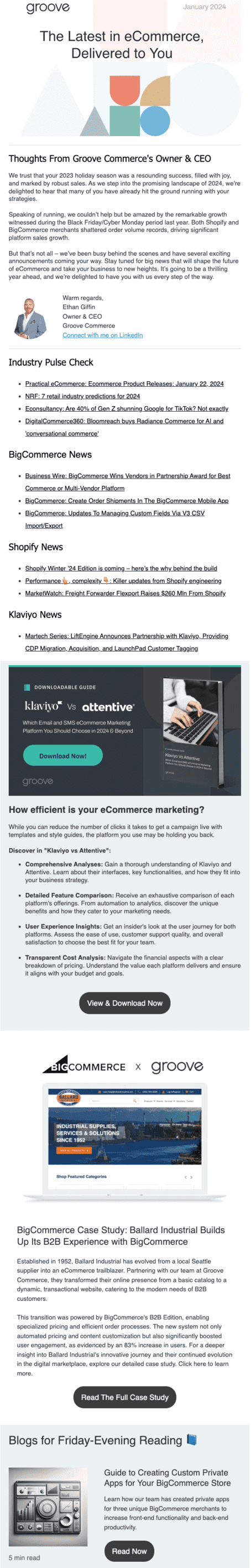
1. Groove Commerce
Whether you sell on Shopify or BigCommerce, Groove Commerce should be a part of your reading routine.
Skim through it, and you will get the latest news and updates on eCommerce trends, online marketing, etc. The layout is as clean as it gets. The trending news topics of the month are arranged at the top for you to browse through quickly.
Next, you have in-depth case studies and blogs with clear CTA buttons rendered in classic black and white. They also break up the text somewhat making for a better reading experience. You’ll notice that it reads just as well on a smartphone as on a desktop, thanks to a responsive design.
This newsletter tops our list because it sticks to tried and tested email marketing principles and delivers what it promises.
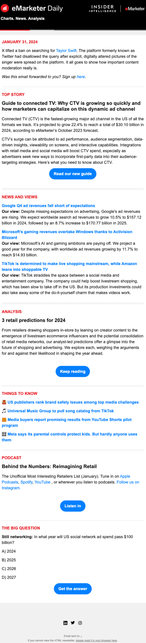
2. eMarketer Daily
eMarketer Daily from Insider Intelligence (formerly eMarketer) reads somewhat like a newspaper with clear headings that pique your interest.
The header is an example of good branding as it has the same theme as the website. Similar to a newspaper, the top of the fold is dominated by a feature article followed by a news snippets section.
You’ll notice that the CTA buttons are rendered in blue, which stands out against the white background. The font is consistent throughout the newsletter, which minimizes rendering issues across different email clients.
What stands out about the layout are the horizontal lines demarcating each section – a great non-verbal cue for the reader to keep scrolling. Clean, neat, and simple.
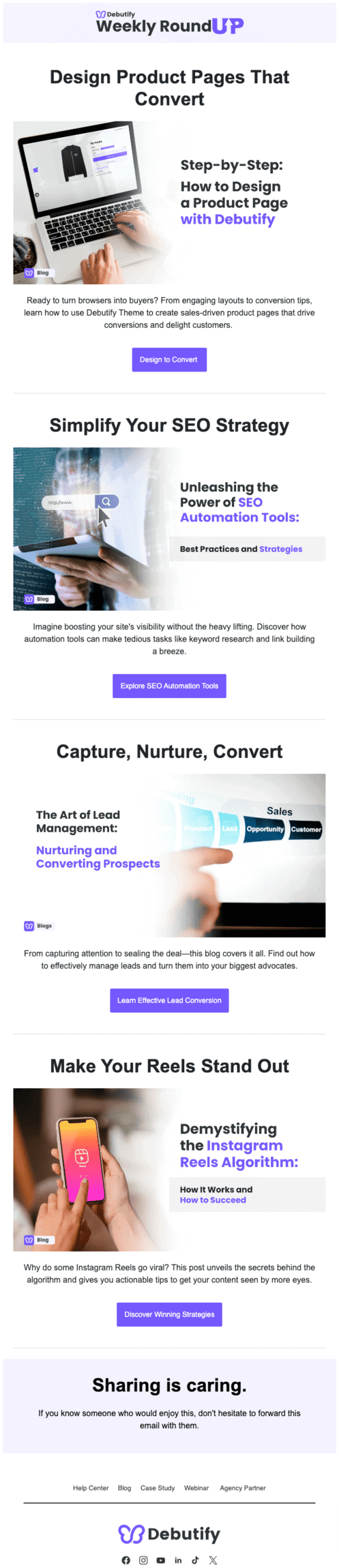
3. DeButify
The Debutify Newsletter delivers eCommerce news, strategies, and insights to your inbox every week.
Notice the minimalist layout with plenty of white space between each piece of content. The use of banner images at the start of each section makes it easy on the eyes, and the action-oriented CTAs certainly are click-worthy.
The header is quite subtle, with a grey-toned background and the navigation bar pushed to the footer section, which also has the usual social links, preferences, and privacy policy tabs. The large font and images make the email look less cluttered, especially on smaller screens.
This could be a great template for inspiration if you want to create a blog newsletter introducing each new post you add to your website.
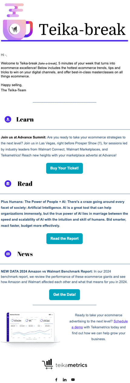
4. Tieka-Break
Tieka-Break is another top-notch eCommerce newsletter from Tieka Metrics, an eCommerce ad management platform.
They’re among the brands that have been breaking away from convention. Instead of designing emails for desktop and then optimizing for mobile, they’re creating mobile-first email layouts that look great on desktop screens.
This has been shown to save time and money – an obvious advantage in the fast-paced world of email marketing. If the mobile version is too narrow for your desktop, you can click the ‘view in browser’ option in the top right corner of the header.
Though there are no images, the text contrasts with the white background to improve readability. A large chunk of the header is devoted to branding and a quick introduction, which is a good practice to keep spam checkers at bay.
Read also: Do Your Emails Convert? A Guide on Email Design Best Practices
Community newsletter examples
Next, let’s look at some examples of community newsletters.
These are similar to social media groups as they target hobbyists, alumni associations, or interest-based groups. Of course, you can apply the ideas you glean from them to all sorts of newsletters.
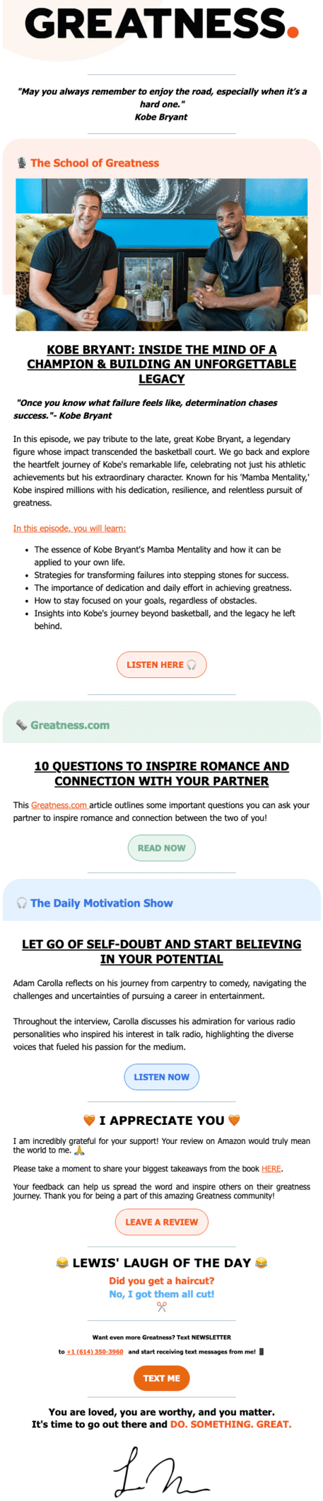
1. Lewis Howes
Lewis Howes runs the School of Greatness Podcast, a top-rated personal growth podcast with millions of subscribers.
His newsletter, Greatness, is essentially an off-shoot of his podcast. It carries guest profiles, curated articles on health and wellness from across the web, event invitations, etc.
You’ll notice it has none of the ‘unsubscribe’ or ‘update preferences’ links in most marketing newsletters. This is because most community newsletter subscribers come from podcast platforms and social media. They are generally very familiar with the brand and, hence, are not likely to unsubscribe in a hurry.
Notice how the brand leverages its newsletter to ask for Amazon reviews and testimonials — valuable insights that can be easily repurposed as user-generated content across various channels.
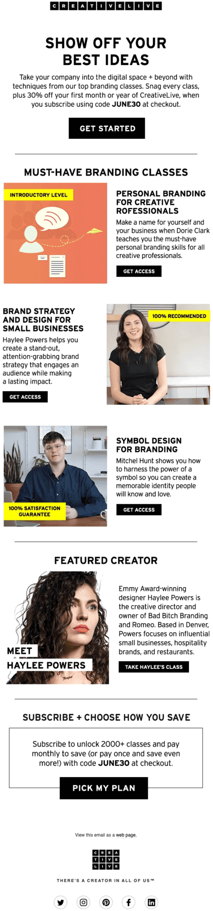
2. Creative Live
Creative Live is an online education company that offers courses in multiple disciplines.
Their newsletter is aimed primarily at the 10 million+ students who take courses on the platform, plus design enthusiasts across the world.
Notice how the header is dedicated to sharing upcoming class schedules and the all-important discount offer. If you have a strong online presence, this newsletter example might help you.
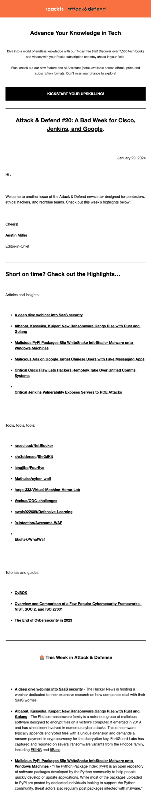
3. Packt
Packt is an online learning platform for software developers across multiple specializations.
Attack and Defend is one of many newsletters they leverage to share new ideas with their community. What caught our attention about the layout is the minimalistic design and basic typography.
The black and white CTAs provide high contrast, and the generous use of white space makes the content easy to read. If your newsletter carries coding instructions like Packt’s does, good readability is non-negotiable. The hero image and logo add a dash of color to the header, but this newsletter is strictly business for the most part.
It’s clean, simple, and designed to showcase the brand’s expertise over aesthetics. While this newsletter may lag slightly on aesthetics, it scores top marks for deliverability and user experience.
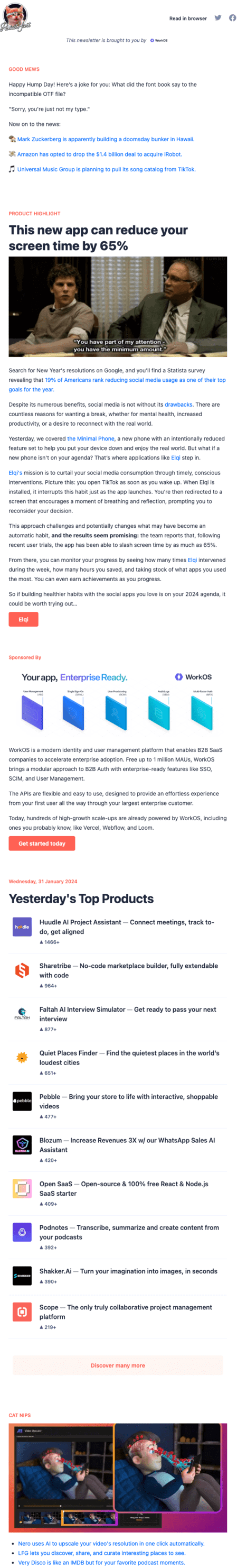
4. Product Hunt
Product Hunt is a community for tech enthusiasts to share tips and reviews about apps, websites, and more.
The daily newsletter is a great way to get the latest updates delivered to your inbox. It carries a section dedicated to the top products of the day.
This is a fun newsletter that makes space for interactive elements like GIFs while using a tiny logo in the header. This is another characteristic of community newsletters – they aim for authenticity and engagement.
Interestingly, the CTA buttons for the featured article sections are rendered in different colors as a way to drive click-throughs, while the feedback link at the bottom is rendered in grey.
This creates a visual hierarchy within the email, which enhances the user experience. Notice how the footer section — with the social links and preferences links — blends seamlessly into the rest of the layout (check source link).
Read also: 10 Fall Newsletter Ideas You’ll Love [+Tips, Examples]
Newsletter examples for real estate
Here are some real estate newsletters that caught our attention.
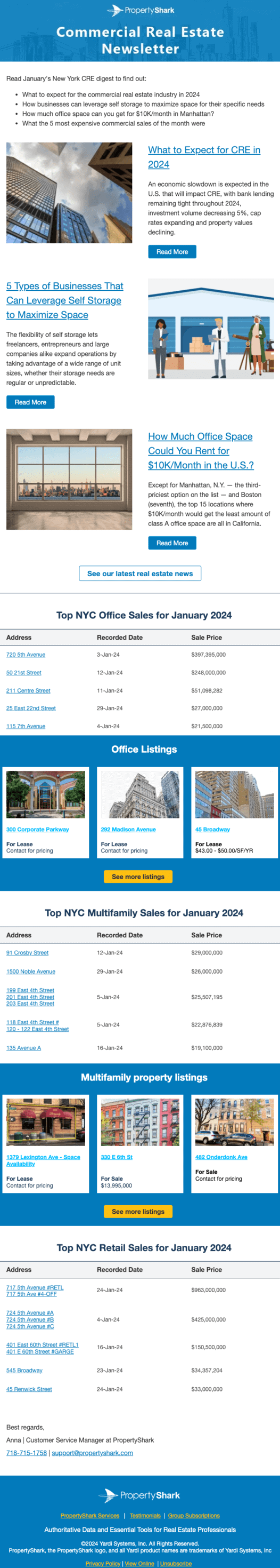
1. Property Shark
Property Shark is a monthly real estate newsletter that provides industry news, property listings, and sales statistics for New York.
The layout is dominated by two image galleries featuring active listings with a blue background to attract attention.
Readers can browse through the key sales figures by category. The main news content is placed up top with thumbnail images and CTA buttons that are equally attractive. The header and footer sport their logo, while the tagline is in the footer alone.
This can be a good way to declutter the header and encourage readers to focus on the content at the top of the fold. Including the tagline and landing page links in the footer encourages the reader to learn more about the brand by visiting its website and other channels.
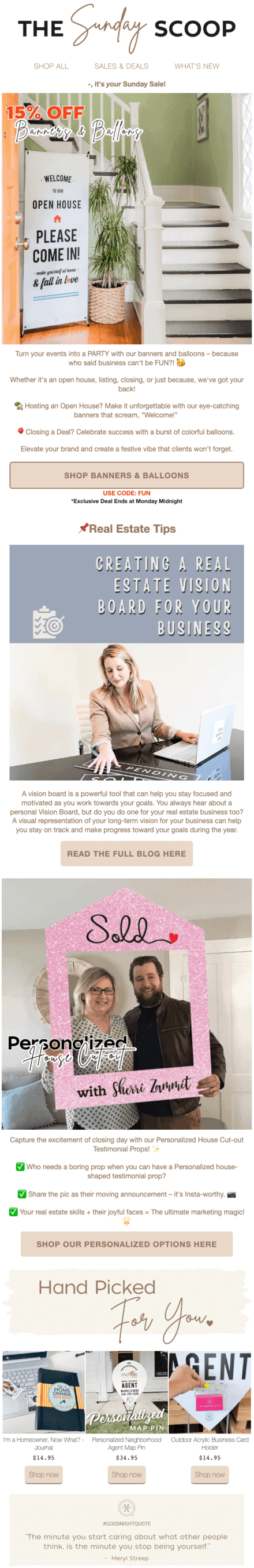
2. All Things Real Estate
All Things Real Estate is quite distinctive for a real estate newsletter.
It emphasizes design over data and stands out from the competition. The layout is sprinkled with banner images and assorted typography that give it a fresh look and feel, similar to a glossy magazine.
Note that the header has a navigation bar below the logo, while the footer only includes the social links and contact information.
This strategy can work depending on the audience you work with.
Read also: Creative Newsletter Name Ideas and Examples for Small Businesses
Newsletter examples for nonprofits
If you’re a nonprofit owner or marketer, here are five nonprofit newsletter examples to draw inspiration from.
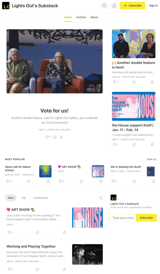
1. Lights Out
Light’s Out is a non-profit that provides a platform for upcoming music artists to showcase their talent.
Their Substack newsletter features a new artist each week, plus a mix of news and events related to the music industry. The articles often feature embedded videos that make it all the more interesting.
The branding is standard; however, the videos and image gallery make this newsletter stand out.
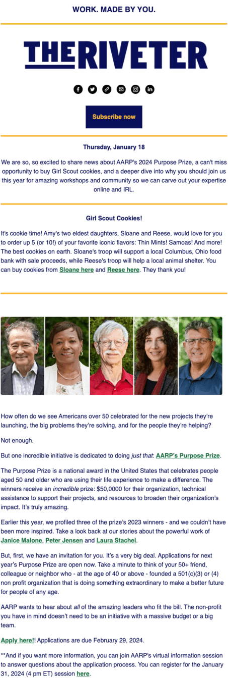
2. The Riveter
The Riveter is a non-profit women-only networking platform that enables members to share career and life advice.
Their newsletter focuses extensively on branding, with the logo, tagline, and email sign-up form all included in the header.
The layout makes minimal use of images, but the text contrasts well with the white background — making it easy on the eyes. The horizontal lines also help the reader skim through the content quickly before starting to read.
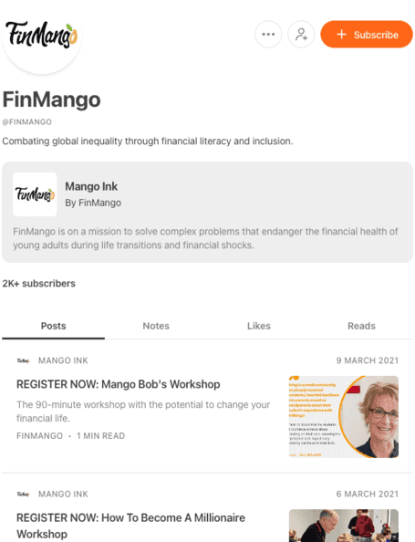
3. Mango Ink
Mango Ink is a Substack newsletter run by FinMango, a non-profit focusing on spreading financial literacy among young people.
Substack’s clean layout and simple design make the newsletter an easy read. You’ll notice that branding is minimal, and the content occupies much more space.
If you’re promoting a non-profit event, this can be a great way to increase sign-ups – most users view their email via mobile. A single-column, black text on a white background layout checks all the boxes in terms of readability.
Read also: Effective Newsletter Email Templates for Small Businesses in 2024
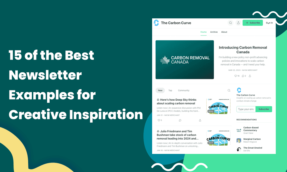
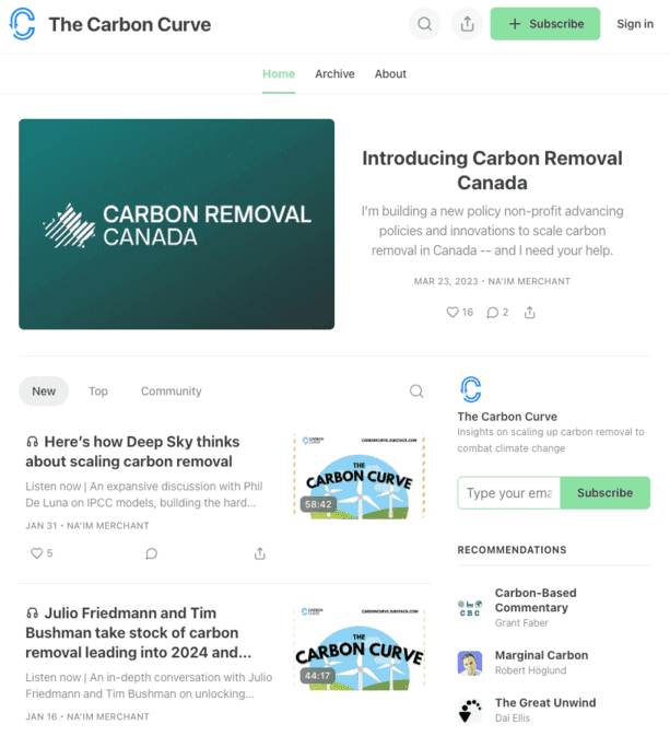
4. The Carbon Curve
The Carbon Curve campaigns for carbon dioxide reduction from the atmosphere.
They run a podcast and a weekly newsletter aimed at helping non-profits, investors, and companies collaborate toward this. In a unique touch, the header features an audio snippet from the latest podcast episode before diving into a review of the key talking points.
You’d also see brief profiles of the host himself along with the guests. This could be a great template to use if you’re a beginner. There are dozens of newsletter platforms you can use to build simple newsletters of this type.
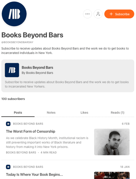
5. Books Beyond Bars
Books Beyond Bars is a non-profit that provides books for free to prison inmates across the State of New York.
The newsletter carries book reviews, event updates, and team profiles with large-size images. Substack provides readers an email-like experience with social sharing, sign-up, and search options within easy reach.
Read also: 21 Email Newsletter Software That Are Hot in 2024
Wrap Up
We hope our curated collection of the best newsletter examples inspired you!
Ready to start your own? EngageBay is here to help 😊
EngageBay is an all-in-marketing, sales, and customer support software for small businesses, startups, and solopreneurs.
With EngageBay, you can create newsletters quickly from scratch or choose from hundreds of beautiful email templates, automate your campaigns, A/B test each element of your emails, manage your subscribers, and even create visually stunning landing pages.
Sign up for free or book a demo with our experts.