How well do your email marketing campaigns perform? According to Constant Contact, an average email open rate of 34.51 percent and click-through rate of 1.33 percent over 200 million emails is common in 2023.
Considering these metrics vary by industry, if yours are under average, one factor to consider is your email design. A well-designed email appeals to the audience segment who receives it. Your email should be responsive, perhaps interactive, and certainly mobile-optimized.
The email design best practices in this blog post will serve you well if you are looking for some inspiration and useful tips for your campaigns.
Table of Contents
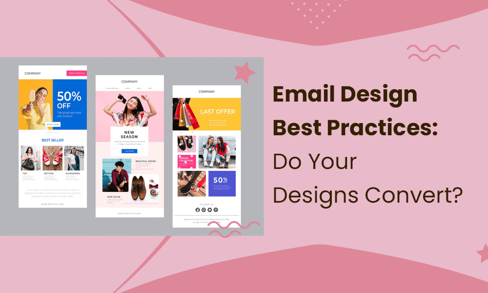
Email Design Best Practices For Beautiful Campaigns
Let’s go through some tips that have proven to work for the best email marketers.
1. A/B test everything
It doesn’t matter how advanced email technology and design get: split testing will always be necessary.
You have more ways of A/B testing your email content than ever. Many email marketing tools have built-in automation or AI that can compare your emails without you having to do so manually. These tools help you identify the best images, CTA placement, subject lines, email length, and even when to send.
Split testing ensures your message is relevant, performance-oriented, and ready to launch.
2. Include the right info in the footer
-

Image courtesy of Brevo
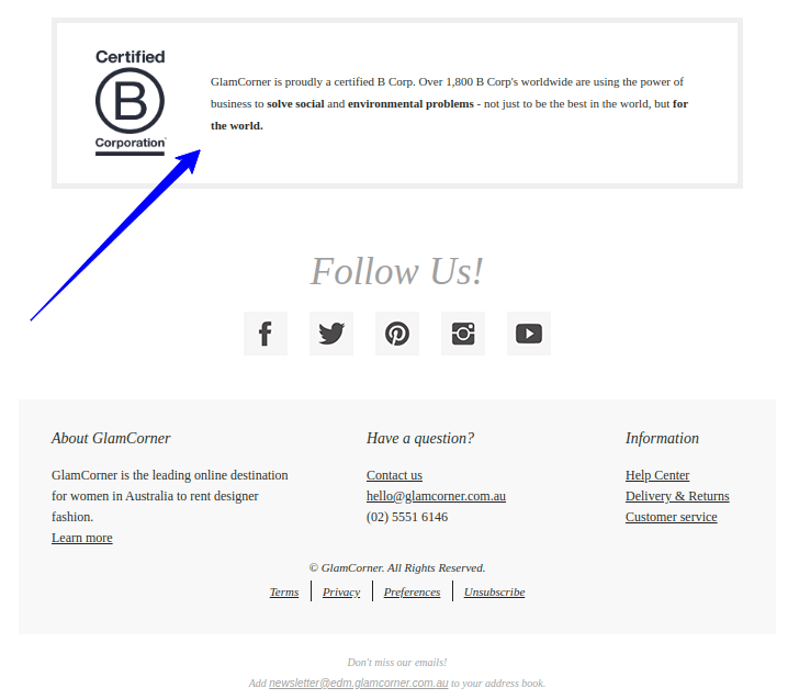
An email footer or signature block is one of the most important portions of your message, even if it isn’t above the fold. Some marketers use generic footers, doing themselves no favors.
So, what should you include in your email footer? Here are some ideas:
- Support links: You can use this section to solicit feedback on your email (unless sending from a no-reply email address) or provide support links so customers or leads can get answers to their questions.
- Referral links: An email footer is an ideal place for referral links, especially if your referral program is new and you’re spreading awareness.
- App link: Encourage more app downloads and engagement by including a link to your app in the Google Play Store and Apple App Store in your email footer.
- Social media links: Create social media buttons for the major platforms, including Facebook, LinkedIn, Twitter, Instagram, and YouTube. Add hyperlinks to each button.
- Website link: It doesn’t hurt to add an extra link to your website in the footer. However, if your footer is already link-heavy, you can omit this one.
- Legal information: You must include a succinct but thorough legal statement, including an unsubscribe link, stating that you will not share personal information. Spell out your terms and conditions in this legal statement, and consider consulting with an attorney for review.
Read also: Email Animation Station – Your Guide To GIFs And More
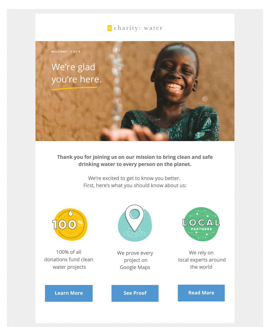
3. A minimalist design is fine
-

Image courtesy of Uplers
What should your email look like? That’s the million-dollar question, and there’s no one correct answer.
The design of your email will vary depending on the product or service you’re promoting and your audience. However, no matter the design, it can surely benefit from a touch of minimalism. Many new email marketers assume their email must have all the visual bells and whistles to attract a high open and click-through rate.
In actuality, the opposite happens, as a cluttered message looks spammy and could end up in the trash. Don’t fear white space. It makes the visual elements in your email more impactful and gives those elements room to breathe.
It can also help with mobile optimization, ensuring visual elements aren’t stacked on top of each other or otherwise load incorrectly.
Read also: 15 Introduction Email Templates That Work Like A Charm
4. Use dynamic content
Dynamic content is making a splash in email marketing, and rightfully so.
As the name suggests, dynamic content changes based on the audience. This type of email allows you to create personalized content for your audience groups without sending thousands of emails per day.
A good email marketing tool will help you utilize dynamic content to the fullest as it segments and scores your audience automatically. You can also automate the inclusion of dynamic content elements like customer surveys, abandoned cart messages, product or service offers, and recommendations.
Read also: Best CTA Examples for Small Businesses To Learn From
5. Doube-check for grammar and spelling errors
Whether you wrote the email yourself or used an email marketing tool, you should always have at least another set of eyes read over the content before you hit the “send” button (or “schedule” if you’re using a marketing automation tool).
Grammar and spelling errors are embarrassing and reduce your trustworthiness. You can use a Grammarly extension or even ChatGPT to find errors in the copy. These days, it’s so easy to catch these mistakes that we have no excuse for sending an email with less than perfect copy.
Read also: 15 Stunning Email Design Examples from Big Brands (2024)
6. Prioritize mobile optimization
FluentCRM reports that 41 percent of email views come from mobile devices. Your emails must be mobile-optimized to display correctly on smartphones and tablets.
Mobile-responsive email templates are common, but double-check that yours is optimized before sending messages. All elements of your email marketing campaign must be mobile-optimized, including your website and landing pages.
Read also: Onboarding Email Templates for New Clients & Employees
7. Make your messages dark mode-friendly
Dark mode is more popular than ever, with 81.9 percent of mobile users favoring it, says EarthWeb. It’s easier on the eyes than white backgrounds and doesn’t suck up as much mobile device battery.
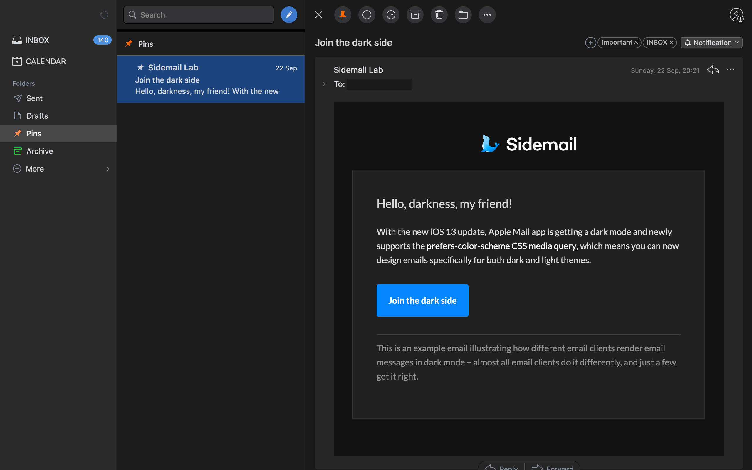
Most email clients support dark mode, whether they offer a partial or full-color invert. Here are some pointers for optimizing your emails for dark mode:
- Make your icons and CTA buttons dark-mode friendly
- Limit saturated colors, favoring paler and more muted hues to avoid visual harshness
- Save your logos and other graphics as transparent PNGs
- Create a translucent outline around all dark text in transparent PNGs
- Test your emails
Read also: What Is An Email Header? 6 Email Header Examples To Learn From
8. Watch your tone
Your tone is one element of your brand. Your audience will expect your emails to maintain the same tone used on your website and social media.
That said, you can switch up your tone depending on your audience. For instance, a younger audience will appreciate an informal tone, whereas an older audience might like a more formally written message.
9. Think about your email layout
Following a conventional email design will help your campaign perform best. Your options include a zig-zag, inverted pyramid, or one-column design.
Here’s an overview of each design style.
- Zig-zag: The alternating images and text pull the eyes in a zig-zag pattern, hence the name. Present your information from left to right to follow how the eye naturally moves when consuming information.
- Inverted pyramid: An inverted pyramid is a great choice if your message has one goal, such as introducing a new product. You present a large image first, then the email body, and a CTA button, creating the shape of an upside-down pyramid.
- One column: A one-column design is an all-rounder with a good balance between images and text. It’s mobile-friendly, appropriately spaces the email elements, and makes for easy, fast reading.
Read also: 18 Trending Email Marketing Campaign Ideas [+ Templates]
10. Go for GIFs
-

Image courtesy of Giphy

GIFs are everywhere these days. We can post them in social media replies, text them to each other, and include them in emails. Selecting GIFs over video gives your emails an animated element without making them large and slow to load.
That said, you must control your GIF size. Don’t send files over 1 MB.
11. Embed your videos
From Thunderbird to Outlook and Gmail, we eagerly await the day when email clients will automatically play videos in an email. Until we live in that age, we can always use HTML5, at least with most email clients.
HTML5 allows us to embed videos into a message. The video will show as an image with a play button. When the reader clicks the button, they can begin watching the video. The video link is hosted on your website or server, not the email client.
Sometimes, GIFs can’t convey your message, especially when debuting a new product or service. That’s when video embeds come in handy.
Read also: 10 Best Email Fonts for Your Next Campaign
12. Add some user-generated content
One of the best ways to build trust in your brand is through social proof. You can tout your brand until you’re blue in the face, but it will always mean more coming from your customers.
User-generated content, or UGC, is from your audience. You don’t ask them to produce it; they do so because they’re genuinely enthused about your product or service and want to share their positive experience with others.
Examples of UGC include social media posts, videos, images, feedback, and reviews posted to a third-party website like a customer’s blog. When you find UGC for your brand, contact the content creator and ask if you can share it in your emails.
Read also: How to Create Great Email Newsletters in 2023 [With 7 Free Templates]
13. Check your links
Whether your emails have two links or 20, you must check them before sending them to your audience.
Click each link, ensuring it takes you to the correct page. Fix any links with typos that might cause an error upon clicking, and delete any dead links.
14. Watch your text-to-image ratio
Another consideration when building your email design is the image-to-text ratio. A well-designed email shouldn’t have too much of either. The ratio requires 60 percent text and 40 percent images.
Sending emails with a wonky text-to-image ratio doesn’t only hurt your campaign from a design perspective. Most internet service providers are likely to think your emails are spam.
15. Prioritize the CTA placements
-

Image courtesy of Campaign Monitor
Your CTA buttons must stick out for your messages to succeed. The button must have enough whitespace; viewers can easily tell the button apart from other visual elements in your email.
The color should be distinct and contrasting but not harsh on the eye, whether viewed in light or dark mode. The higher above the folder the CTA button, the better. A good place to insert the button is in your email header, but don’t stop there.
You can also add a second button near the footer, especially if you have a long message or one with many visual elements that require scrolling.
Read also: Email Blast Examples From Popular Brands to Inspire You
16. Add interactive content
Another great best practice is to use interactive email content. Video is an example of interactive content, but everyone expects it. Why not include an embedded survey or poll during your next email campaign?
You can also use an add-to-cart button, accordion features to expand and retract your messages, offer reveals, rollover effects, product carousels, search options, and animations, such as animated CTA buttons.
These elements take more time and effort to weave into your messages but should have a positive effect.
17. Always have some text copy in your emails
Image-only emails can leave a bad taste in your audience’s mouth. Considering how often people access their emails on a mobile device, you must think they won’t always have access to a reliable internet connection.
What if your images don’t load? It’s not the end of the world if your messages have other elements like video and text. However, an image-only email will look strangely empty. Your leads or customers might assume you sent it accidentally.
This habit can lead to unsubscribes and spam complaints, so don’t risk it.
18. Write good CTAs
Although you don’t need much copy with a CTA button, every word must be airtight and meaningful. Write benefit-focused call-to-action phrases, keeping it specific. The CTA button should also indicate where users will go if they click.
You cannot say “click here,” as that’s not specific enough. Instead, you might write, “click here to learn more about [product name],” or “place your order today.”
Readers know where you’re directing them in both cases. In the first example, you’re taking them to a landing page, and in the second, to a product page.
Read also: 12 Email Invoice Templates to Customize and Click Send
19. Consider your CTA sizes
We discussed the value of whitespace and color for a CTA button, but what about its size? A good size for a CTA button is 50 pixels. It’s large enough that your readers can’t miss it but not so overwhelmingly large that it detracts from the other elements in your email.
20. Use merge tags
Here’s a personalization tip for you. Use merge tags, which pull mailing list data into your messages. You’ll have more customer and lead data, including their full name, nicknames, and usernames.
It will be easier for you to personalize your correspondence and make your messages feel more tailored.
21. Know which mobile email coding to use
You can select between two coding options for your mobile-optimized emails: hybrid or responsive.
Hybrid coding has a layout that changes fluidly depending on the display size. If a user opens the email on their iPad, it would look as good as on their iPhone. Responsive emails utilize CSS and media queries to modify styles so the email looks good on a smaller display.
Read also: 27 Confirmation Email Examples For Customer Delight
22. Write the Alt Text in your email images
Whenever using images, you should also include alt text. This short descriptor of the image contents provides context if your images don’t load and can prevent your email audience from unsubscribing.
23. Choose your fonts carefully
Although you can get flowery with many aspects of your email design, font is not one of them. Email clients have their preferred fonts, such as Times New Roman for Outlook, Arial for Gmail, and Helvetica for Apple Mail.
Other fonts are safe for most email clients, including:
- Impact
- Verdana
- Trebuchet MS
- Tahoma
- Palatino Linotype
- Lucida Grande
- Lucida Sans Unicode
- Lucida Console
- Helvetica
- Georgia
- Courier New
- Comic Sans MS
- Arial Black
However, it’s a good practice to utilize a font fallback, which tells the email client a secondary font to use if it cannot display the original option.
Read also: Master All the Key Types of Email Marketing Campaigns
24. Avoid stock images
Stock images are okay in a pinch, but remember they’re not original to your email marketing campaign. Anyone, including your competitors, can get their hands on them by paying a licensing fee.
Consumers are savvy and might remember seeing a stock image from somewhere before. Using stock images makes you look less credible, so prioritize original images whenever you can. Original images keep your audience engaged and are an extension of your brand.
25. Watch your email image sizes
Bigger isn’t always better, such as with images in emails. A large image loads more slowly, especially if it’s high-res. An image shouldn’t exceed 1 MB as a PNG (it should be less in other formats like JPG) and be no more than 1200 px.
26. Grab attention with the header
The email header is the first indication of what to expect when opening your email, so you must make it good. A header can utilize images, text, or both, with a memorable headline that touches on the reader’s emotions but never misleads them.
Your descriptions after the headline should tell the reader what they’re in for as they continue reading without giving everything away. The goal is to inform and incentivize.
Read also: Re-Engagement Emails 101: A Guide [With Templates]
27. Watch your email width
You don’t want your emails extending beyond the page, which will cause rendering issues and make your emails look unappealing. Most email clients support email widths of 640 pixels, so keep yours within that limit for safer sending.
28. Use contextual marketing
Contextual marketing lends your email a human element and personalization. This form of marketing utilizes a one-on-one element to increase engagement between your brand and the reader.
The personalized elements of these emails make them difficult to resist, and your audience will appreciate how tailored the content is.
29. Add preheaders
Don’t forget your preheaders, which are preview text of what’s inside your email. Check your emails right now, and you’ll see several words of preheader text from any professional email in your inbox.
The preheader text is your chance to encourage your audience to open the message. Again, don’t use misleading, spammy text, which will have the opposite effect.
Read also: Secrets & Templates For a Perfect Gentle Reminder Email
Bottom Line
Email design constantly evolves with consumer preferences, but a few best practices remain.
They include using the right amount of white balance, following the image-to-text ratio, designing good CTAs and placing them properly, prioritizing readability through fonts, and split testing.
Now that you know what your email marketing campaigns need, you’re ready to begin building better emails! Sign up for EngageBay if you want a cool email marketing solution that’s comes with a free integrated CRM.