
A splash page, not the landing page, is the first thing that pops up when a customer visits your website.
The splash page is the first virtual handshake to a potential customer, and as good business etiquette, a firm first handshake leaves an endearing impression.
We have prepared this blog post to help you create a splash (page) for your brand.
Here is a sneak peek:
- What is a splash page?
- What is not a splash page?
- Elements of a splash page
- How to get started with your first splash page
- 5 exemplary splash page examples
Let’s get started!
Table of Contents
What Is a Splash Page?
A splash page is a web page that appears before the main content of a website. It often includes an advertisement or message, and sometimes an image or video. Splash pages are typically used to generate traffic for the main content of a site, such as a blog post or product page.
A splash page typically consists of first-hand information displayed as a note about the company, such as product promotions, services (like a subscription), or discount announcements, and has an exit link.
 Why do you need a splash page?
While splash pages can be used for different intents, there are specific purposes for which they are used to deliver the message better:
- Collection of client information, including contact details, country, age, etc.
- Promotional material such as a new product launch or discount sales announcement.
- Links leading to a different page or a website.
- Disclaimer or warning before you enter the main website.
- Creative announcements about the main webpage.
- Brief information about a service such as membership or subscription.
A splash page is essentially a teaser before the main picture.
For some brands, a splash page may be the first look and feel for the company’s service, while for others, it could be a small part of the bigger picture.
Splash pages are not entirely a necessary addition as, for some brands, they might act as a hurdle to reaching the main page.
Let’s be honest — nobody likes unnecessary pesky, pop-up windows.
A splash page has to be created with an intended purpose.
Read also: 12 Great Landing Page Optimization Practices — The Ultimate Guide
What is not a splash page?
In the section “what is a splash page,” we explained what it is in detail. We’ll now look at this from another angle.
A splash page is not a landing page or the home page. Though the definitions might sound similar, they have different objectives.
Landing pages are designed for marketing or promoting your company. They are specifically designed to boost lead conversions and show what the business does (could be called the digital “window displays”).
A splash page is more like a visiting card — offering a subtle glimpse into the business itself. They are a window to convey (or gather) finite information before a customer enters your portal. They also drive the user to a specific CTA (Call to Action).
Think of the splash page as a receptionist greeting you at the entryway of a superstore and the landing page as the expert marketer who leads you to where you need to be.
A splash page cannot and should not be used as a page where all information is provided before entering the site. This defeats the whole purpose.
Read also: Demystifying Squeeze Pages: 8 Best Practices to Generate Maximum Leads
Breakdown: Elements of a Splash Page
First things first.
To create a great splash page, there are certain elements you need to get right:
- High-quality, eye-catching graphics
- A short but descriptive headliner and copy
- A clear, crisp call-to-action
These three elements form the core of a splash page design and must be fabricated well to serve the purpose.
Now let us dive into the deets.
#1. Visuals are the main players
A splash page or window is the first introduction of your business to a visitor.
What you display here will set the tone for the rest of your website.
A well-composed welcome screen reflecting the brand identity with aesthetic visuals will leave a strong impression on visitors — making them dive further into your website.
On the contrary, a poorly designed splash page will naturally push away potential customers.
Visuals attract and engage, and might include:
- Product images for promotional content
- Background images related to your copy
- Video or animation (Caution! These elements can slow down your page)
To ensure that the splash page performs well across different devices and browsers, you can leverage QA automation tools to automatically test its loading speed, design elements, and functionality.
This helps identify and fix any issues before they affect user experience, ensuring a smooth and professional first impression.
#2. Sharp copy attracts visitors
Descriptive text orient the user toward the purpose of the splash page.
Keep your description simple, accurate, and geared towards action.
A matching headline to grab attention is a great way to introduce your splash page and, ultimately, your brand.
A short and sweet description can get the job done more than paragraphs of text leading nowhere. A site visitor is more likely to dismiss your splash window instantly when there is a lot of unnecessary text.
Also, it is of utmost importance to display content on your splash screen that is not visible anywhere else on the site.
A splash page is not just for introductory purposes but also to present content uniquely limited to the splash page itself.
#3. Lights, camera, call-to-action!
The call-to-action is the element that sets the action you want your website visitors to take.
A CTA is crucial as it leads your customer to take proper action that benefits you and the customer.
Without a definite CTA, a customer would just exit without giving you information or land on the page you need them to land. While having a CTA is effective, displaying an exit mark is also something you need to consider as it makes your splash page’s design more visitor-friendly.
A CTA entirely depends on the objective you wish to accomplish through your splash page; here are some examples of CTA usage to give you a clearer picture:
- Choosing your country or region.
- Age verification to enter the website.
- Instructions to have the best user experience, such as turning on the volume.
- Entering information such as email, subscription, etc.
- Information leading to a sales event on the main website.
And many more…
 Get inspired by the best sales page examples to create high-converting pages – explore our comprehensive guide now!
How To Get Started With Your First Splash Page
But first, how do you get started on your splash page?
Hiring a third-party expert designer will be a good initiative if you need a professionally designed splash page.
If you are someone who loves doing on their own, choosing a template that works for you and reflects your brand is the first step.
Multiple websites offer professionally designed templates:
Ready to get started?
Wait, wait, we have some more content to motivate you!
Read also: 12 Great Landing Page Optimization Practices: The Ultimate Guide
5 Exemplary Splash Page Models To Inspire You
Nothing beats real-life examples. That’s why we have five amazing and appealing examples to stir up your creative self — these brands have employed the best practices and nailed the design element of their introductory screen, too.
Dive in!
#1. Age-restriction splash page by Budweiser
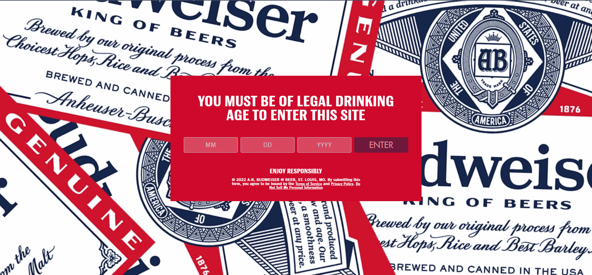
Budweiser, being a beer company, has weaved the age restriction cleverly through their splash page. The background image of the splash window is attractive as it mirrors the brand.
The web design is simple, yet the objective of the splash screen is straightforward.
Why this made our list:
- Design: The design is simple yet reflects the brand.
- Purpose: Age restriction is the purpose, and the splash window creatively exhibits the intent.
- On-point CTA: Once you enter your age, it leads you to the main page; the CTA is precise.
#2. Creative description by HootSuite
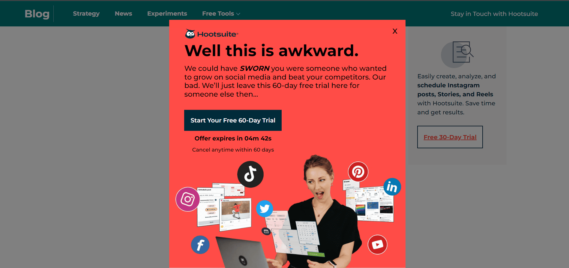
Hootsuite has provided an innovative yet funny description to get visitors to subscribe and start a free trial. This copy not only states the objective but also piques the visitor’s interest.
Why this made our list:
- Creative copy: The funny yet purposeful description has made the splash page unique and stands out among competitors.
- Corresponding design: The images on the splash window are connected to the description and show the purpose of the splash page clearly.
- Exit link: Not everyone who visits your page wants to subscribe, and Hootsuite knows this. They have made the page more visitor-friendly by providing an exit button.
#3. A ‘visiting card’ splash page by Schmoll Creative
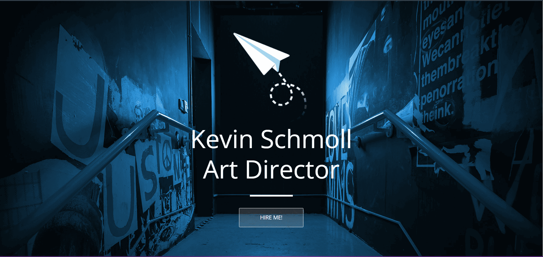
Here’s another example of a good splash page; it is used quite literally as the first handshake. By clicking the ‘Hire me’ CTA, you are led to an introduction about the person.
Why this made our list:
- Originality: An original idea to use a splash page as an introductory poster.
- Clear CTA: The CTA leads to more information about the person, which could be valuable to a visitor.
#4. Pool Suite’s ingenious splash page
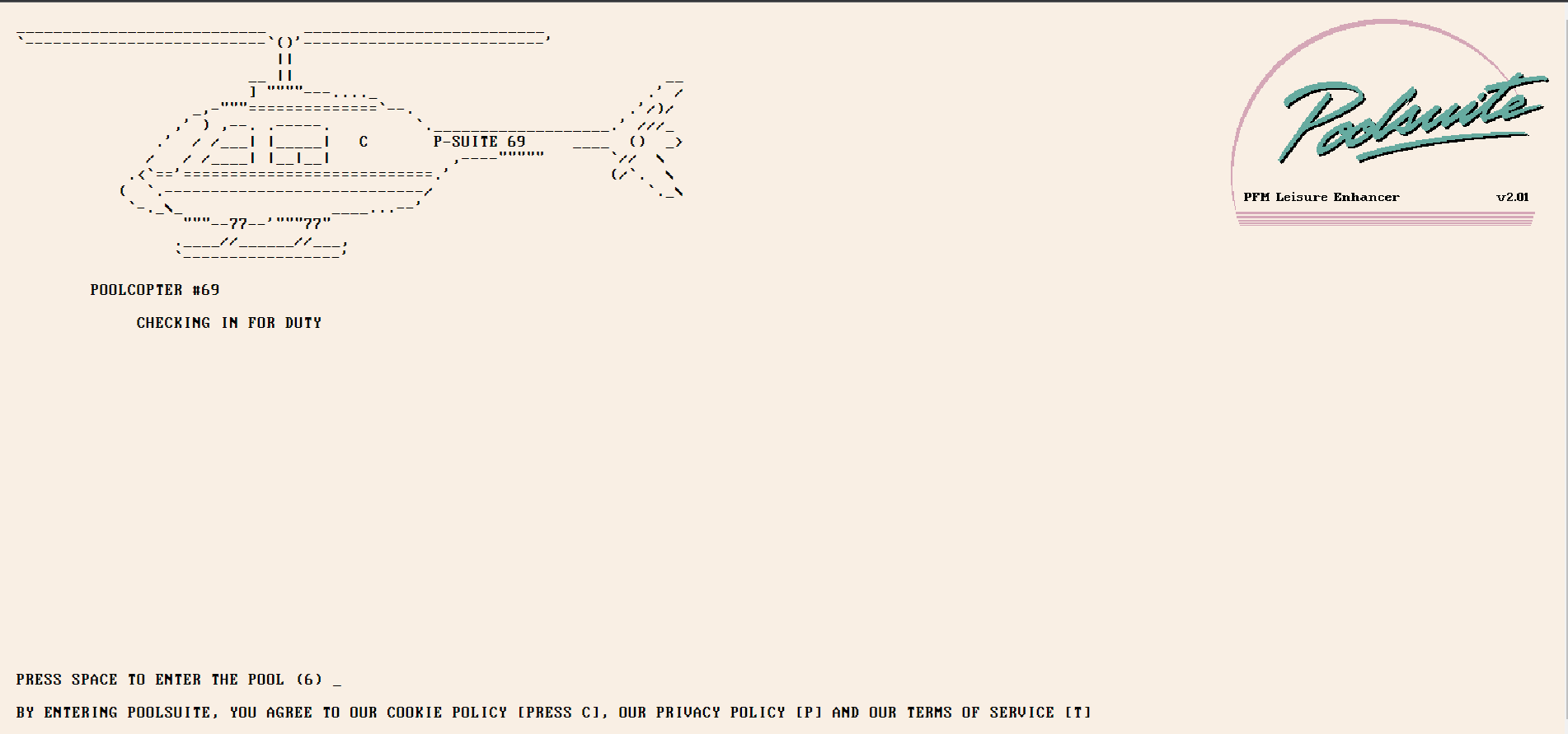
The Poolsuites’ splash page is an exciting loading page before you enter the leading site. The visuals are portrayed creatively and ingeniously, making them intriguing.
Why this made our list:
- Unconventional idea: Engaging visuals paired with the right text make the loading page unique.
- Cool theme: The theme of the main website is followed on the loading page, which makes the transition smooth and captivating.
#5. Promoting an event — Resident Evil
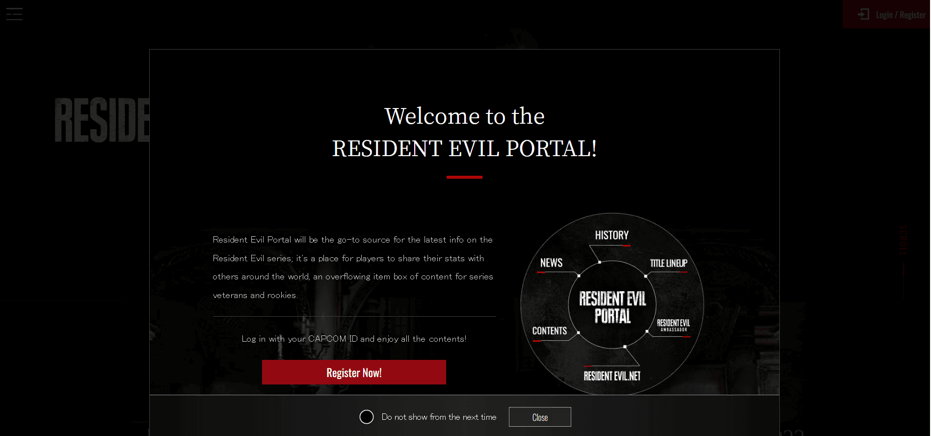
To announce the resident evil game series, the splash page for game.capcom.com displays all the resources about the series. While promoting the new series, they made all the resources available to visitors.
Why this made our list:
- Resourceful: The splash window is resourceful and provides apt information on the new series.
- Clear CTA: By creating a clear “register” CTA, the website ensures the right visitors end up where they need to.
- Precise exit link: The close button provides a clean exit for those looking to enter the portal directly.
Read also: 20 Of The Best Product Landing Page Examples Online
Winding Up
Splash pages can be a great way to introduce your brand to the user. Although not entirely necessary to include a splash page, they can be a fine addition if used with a clear objective.
Before we wrap up, here are a few points to keep in mind before getting started with your splash page:
- Objective matters: Splash pages need to be driven by intent. It is not a fancy visual addition to your page; if there is no purpose behind a splash page, it will be an unnecessary pop-up window.
- Less is always more: Keep your design simple and straightforward with concise information and a definite CTA.
- Responsive design: Ensure your design is responsive and visitor friendly. There is no point in having a splash page that slows down the loading time.
- Monitor your analytics: Stay on track by measuring your analytics to ensure your splash page is received how it needs to be.
- Last but not least, don’t forget to make a splash 🙂
Need a landing page builder that can help you create visually stunning pages? Try out EngageBay for free!