Are you happy with the way you’ve been advertising online? Are you wondering if your banner ads drive click-throughs?
What elements of a successful banner ad make it impossible to resist?
Great banner ads do not happen overnight. It is no longer adequate that ads are eye-catching; they must have a clear purpose to generate leads.
A web banner design should be carefully created with a balance of innovation, creativity, and purpose.
Here is what you’ll learn in this blog post:
- What are banner ads?
- Why have banner ads?
- Thumb rules to create an effective banner ad
- Banner Ad hall of fame: 10 banner ad examples of successful advertising
Happy reading!
Table of Contents
What Are Banner Ads?
Banner ads are a form of web advertising that features a graphical image and text, usually promoting a product or service. Banner ads are typically displayed as rectangular boxes above or below the main content of a web page.
They can also be found on the sides of web pages in horizontal rows or columns, or in other places where they can be viewed by site visitors.
Web banner advertising is more visual than text to instantly grab the audience’s attention. Using persuasive visuals to make the user click on the ad promptly makes banner ads successful in lead generation.
Banner ads are placed on web pages with high traffic and excellent visibility to create brand awareness and drive traffic to the target website.
A typical banner ad design usually has attractive visuals, contains minimal text, and conveys a clear message.
If you want to make banner ads that look great, this guide to creating banners can assist you in delivering banner ads that look amazing and attract people to click on them.
Read also: How to Maximize Your Return on Ad Spend (ROAS) in 2024
Banner Ad Hall of Fame: 10 Banner Ad Examples of Successful Advertising
In later sections, we’ll discuss what elements make up great banner ads, and some best practices for beginners.
In this section, we have some fantastic banner ad examples and why they stand out:
#1. Opportunistic ad: AT&T
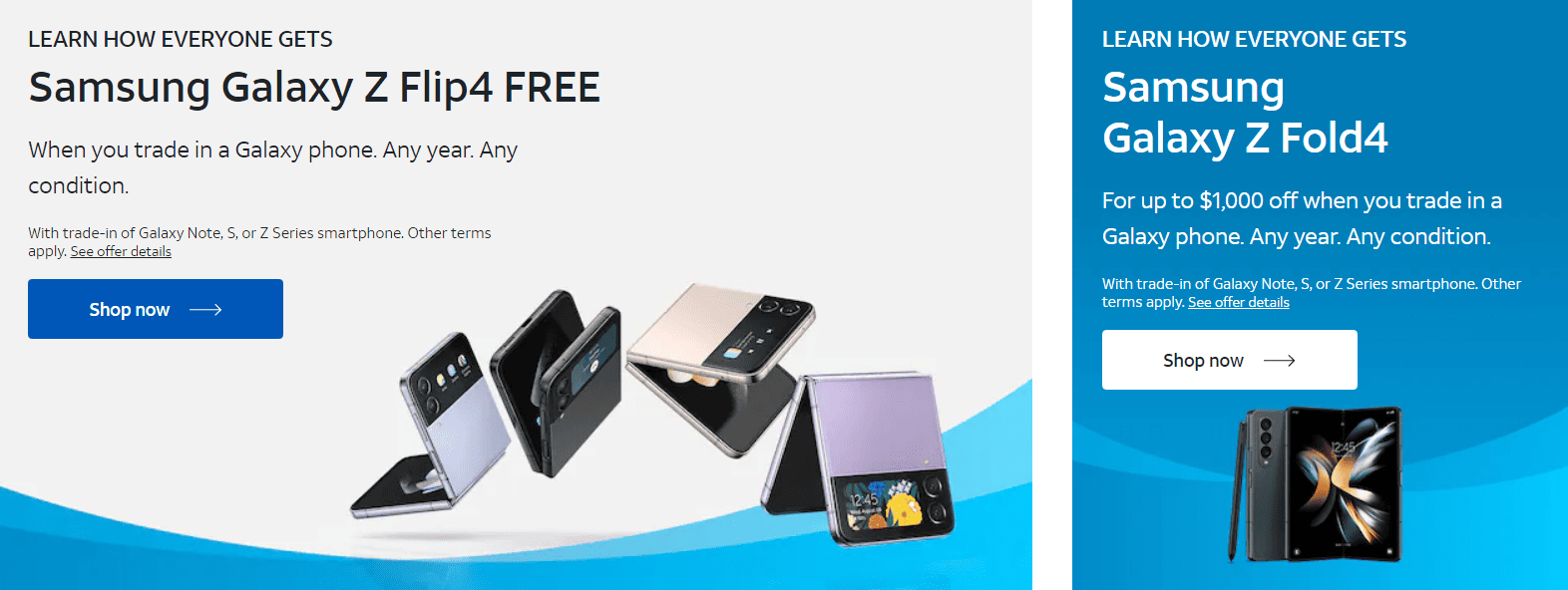
What better way to advertise than to urge the audience to take action?
That is precisely what AT&T tried to achieve by marketing a free product of high value to compel the users to click on the ad and follow through with the next steps.
Smart!
#2. Creative word play for the win: FinalStraw

Using humor and clever wordplay, this banner ad by Finalstraw strikes gold. This strategy by FinalStraw has made the brand stand out and has helped create an impression.
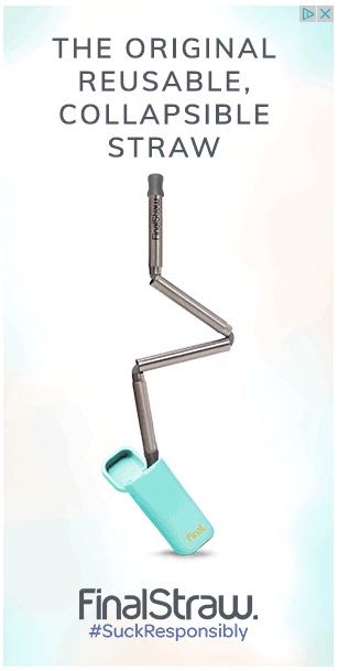
The value proposal of reusable, collapsible, and portable straws which are environment friendly has been emphasized with the relevant image, copy, and hashtag.
It sucks customers right into the ad 🙂
Read also: Everything You Need to Know About Advocacy Advertising
#3. Adorable animation: IBM

IBM has used simple animation to garner the attention of the audience.
This creative usage of animation to convey a message and compel the audience to visit their site has made it on our list for its simplicity yet strong message.
#4. Minimal Design: Samsung

Samsung has created a sharp, neat banner ad that does nothing more than precisely deliver the message.
The design is attractive and gives a break from the usual colorful and bright banner ads, making it a unique display.
#5. A sense of mystery: Hermes Paris

Hermes has instilled a sense of mystery that would pique the audience’s interest, compelling them to click the CTA and learn more.
This simple yet effective design has nothing but a strong visual with a persuasive CTA; this approach works for Hermes as they don’t need to describe things or have the need to promote, being a well-established luxury brand.
Read also: 6 Ways To Close The Deal With Less Persistence And More Influence
#6. Tickle the funny bones: Bulldog
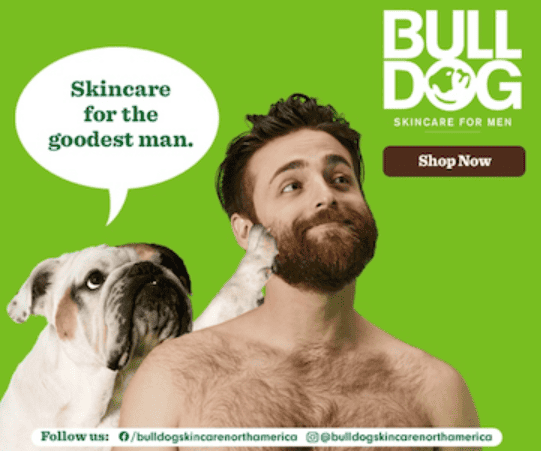
Bulldog, a popular skincare brand for men, has used humor and reflecting visuals to get the message across and promote its brand.
The bright background with the funny image and caption makes it impossible to miss and makes the user want to learn more.
Read also: 10 Ad Copy Examples That Are So Good, It Hurts!
#7. Captivating visual: Lexus

Using captivating eyes to captivate your eyes? Uncanny!
But what does a car brand have to do with the eyes?
Well, Lexus has used this banner ad to promote their latest sound system, which can be witnessed on their landing page following the link on the banner ad.
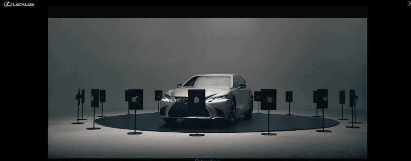
Lexus has definitely used two of the human senses — sight and hearing — to promote their product.
Most definitely unique and innovative!
Read also: Targeted Advertising Messages And How They Work
#8. Sense of urgency: Google Nest

Inspiring a click by introducing a sense of urgency, especially with a sales promotion, is a trait of a good ad. One way to ensure you get the best responses within a limited time is to instill a sense of urgency and push the cutler to act towards it.
In the example above, the urgency is further highlighted with the caption ‘best buy of the year’, prompting the customer to take action.
The ad’s simplicity and compelling text make it an excellent example of how completing banner ads can be.
Read also: How Your Business Can Grow Sales Using Persuasive Advertising
#9. A message with a cause: Brita

Brita has combined a valuable message as the centerpiece of its banner ad proposal. Not only is this ad attractive, it also conveys an important message — to reduce plastic waste.
The design is elegant, and the brand has chosen bright yet appealing colors which are aesthetically pleasing.
The adept caption combined with the chic design inspires users to stay true to the cause and click the ad.
Read also: Native Advertising Examples That Master the Art of Subtle Selling
#10. Apt visual: Ridge wallets

The goal of the ridge wallet is clear from this ad: a slimmer wallet with exclusive features, which is precisely what an ad is supposed to do.
Ridge has visually represented how their wallet works without describing their product in detail.
This banner is crisp and authentic, which is why it made it to our hall of fame.
Also read: What is a Splash Page? — The Ultimate Guide
Why Invest in Banner Ads?
Banner advertising is one of the most effective ways to generate leads and increase ROI. When you align your banner ads to your specific goals and effectively place them in high-traffic sites, they can be pretty advantageous and a quick way to drive traffic.
Elevated brand reach can also be achieved through banner advertising. In a survey in 2021, it was recorded that the Google Ads network reached 90% of internet users globally.
To summarize, here are the points on why banner advertising is effective:
- Increased brand visibility and coverage: Banner ads are strategically placed on high-traffic websites where they can be viewed the most. This placement increases brand awareness and visibility; even if customers do not instantly click through, they are bound to remember the brand, which may influence their future decisions.
- Affordable: Banner ads are easy to initiate and set up, unlike other forms of digital marketing. They are easy on your pocket and require minimal fees to get started.
- Measurability: Banner ads help track how effective your marketing campaign is. With banner ads, you can measure the amount of traffic received via click-throughs and hence gauge the campaign’s efficacy with the help of tools such as Google Analytics.
- Long-term advertising: Banner ads offer a long-term solution. These ads can be maintained for more extended periods. This helps reinforce your brand identity to potential customers.
- Intuitive and innovative: Banners ads are a great way to showcase your creativity and innovatively present your brand. The interactive nature of banner ads makes them a resourceful advertising method to garner attention.
Moving on, let us now review the elements that make up a great banner ad.
Read also: 9 Brand Awareness Strategy Ideas
7 Thumb Rules To Create an Effective Banner Ad
With banner advertising, one thing matters the most: design.
Since banner ads are highly visual, getting the graphic part right is imperative. The visual needs to be persuasive, captivating, and crisp, supported with the right textual content.
Here are the guidelines to achieve a top-notch banner design:
Rule #1: Select the appropriate banner size
Before you begin the design, choosing a suitable banner size that effectively advertises your product is crucial.
The banner size significantly affects the look of the ad and can influence the click-through rates.
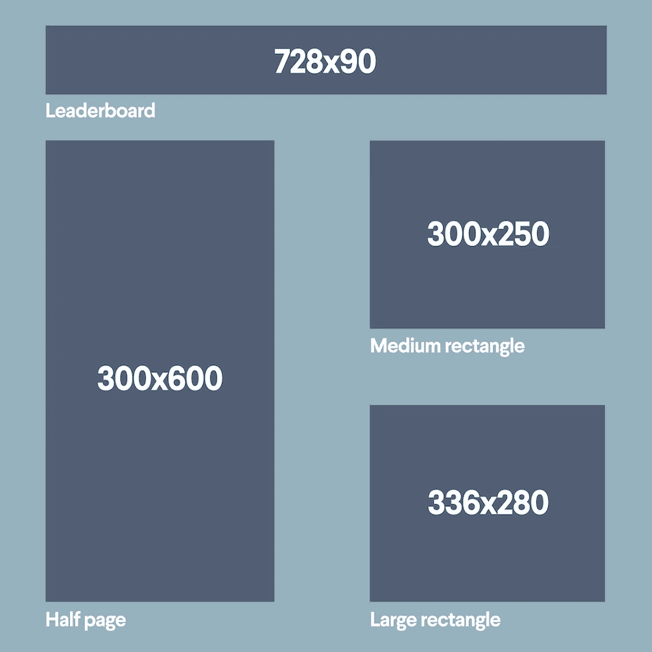
Here are the standard banner size according to Google Ad Sense:
- Top leader — 780×90
- Half of the page –– 300×600
- Integrated rectangle — Medium Sized rectangle — 300×250
- Large Rectangle — 336×280
Rule #2: Place it smartly
To ensure your ad gains maximum visibility, determining the placement of the ad on the website is significant.
The best location is at the topmost part of the page in the vicinity of the main content.
A potential customer is more likely to see your ad when it is located at the top of the page.
It is also vital to ensure your ad is above the fold.
To embed the ad with the rest of the website, establish a “natural advertising” design that merges with the elements of the rest of the page.
Read also: How to Increase Brand Awareness (Tips, Tricks, and Pointers)
Rule #3: Use unmissable visuals
The centerpiece of a successful banner ad is the high-quality visual. The purpose of the banner ad is to get the user hooked on what you offer.
The visual needs to be captivating so that the user clicks it in the blink of an eye.
These graphics must be relevant and attract the user from other data they are actively processing on the page.
Getting them hooked is one thing, but keeping them engaged enough to show them what you have to offer is another. The best banner ads grab the attention while also crisply promoting what they have to offer once a customer clicks the ad.
Rule #4: Create a valuable proposition
Since the text part of the banner ad is cut short, it is essential to convey what you need to share in a quick, sharp form using a banner text generator can help you craft concise and impactful messaging.
Creating valuable content that is easily readable will ensure your message is clearly communicated without losing the essence of the banner ad.
Remember, the text should not dominate the design of your banner ad but should equally command the attention.
Catchphrases such as high quality, limited-time sales, or other creative ones can do the job effectively.
It is also essential to ensure you use the appropriate fonts to make the text quickly readable.
Avoid cursive and hard-to-read fonts at all costs.
Rule #5: Lead the way with CTA
A compelling call-to-action button can be the bridge between a customer clicking through and completely ignoring your ad.
A well-designed CTA is what gets the potential to actually “click” the ad and move further. It is essentially an invitation for a prospect to your page.
A CTA should be visible, attractive, and lead the audience in the right direction. They must entail the end goal of the ad, such as “learn more” or “get started.”
They could make or break the banner ad. Hence it is essential to have a clear CTA which points the audience in the right direction.
Read also: 14 Examples of Small Business Branding (Achieve Similar Results)
Rule #6: Learn the hierarchy
The design of a banner ad is most effective when it follows this proven, effective hierarchy:
- Brand logo
- Supporting high-quality visuals
- Valuable proposition n the form of text
- A strong CTA
A balanced banner design with a fair amount of visual and text content makes a successful one.
By following this hierarchy, you are ensuring that the design is proportionate and covers the fundamental aspects of what a banner ad should constitute.
Rule #7: Keep the design simple
Always simple and straightforward designs create attract better than cluttered designs with too much information.
With banner ad designs, the same logic applies.
The most successful ad designs are always minimal designs with a precise balance of text and visual content.
Since the audience views the banner ad for a few seconds at most, a sharp, crisp design resonates louder than a complicated composition.
Read also: Outbound Marketing Tips to (re)Brand your Company [Updated]
Final Thoughts
On an ending note, the most common element that makes them stand out in all of the banner ad examples above is creativity and uniqueness. By showcasing your creative best, you ensure the user stops, takes a look, even if for a millisecond, and eventually clicks through if compelling enough.
Ultimately, banner ads are great for lead generation if used correctly. Don’t forget to have fun in the process!
Need to get started but don’t know how?
EngageBay can help you get started with our unique team of marketing software experts. Sign up for free to know more 🙂
