
The internet has been in ‘mobile mode’ for years now, and emails aren’t left out. With 85% of users accessing their emails using smartphones, mobile-friendly email designs are no longer nice-to-haves but have become must-haves.
According to Litmus, mobile-optimized emails have over 43.5% open rate compared to desktop, which only has about 20%. This explains the need to ensure that your emails are mobile-friendly.
In addition, statistics show that:
- 3 in 5 consumers check their email on the go with their mobile phones
- Mobile emails increase the likelihood of bringing customers to your website by 65%
- Approximately 1.7 billion email users read emails on their mobile devices
In this article, we’ll look at tips to create mobile-friendly eCommerce email designs and examples to get you started.
Ready? Let’s go!
Table of Contents
What Is a Mobile-Friendly eCommerce Email Design?
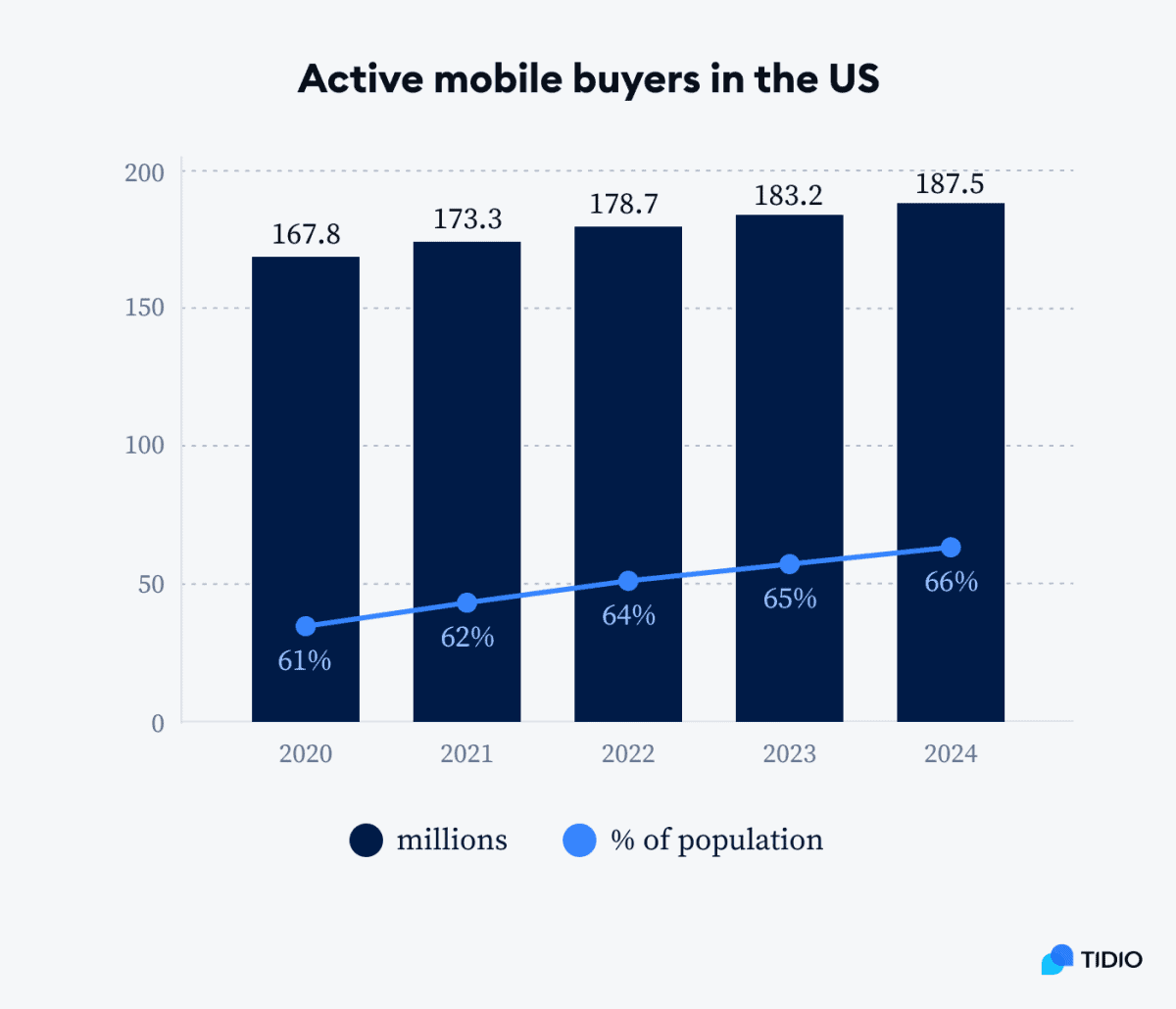
A mobile-friendly eCommerce email design is a marketing email optimized for viewing and interaction on mobile devices. According to reports, in 2023, over 183 million people shopped online from mobile devices in the US alone. The number is projected to be around 187 million by 2024.
If you are an email marketer, or if your eCommerce business drives a significant portion of its revenue from email marketing campaigns, with this online shoppers’ tendency, it makes sense to optimize your eCommerce email for mobile devices to drive more sales.
Essential Tips for Creating Mobile-Friendly eCommerce Email Designs
Have you ever viewed an email incorrectly formatted on your mobile phone? If you’re like me, you’d probably have done one of two things: delete or completely ignore the email.
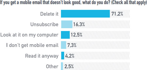
Well, we are not alone. 71.2% of users admit to deleting an email incorrectly formatted on their mobile phone.
So, it is important to format your emails correctly for viewing from any mobile screen to avoid losing your email client.
Here are some best practices to help you create properly formatted mobile-friendly eCommerce emails.
1. Use a short and catchy subject line
Remember you are reaching out to people on a smaller screen when creating a mobile-friendly email design. Typically, your subject should be between 25 to 35 characters or 4 to 7 words.
Statistics show that 47% of email recipients decide to open an email based on their subject line, and another 69% report emails as spam based on subject lines alone.
In addition to keeping your subject line short, ensure that it’s catchy and mirrors the content of your email.
Here are a few subject line examples to get started:
- Get inspired: Exclusive summer styles
- Hey [Name], ready for an upgrade?
- Save 50%, [offer inside]
2. Keep your email copy concise
When it comes to eCommerce mobile-friendly emails, less is more. On average, mobile users get more distracted than users who view their emails from a desktop.
Therefore, cutting to the chase and delivering your message is advisable. The ideal length for mobile-optimized email is 50-125 words.
To achieve this, you need to:
- Know your main aim for sending the email
- Deliver your content in a way that resonates with the email segment you are sending to
- Avoid fluffy words
Also, text fonts matter. Text too small to read is one of the leading causes of users’ frustrations while viewing emails on mobile. Email font size between 18 – 22 px is recommended.
Finally, include your social media icons so recipients can easily share your products or offers on social media platforms as these go more viral on mobile.
3. Put your email preheader to good use
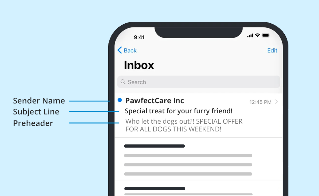 A preheader is a text displayed under the subject line to give further information about the subject line and email in general. Preheader texts are often ignored even though they can be very helpful when customizing emails for mobile.
Mobile users often get more emails on average and may easily get distracted and overwhelmed by their inbox volume.
By including a preheader, you get to flash the content of your email. Reports show that emails with preheaders have a 7% higher open rate than those without.
Litmus recommends 35 characters to ensure the preheader is shown in full on various mobile devices.
4. Stick to a single-column layout
A Single-column email layout is ideal for any device user and is the most user-friendly for smartphone users. Using a multiple-column layout is ideal for desktop email design but risky for mobile because it could cause text and images to be unsteady, and columns could overlap, too.
This is why a single column is preferable. Its presentation best fits mobile devices, enabling it to be read easily. Use a single-column layout no wider than 600 to 640 pixels for best results.
5. Choose images wisely
Many email clients block images by default, so you must carefully apply them while designing your emails. Bear in mind that images should only complement the overall content of your email, so you need to design your email so that it doesn’t lose its message in case the images are not displayed.
Add alt tags, too. Also note that though it is good to make your images of high quality, it could also make them heavier in size, leading to difficulty loading, which negatively affects mobile user experience.
Therefore, it is better to use images with a strategic purpose in mind and avoid so many of them while designing for mobiles.
6. Maximize white spaces
Mobile users view your emails on a small screen, which already tends to make the email cluttered. You do not want to make it even worse by making your general email background space-less because it makes your email unappealing to the reader, and you may eventually lose their interest.
Therefore, leave enough white space in your email around images, text, and especially around your CTA button so readers won’t have trouble clicking on them.
However, be careful not to use white spaces in excess so your email does not lose its professionalism.
 7. Test the email
You sure wouldn’t want to go through all the stress of making your email mobile-friendly and not testing it before launching it. You can test your emails against IOS, tablets, and Android devices. You can also try it out on a desktop to ensure you achieve what you intended.
With these tips, you can create mobile-friendly emails that drive engagement. You can now go ahead and put them into practice for better results.
Read also: 5 eCommerce Email Personalization Strategies [+ Examples]
Mobile-Friendly eCommerce Email Design Examples
We outlined seven mobile-friendly eCommerce email examples to get you inspired. We also include why they work.
#1. Nike
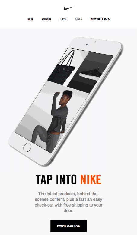 In the email example below, Nike keeps it simple, concise, and straight to the point. The email template is clear and intuitive, and the CTA is also clear and straightforward.
When creating mobile-friendly emails, it’s good to avoid using hyperlinks or menu bars for CTAs because they are more difficult to access and may be hidden from the reader, affecting your click-through rate significantly.
Nike put their CTA in a good spot surrounded by a reasonable white space. Google recommends a 48px squared size for CTA buttons, while Apple recommends 44px squared.
The font color blend between black and red makes it all the more engaging and easy to scan, both necessary for conversion rate optimization.
2. Huckberry
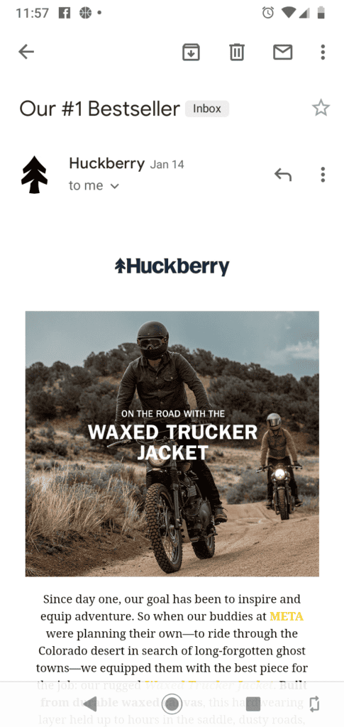 Huckberry gets several things right in this email campaign. First, the subject line “Our #1 best seller” creates FOMO (fear of missing out) in the recipient’s minds, so they will want to open the email to see Huckberry’s bestseller quickly.
The subject line is within the optimum character range for mobile-friendly emails (25 to 35 characters).
Additionally, the font size is large, which is vital to increase readability in mobile emails. Google recommends 18-22px font size, while Apple recommends 17-22px font size for mobile emails.
3. Twinings
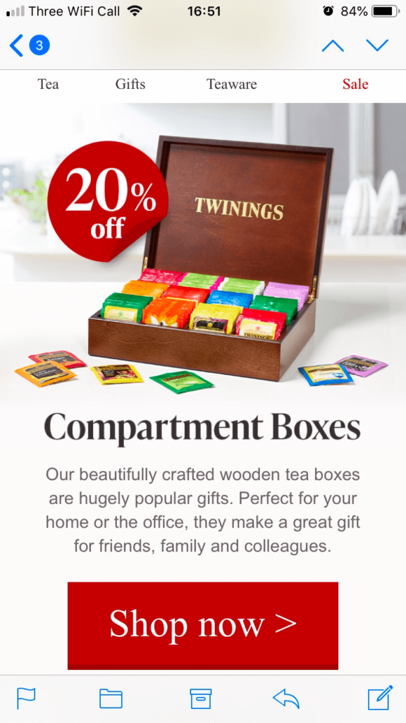 In this email campaign optimized for mobile, Twinings gets some things right. For instance, the color red for highlights makes the vital info in the email stand out, such as the CTA and the discount.
The average human attention span is 8.25 seconds. When combined with the distractions from reading emails from mobile phones, you’d see that it is vital to highlight the email’s important elements.
The email also looks well-spaced and properly arranged, which is crucial to enhance readability.
4. Casper
 A report shows that desktop users spend 40% more time on a site than mobile users. Additionally, desktops have a higher conversion rate (3.7%) than mobile at 2.2%.
While the reasons for this vary, Caper is doing something right to address this challenge. Placing the CTA above the fold increases the likelihood of potential customers clicking on it.
It’s important to note that this works in this instance because the email copy is short and precise. in the case of a long sales email, placing the CTA above the fold may be too early, as prospects may still need to be convinced to take action.
5. Lego
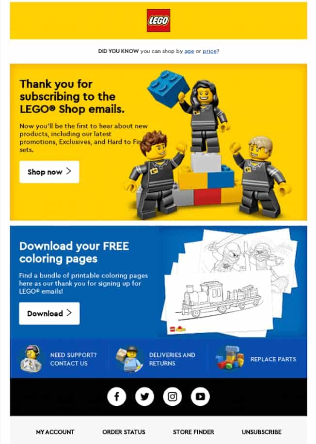 This email example makes it to the list for several reasons. Firstly, the color blend is beautiful and attractive. Next, the subject line ‘Thank You for Subscribing’ is 23 words, within the recommended subject line word for emails.
Its single-column email layout makes it easy to read on mobile.
6. GasBuddy
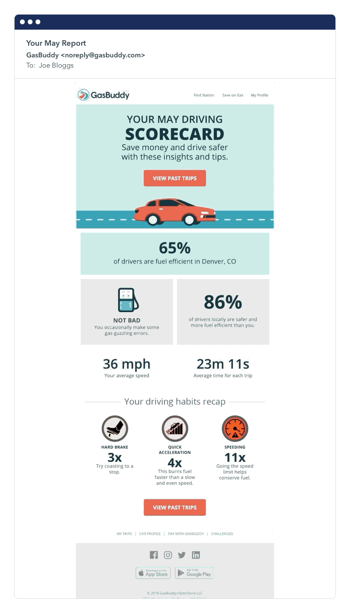 The white spaces in this mobile email example make it more appealing and look less cluttered, even though the email template has a lot of information.
This is important because mobile phones are usually smaller than desktops, so optimizing emails with white spaces is a great way to improve readability.
Additionally, a VWO report revealed that CTAs surrounded by more white space and less clutter increase conversion rates by 232%.
7. Peonies
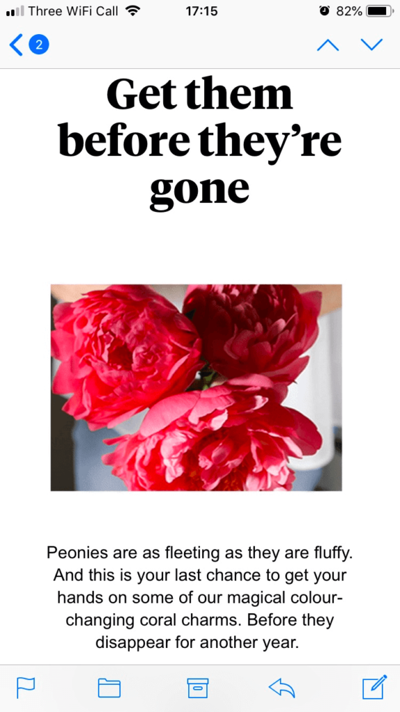 High-quality images are a great way to capture subscribers’ attention in an email. A report from eMarketer shows that product images influence 83% of digital purchase decisions.
Peonies get it right by including a high-quality image of their product to draw customers in.
For mobile-optimized emails, an image pixel of 450 to 500 is ideal. Additionally, their message is clear, and the subject line “Get them before they are gone” is creative.
Read also: eCommerce Product Recommendation Emails You’ll Love
The Importance of Responsive Emails in eCommerce
As discussed earlier in this article, creating mobile-friendly emails is necessary to get the best results from your email clients. However, people view emails from a combination of devices.
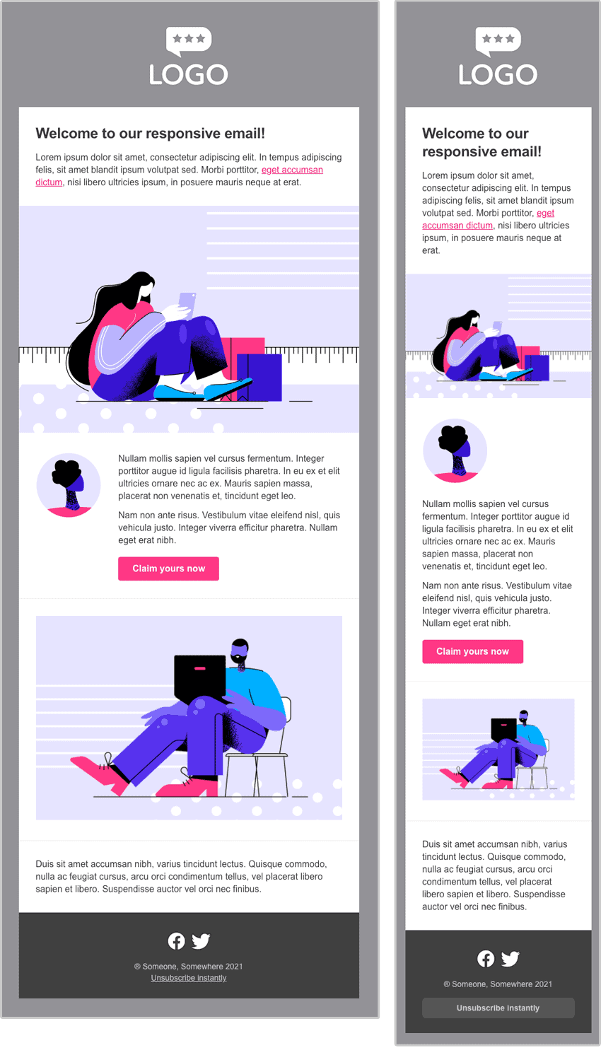
 To ensure your subscribers get a properly formatted email, irrespective of the device they are viewing from, you need a more flexible email design template, which brings us to responsive email templates.
Responsive emails are specific HTML emails designed to adjust to any device screen size, such as mobile phone (iPhone, Android, etc.), tablet, or desktop, for a consistent user experience.
Building responsive emails requires using a fluid layout, viewport meta tag, or media queries to adjust the layout and email content based on the available screen space.
This ensures the email template is visually appealing and functional regardless of the device it is viewed from. Unlike mobile-optimized emails, whose font size doesn’t change depending on screen size, a responsive email’s font size adjusts to fit into device size.
 It is important to decide on a flexible email service provider that can easily be customized to fit any device viewed; that way, you get the most out of your email marketing campaigns.
Differences between HTML emails and responsive emails
This is a frequently asked question. To answer this, HTML and responsive emails are similar but different. The key difference is while all responsive email templates can adjust to fit any device, not all HTML emails can adjust to any screen size.
HTML emails are created using HTML and CSS for styling and are used for email campaigns containing texts, images, and other elements that add to its vibrance and impact. They prioritize visual appeal over adaptability. Hence, they may not automatically adapt to different mobile screen sizes or devices.
| Criteria | Responsive email | HTML email |
| Adaptability | Adapts to different screen sizes | Usually static |
| Priority | User experience | Visual appeal/ design |
| Complexity | More complex to create | Less complex |
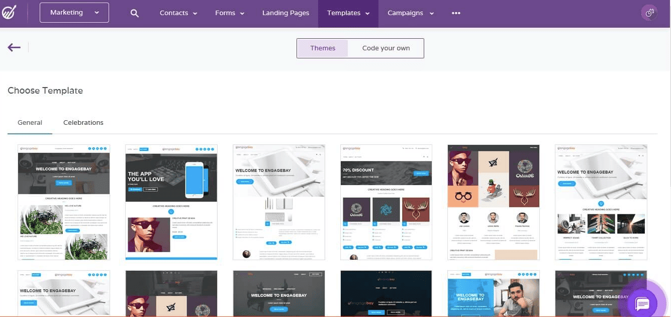
You can use EngageBay email builder to create responsive email designs easily.
Don’t want to create one from scratch? We’ve got you covered still. Pick one from several hundreds of free responsive email template designs and customize it easily on EngageBay’s email editor.
Read also: How To Craft Irresistible eCommerce Promotional Emails
Conclusion
With two-thirds of the world population now using mobile phones, creating mobile-friendly emails is a great way to stay up to trends and connect with your subscribers for more sales. Take it a step further and create responsive HTML emails so you don’t miss out on potential sales.
Want to get the most out of your eCommerce email efforts? Streamline your sales, marketing, and support efforts on EngageBay’s all-in-one sales and marketing automation platform.
It was made with love for small eCommerce businesses like yours. You can begin by checking out this customer review from one of EngageBay’s 46,000 users.