A great majority of eCommerce companies already understand the value of a powerful landing page.
And, others are finding out just how effective a good landing page can be for lead generation and lead conversion.
A targeted, well-written landing page is like one of those decorated shop displays in the days of the past. Ideally, your landing page should make it very difficult for potential buyers to ignore your products.
Your eCommerce landing page will (ideally 😅) encourage buyers to engage with your website (like window shopping in the past), and hold their attention as they decide to make a purchase.
In this article, you’ll discover:
- The key benefits of a killer eCommerce landing page
- Major types of eCommerce landing pages
- 15 real-life examples of stunning eCommerce landing pages
- Best practices for landing pages
We know eCommerce marketers are a busy lot, so let’s get started.
Table of Contents
Why Are Landing Pages Important for eCommerce Websites?
Well, if you’re not yet leveraging the power of eCommerce landing pages, here are some reasons why you should:
- Increase ROI on paid traffic: eCommerce landing pages help you make your offers stand out to your customers. This helps you increase the ROI on your paid ads.
- Target any number of customer segments: You can create multiple landing pages for different customer segments. A survey showed that a personalized call to action (CTA) button converts 202% more than a regular CTA button!
- Save time with landing page builders: Most marketing software offer easy drag-and-drop landing page builders. This can save you a lot of time while allowing you to create and use multiple landing pages.
- A/B Testing for better reach: Landing pages are usually specific to different marketing campaigns. With the feature of A/B Testing, you’ll be able to optimize your eCommerce landing pages for maximum reach and engagement.
Read also: Beginner’s Guide to Landing Pages
The Four Types of Landing Pages
The are four major types of landing pages. This categorization is based on the customer’s position in the sales funnel.
This makes sense, right? Let’s break it down further.
Top of the Funnel (TOFU) Landing Pages
These landing pages are designed for people who are either unfamiliar with your brand or have very little familiarity. These are the people who are just beginning their engagement with your brand.
The main purpose of a TOFU landing page is to introduce your brand and generate leads.
Key elements of a winning TOFU landing page:
- Brand story/values/mission
- Painpoints solved by your product
- Social proof
- First-time customer offers
Middle of the Funnel (MOFU) Landing Pages
These landing pages are designed for people who are familiar with your products but have not yet made their first purchase.
The main purpose of a MOFU landing page is to drive prospects to buy the product.
Key elements of a high-selling MOFU landing page:
- Targeting a specific product they are interested in
- Limited-time offer/discount to build a sense of urgency
- Offer a lead magnet (for cold leads)
- Actionable call-to-action button
Read also: 7 Landing Page Optimization Tools For Smooth Conversions
Bottom of the Funnel (BOFU) Landing Pages
These are landing pages designed for people who have added a product to the cart and haven’t yet checked out. Or, it can be used to upsell products to a buyer who has already added a product to the cart.
The primary goal of a BOFU landing page is to close the deal and also offer additional products that are relevant to them.
Here are some important elements of a winning BOFU landing page:
- Limited-time discount coupons
- ‘Bundle with’ offers to upsell related products
- Additional discounts like free shipping
Already Purchased Landing Pages
These are landing pages that are aimed at people who have already made one or more purchases. These are your potential repeat customers.
The main goal of an already purchased landing page is to build a rapport with existing customers and keep them purchasing again.
Some of the key elements of already purchased landing pages are:
- Offering early access to new products before they reach the open market
- Requesting testimonials or referrals
- Lifetime loyalty programs/ incentives
- Stories from other happy customers
Every eCommerce marketer would have a few campaigns that make use of each of these landing pages.
Now, let’s stop with the theory part of the article, and look through some real-life examples of high-converting eCommerce landing pages.
Read also: 7 Powerful eCommerce Marketing Automation Strategies + Tools
15 Best eCommerce Landing Page Examples From Top Brands
You’ve already seen some of the most important elements of a successful eCommerce landing page.
We’ve sifted to hundreds of landing pages among top eCommerce brands to bring you the most unique, and high-converting ones. We’ve also listed out the elements that make each of them stand out.
1. Gillette

Here’s what makes this eCommerce landing page a success:
- This landing page targets a particular segment of prospects who are looking for high-end, luxury shaving kits.
- It’s perfect for the holiday season when many prospects would be looking for a quick gift purchase.
- There’s a catchy headline that clearly highlights the kind of product they are selling – luxury shaving tools.
- The clear call-to-action (CTA) button encourages prospects to quickly check out the items they want.
 Beware of the dangers of overstocking. It can have serious consequences for your business. Get a detailed insight into it here.
2. FabFitFun
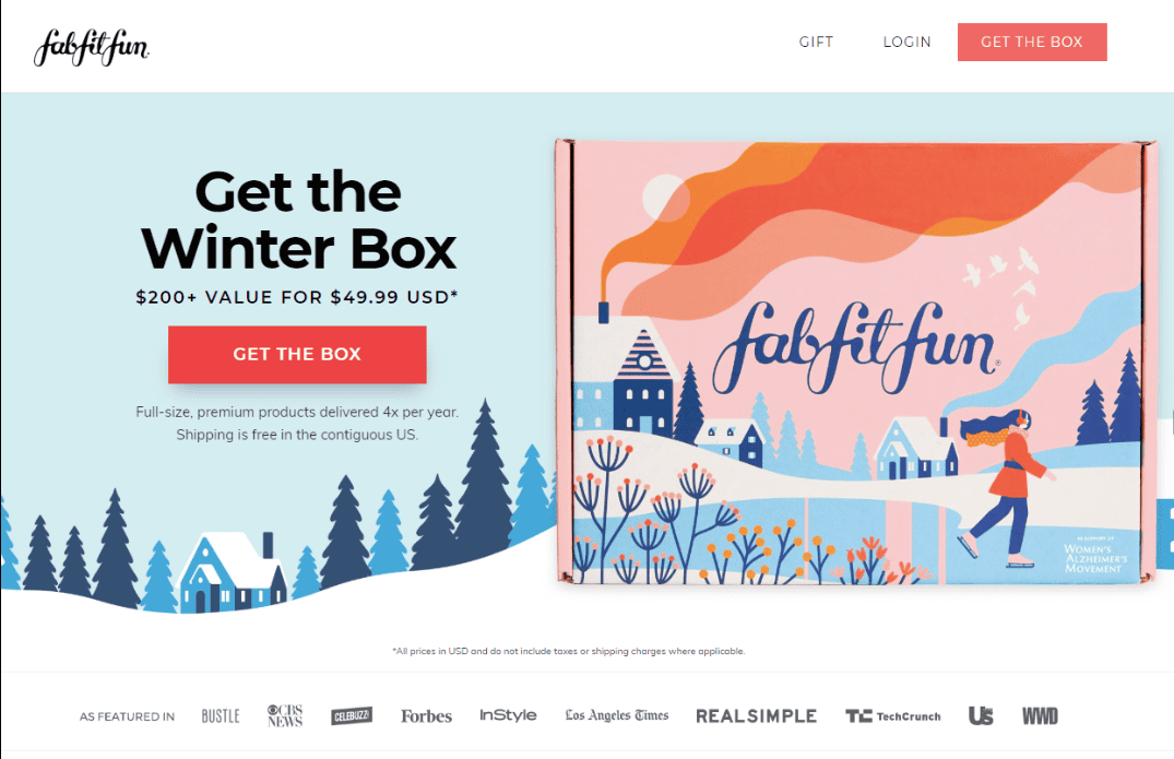
Here’s what makes this a great eCommerce landing page:
- Excellent graphics that are not distracting for the prospects.
- It shows social proof at the bottom, which lends more credibility to the product.
- The value provided by the product is highlighted clearly
- It offers the option of free delivery in the USA.
Read also: 15 Easy Steps to Build a Personalized eCommerce Marketing Plan
3. Solo Stove
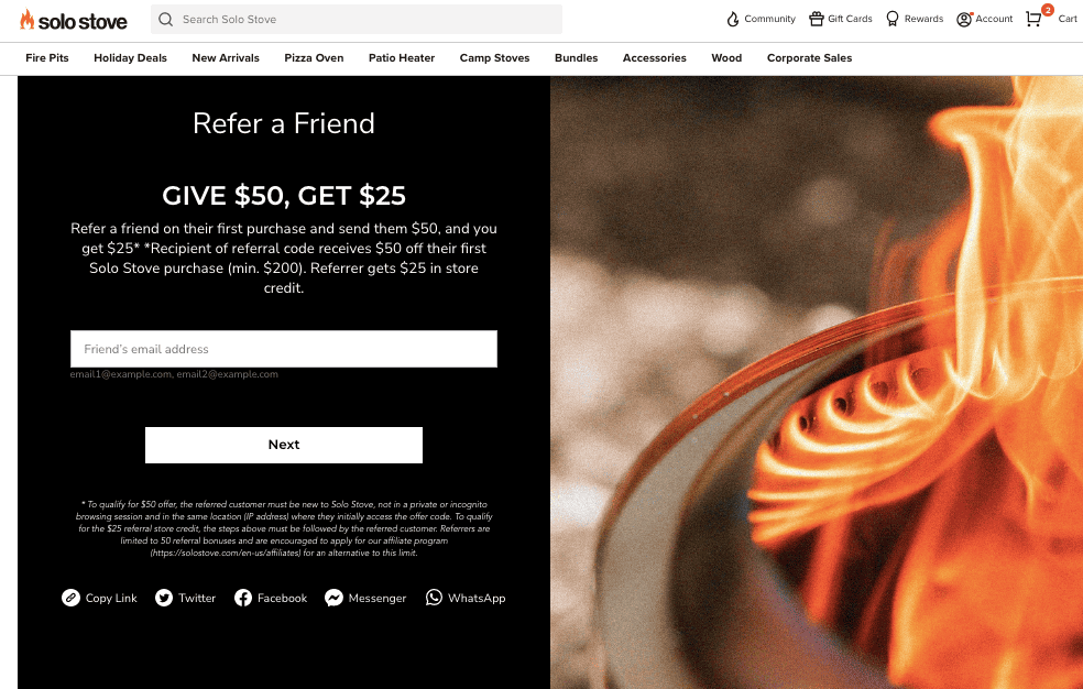
This eCommerce landing page by Solo Stove comes under the Firestarter Rewards Page after you sign in.
This is a great example of a crisp and engaging ‘already purchased’ landing page. This is where you get repeat customers to engage with you and offer referrals or testimonials.
Here’s what’s working for this eCommerce landing page:
- A single form-field encourages repeat customers to refer their friends. In this way, new leads are generated with the help of existing customers.
- According to surveys, multiple form fields that request the name and gender of a prospect actually see a 5% drop in conversion rates! So, a single form field is a great idea for this landing page.
- Excellent graphics, that really tie in with the brand.
- It presents a win-win situation for both the repeat customer and their friend/family member.
- It offers share buttons for social media.
Read more: 20 of the Best Product Landing Pages Online
4. Thistle
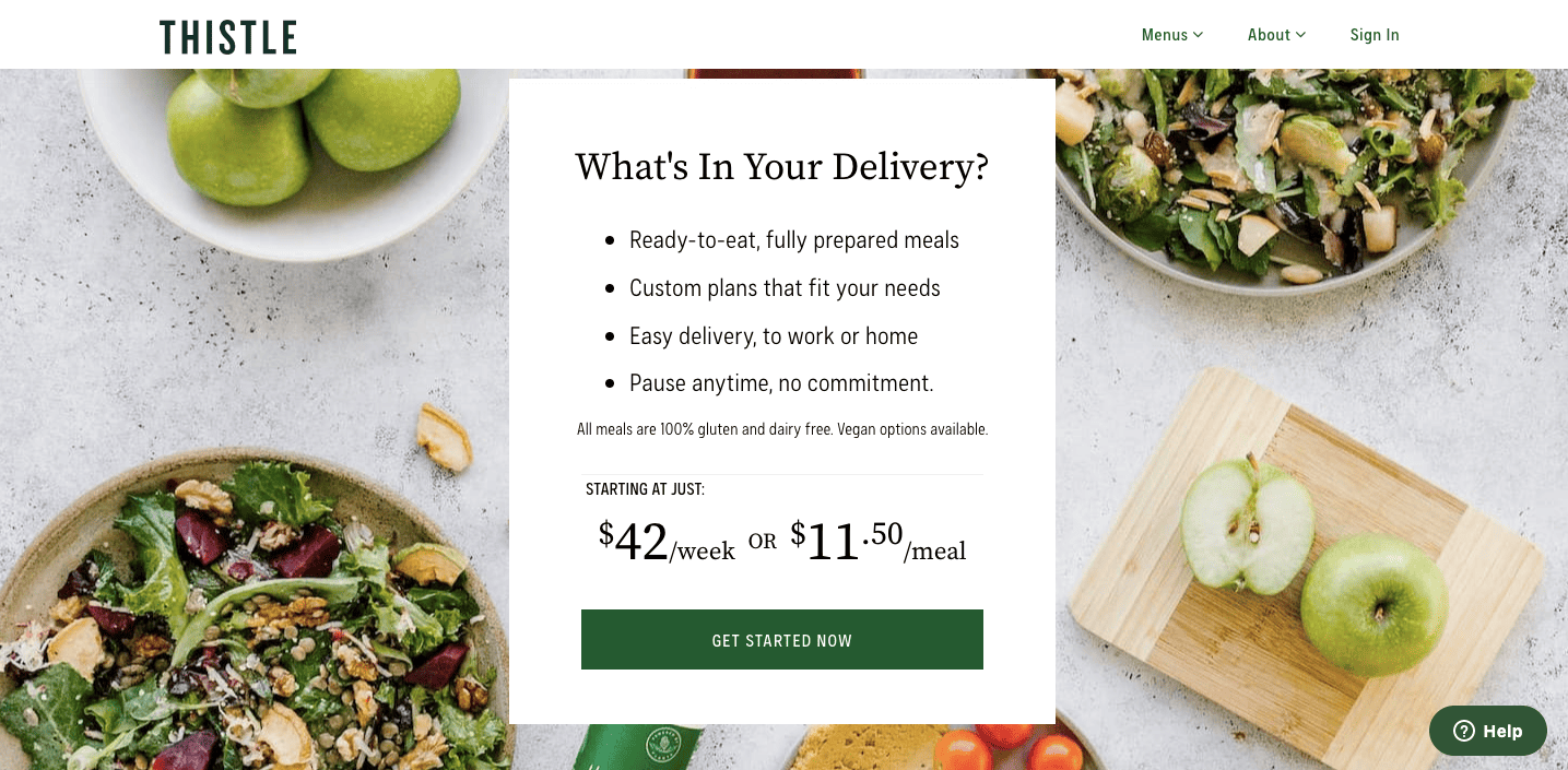
Thistle is a food delivery service that brings nutritious meals to your home. There are other landing pages that you can find on the website. However, the image above is an example of the middle of funnel (MOFU) landing page.
Here’s what this eCommerce landing page is successful at:
- There is additional information that’s relevant for prospects considering a purchase.
- The value and advantages of the product are highlighted in clear terms.
- There’s a clear call-to-action (CTA) button.
- It specifies that there’s no long-term commitment for prospects who are unsure about continuing the services for a long time.
5. GoPro
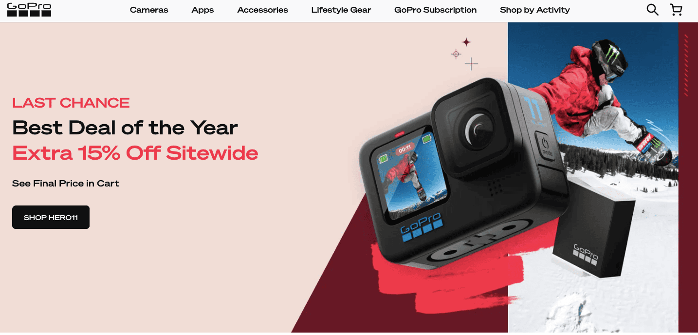
GoPro has some of the most successful eCommerce landing pages that are high-converting.
Here’s what makes this landing page work:
- It clearly highlights one year-end offer. According to studies by Wishpond, featuring more than one offer on your landing page can decrease conversion rates by up to 266%!
- The headline with the words ‘Last Chance’ creates a sense of urgency and FOMO for prospects.
- The product is showcased with high-resolution images and graphics.
But, GoPro goes one step further in encouraging prospects. Here’s another eCommerce landing page example from GoPro. This is a pop-up landing page that shows up for new visitors to their website 👇
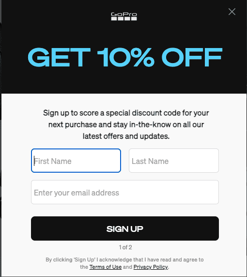
This pop-up eCommerce landing page is great for generating new leads. It offers an additional discount on GoPro products for your next purchase, and signs you up for their newsletter as well.
However, this landing page has multiple form fields, which may affect conversion rates in the long run.
Read also: eCommerce Brands: 10 Brands to Watch in 2026
6. Charlie’s Rawsome Granola
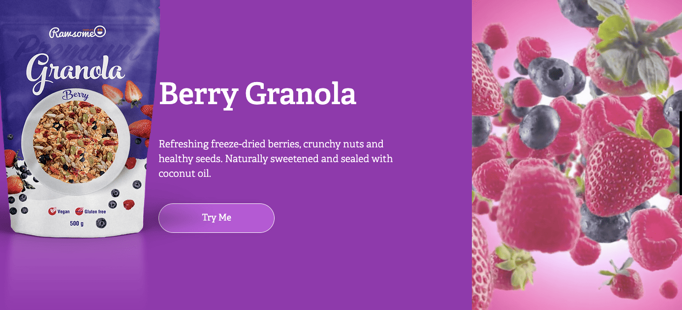
Charlie’s Rawsome Granola is based out of Australia and offers interesting landing pages for prospects.
Here’s what’s working in their favor:
- The landing pages offer a great customer experience. As the prospect scrolls down the landing page, color-coordinated panels interlock with each other. This makes it visually satisfying when the prospect scrolls down the landing pages.
- There is one highlighted, dynamic image that zooms into focus for each flavor of granola.
- The product image is highlighted clearly.
Then, as the prospect scrolls, there is another landing page that forms out of interlacing panels. This gives more information about the product and its consumption for prospects unsure of making a purchase.
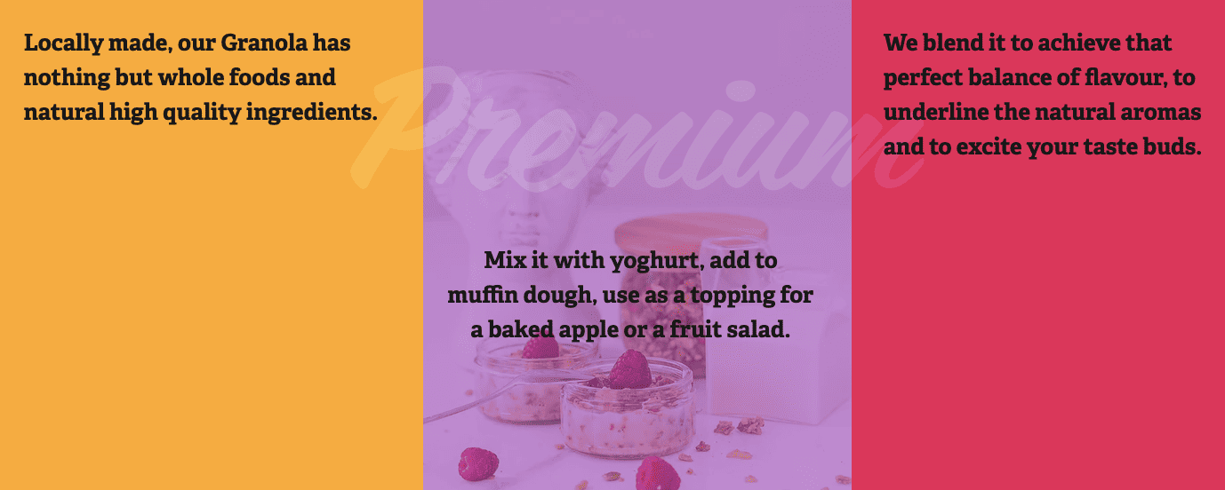
However, one aspect that can be improved in these landing pages is the call-to-action button.
Using a different color to offset and highlight the call-to-action button could help improve conversion rates on these landing pages.
Read also: How To Automate Your Ecommerce Business
7. Home Chef
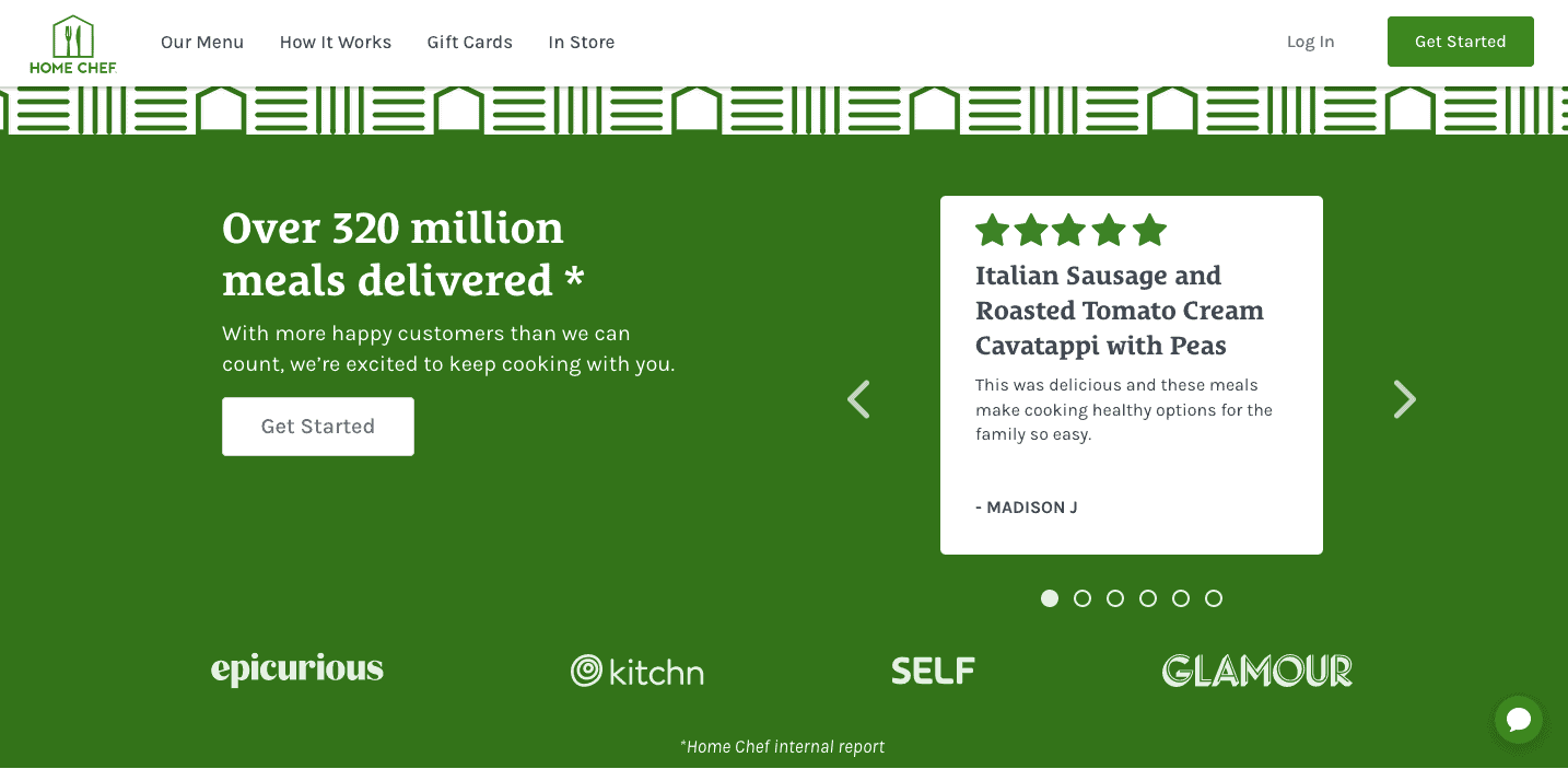
This is a great example of an eCommerce landing page. The design is minimalist, yet effective.
Here are the best features of the Home Chef eCommerce landing page:
- This landing page aims to build credibility for the product. It has one goal, and it achieves this goal well.
- The headline highlights the company’s prior experience of delivering to millions of customers.
- The testimonial on the right is very credible. It features the name of the customer, which lends credibility. Prospects can scroll through multiple testimonials on the same landing page too.
- This landing page also showcases the websites and magazines that they have been featured in, adding to their credibility.
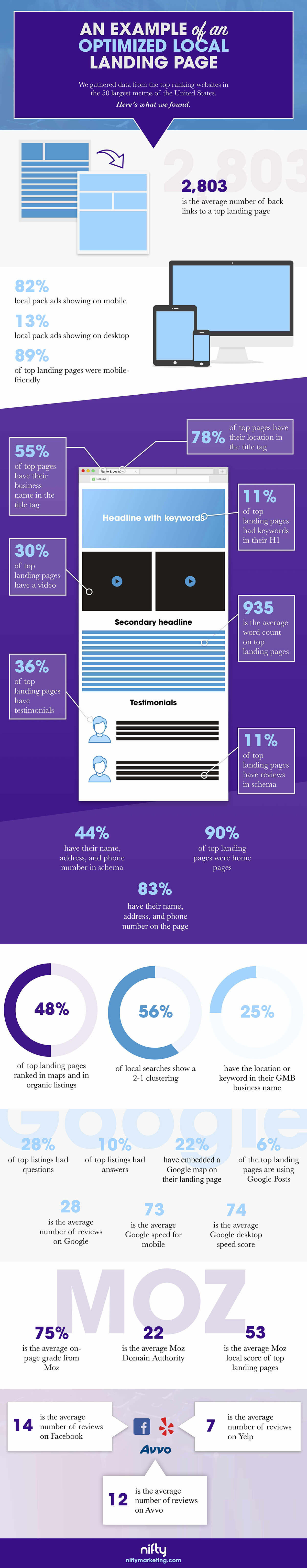
- A study by Nifty showed that 36% of the top landing pages feature social proof in the form of testimonials from previous customers.
Home Chef also has another unique and creative landing page option.
Prospects can take a short quiz to determine their style of cooking from the main landing page, as in the example given below.
Prospects are asked a few easy questions about their cooking preferences. Based on your style of cooking, the call-to-action (CTA) button directly takes you to sections that are most suitable for the prospect.
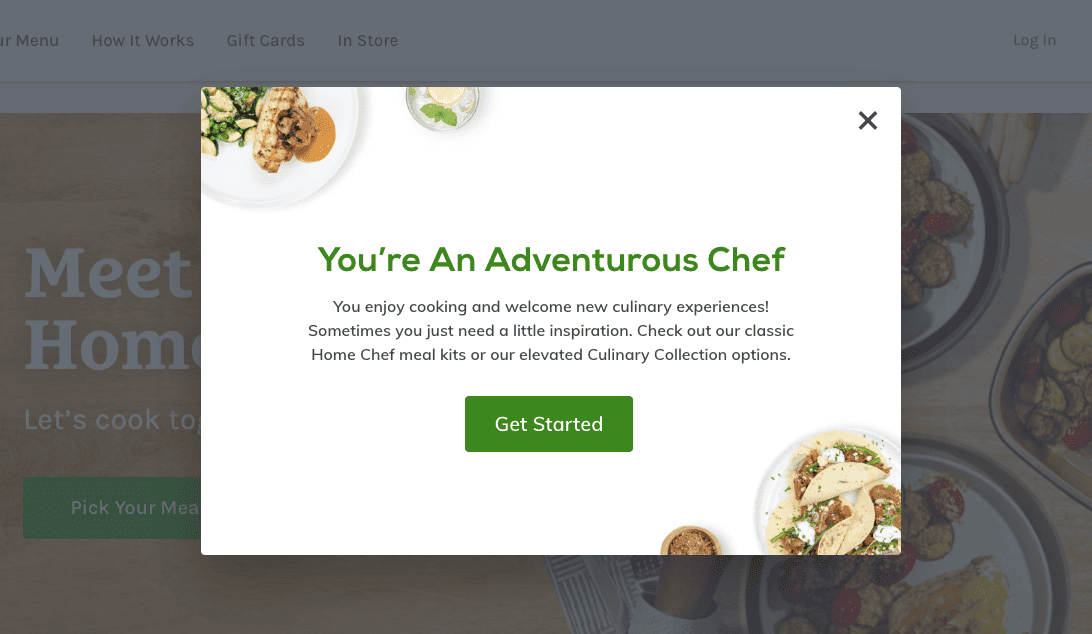
Here’s why this landing page is a good idea:
- It saves prospects the time of having to look through each category of products. Here, they are directly led to products that are most suited for them.
- It boosts engagement with the website.
- It gives prospects a sense of personalization based on their specific requirements.
8. First Day
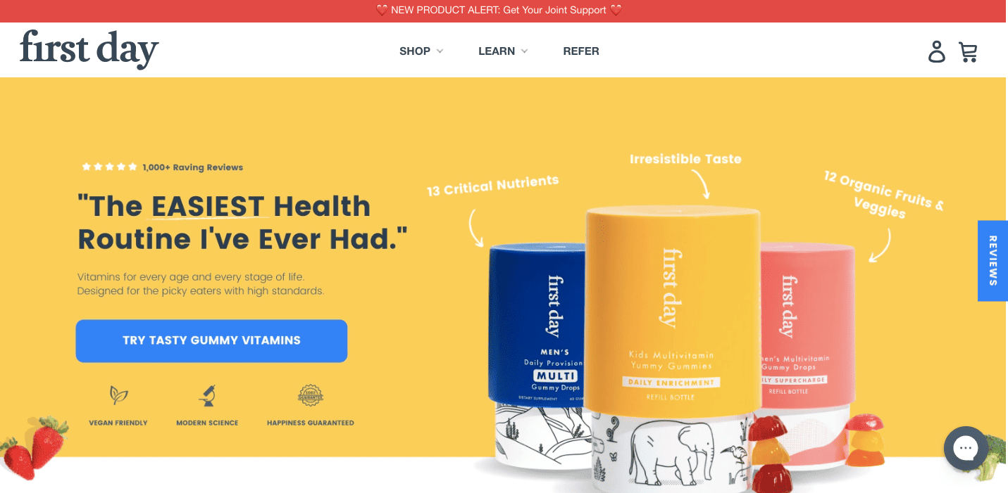
This is another example of a well-designed eCommerce landing page.
Here’s what is working well on this landing page:
- Clear call-to-action button.
- Prospects can click the review tab on the right to check out more reviews.
- The products are featured clearly, with their unique selling points (USPs) marked out.
However, this landing page could also benefit from featuring the names of their reviewers, as it would add more credibility.
Finally, the icons below the call-to-action button can become a bit confusing for prospects. At first glance, the icons may be mistaken for showing social proof. But, the icons only make vague promises like ‘modern science’. These icons can be changed.
But overall, this is a great example of what a good eCommerce landing page can look like, especially in terms of design.
Read also: 2023 Guide to Email Marketing for eCommerce
9. Alala
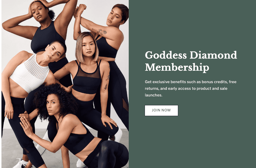
This is a simple, yet effective eCommerce landing page to encourage prospects to sign up for a membership at Alala.
Here’s what’s working in favor of this landing page:
- The minimalist design ties in with their apparel brand.
- The image highlights diverse women wearing the apparel.
- The major benefits of the membership are laid out succinctly.
- There are zero distractions from the goal of the landing page — getting people to sign up.
Read more: 7 Landing Page Optimization Tools for Smooth Conversions
10. Coco Village
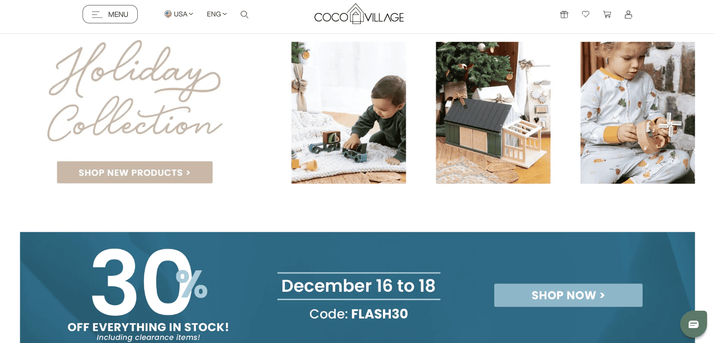
Coco Village features products for children and ships across the US and Canada.
This landing page is excellent because:
- It highlights one particular seasonal collection of products.
- It offers a limited-time discount code at the bottom, which creates a sense of urgency.
- Both call-to-action (CTA) buttons are clear. Prospects can either begin by shopping the holiday collection or across the store, based on their requirements.
However, it may not always be a good idea to have multiple call-to-action (CTA) buttons for the same landing page.
A study by Unbounce found that a landing page with a single CTA converts at a faster rate.
👉Boost your sales success with the ultimate sales page examples – dive into our in-depth guide today! 🚀
11. Skullcandy
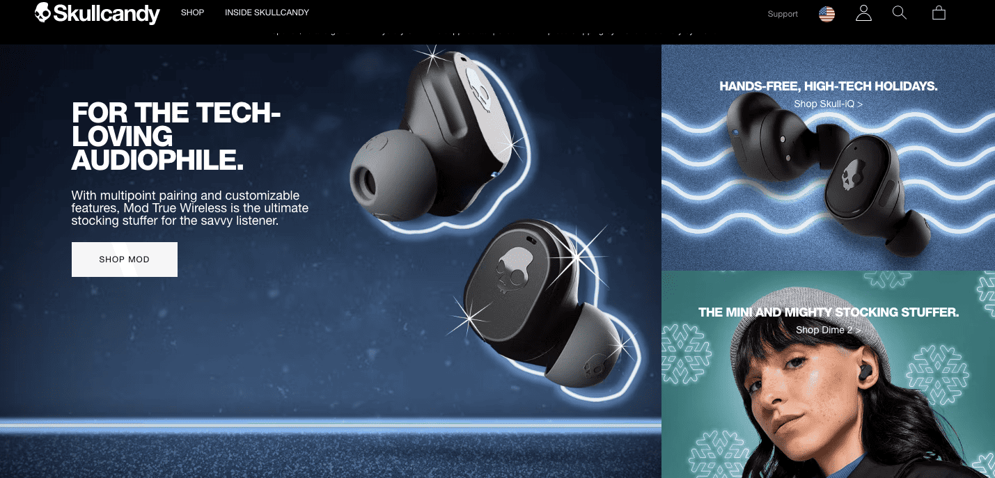
This is yet another excellent example of a good eCommerce landing page. Here, the goal is to promote a few selected products for holiday shoppers.
What this eCommerce landing page successfully does:
- A very catchy headline that appeals to the prospect’s interests.
- There are clear images and descriptions of the highlighted products.
- The single call-t0-action (CTA) button would work well. But prospects can also click on the options on the right without a clear CTA button if they wish.
- This is a great example of a middle of the funnel (MOFU) landing page, where the goal is not to gather more leads. The goal is to give more information, to drive the prospect to buy the product.
Read more: Unlocking Success: 8 Exceptional Landing Page Examples And Why They Work
12. De Havilland Gin
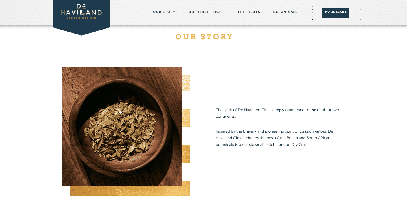
This is one of the landing pages on the De Havilland Gin website.
What’s great about these landing pages:
- It tells the story of the brand and product in an engaging way.
- It highlights that it is a luxury product through the brand story.
- After scrolling through the brand story, prospects are led to another landing page, with a CTA button. Check the image below.
- It flows in such a way that the prospect feels like they have taken this journey with the brand.
Read also: eCommerce Conversion Funnel in 5 Stages
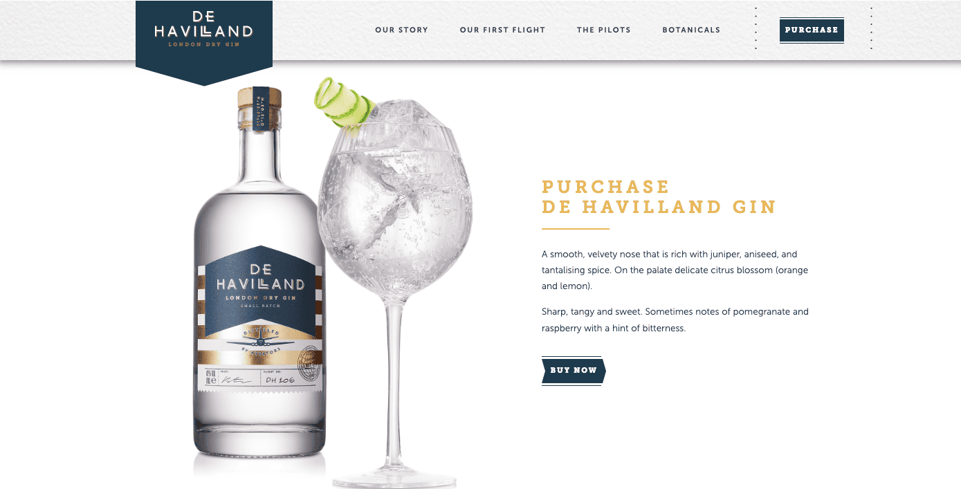
Source: De Havilland Gin website
13. meowbox
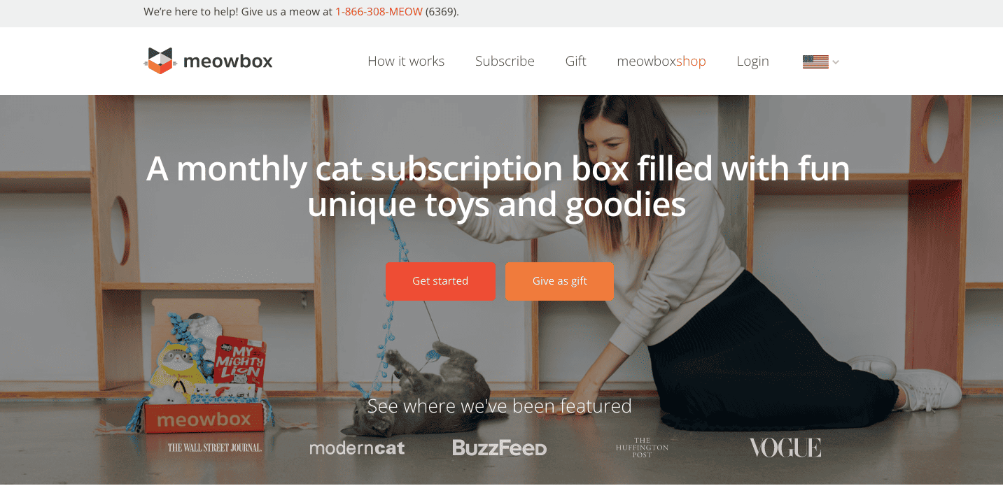
This eCommerce landing page from meowbox is a great example of a top-of-the-funnel (TOFU) landing page. Here’s what makes it stand out:
- In this case, the two CTA buttons make sense for the holiday season. This landing page can capture leads who own a cat and leads who are looking to gift a meowbox subscription to friends and family.
- Prospects are then led to a middle-of-the-funnel landing page, where they get details of pricing plans.
- It also showcases social proof with leading websites/brands.
Read also: The Definitive Landing Page A/B Testing Guide [With Ideas & Case Studies]
14. Koala Sleep
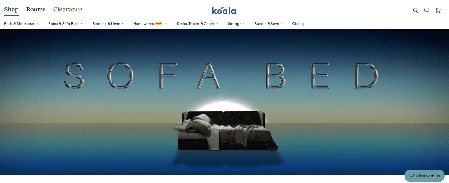
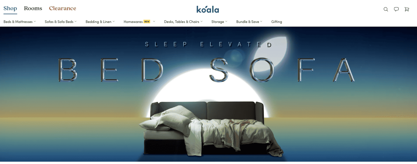
This eCommerce landing page showcases the use of a video for landing pages. The goal of this landing page is to promote one product — the sofa bed.
The words ‘sofa bed’ re-arrange themselves to read as ‘bed sofa’, while the video zooms in on the product. This highlights the versatile nature of the product itself through video.
Here’s why this landing page is successful:
- The headline ‘Sleep Elevated’ appears as the image of the sofa zooms in.
- The re-arranged words add a classy touch and highlight the nature of the product.
However, this landing page lacks a CTA button. Adding a CTA button would increase conversion rates for this landing page.
Read also: 12 Great Landing Page Optimization Practices — The Ultimate Guide
Ecommerce Landing Pages Best Practices: Key Takeaways
Based on the real-life eCommerce landing page examples above, here are some of the best practices for optimizing your landing pages:
- Include a single, clear CTA button. Use multiple CTAs only for special purposes like seasonal discounts.
- A catchy, pithy headline goes a long way in grabbing the attention of prospects.
- Have minimal distractions from the goal of the landing page.
- Use social proof wherever applicable.
- Images should be clear and of a high resolution.
- Include minimal site navigation options.
- Ensure that you run A/B testing on each landing page.
- Each landing page should also be optimized for mobiles and tablets.
So, which of these real-life eCommerce landing pages truly inspired you today? Let us know in the comments below.
If you want to try the world’s most affordable all-in-one CRM tool for your client relationships and marketing automation, there’s always EngageBay 👇